(Archive) Advertising District / New Solo
-
 13-October 06
-

 Ling
Offline
*yawn* whoopdie fuckin do.
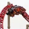
Well, the supports are nice and general, but maybe not the best choice for a shuttle Intamin. The foliage is lacking and the coaster is basic. I would have to see the rest of the area. The only thing that makes me want to know more about the park is that the station looks like it might be interesting. -

 ACEfanatic02
Offline
Try to get a good portion of a park done before you advertise. One area AT LEAST.
The rule of thumb I (try to) follow is: if you can't show a full screen without showing something unfinished, you shouldn't advertise.
-ACE -

 lucas92
Offline
^that's very true, and most of the times you're always about a lack of updates so you're rushing and that's what genarally make a crappy unfinnished park...
 -

 Genius638
Offline
hmmm....
It's a shuttle. What were you going for? realistic? you seem to maybe have accomplished that with the lack of detail...but it's pretty dull either way.
It really, honestly seems rushed. And I'm not sure about the supports....maybe look at some real screens of the late Astroworld's 'Greezed Lightnin', I know that was the same type of coaster.... -

 RCFanB&M
Offline
Ok...I hope this is a real project...
The coaster looks just ok, the supports are normal and the layout is generic. I don't like very much the foliage, you should add more types of tree, and if I were you, I'd put yellow flowers instead of violet flowers. I'd like to see some buildings, so I can make a more complete comment. Anyway, it looks interesting.
Keep the updates coming. -

 Ge-Ride
Offline
Copy and paste the coding. It's some more of that forbidden server crap.
Ge-Ride
Offline
Copy and paste the coding. It's some more of that forbidden server crap.Edited by Ge-Ride, 13 October 2006 - 10:24 PM.
-

 JDP
Offline
ughh, one, as already said, finish a project. Im not even sure if i should post on your topic. two... that screen is just boringggggg...
-JDP -

 twister12
Offline
really sorry i keep swapin projects. i have a short tension-span for a park unless it is really good. also, sorry for the really boring screen. i realizes this wasnt the best, so im redoing this to be spanish stlyed. expect an update soon.
 -

 RCT_Master
Offline
^Good idea. It's always good to start with a theme. The coaster looks pretty basic, but boring as well. I like the supports. Simple, yet realistic. The rest of the area looks really boring. The coaster stands out because of it's colors. If you use different colors in your buildings, paths and foliage, it'll pop more.
 -

 twister12
Offline
well, its comin along at a slow pace. i need help figurin out foliage. im really bad at this. so this is an update/question.
Help Me!!! -

 trav
Offline
Wtf are there scottish pine trees there for? Isn't this spanish? Try using more palm trees and more trees that look like they could survive in a hot climate without shriviling up and dying.
 -

 Ling
Offline
that all looks pretty good, except for the Scots Pine trees. More jungle-type trees would fare better with the theme it looks like you're going for.
 -

 Genius638
Offline
The station is gorgeous, looks just like a villa. foliage....can't see what the porblem is here, just do what you think is best. Maybe add a pond or something under the track to spice it up a litttle. You could also use land-rocks.
 -
![][ntamin22%s's Photo](https://www.nedesigns.com/uploads/profile/photo-thumb-221.png?_r=1520300638)
 ][ntamin22
Offline
thanks ling & trav. ill try that later. got a band competition right now.
! what manner of band competition? -

 Panic
Offline
You've got good ideas but you need to expand them into something more large-scale than that. Right now 1) the building looks kind of like a conglomeration of 1x1 and 2x1 and 2) it looks like there's not going to be another building close by, which means that the aesthetic flow will suffer.
 -

 Carl
Offline
Some of the various Cypress trees in the game would also be good for a Spanish setting.
 Tags
Tags
- No Tags