(Archive) Advertising District / Disney's Villains Park - LL
-
 11-October 06
-

 Segaman75
Offline
Yeah, yeah... I know. I lied about not building another LL park. So shoot me.
 I'd like to announce, Disney's Villains Park. Being constructed in LL, it should be done within the next few weeks... hopefully. That's the thing about LL and me, I can build a park in a month or two, instead of taking months or years to try and finish something in RCT 2. I should just give up on RCT 2 period and just forget about building anything in that game.
Oh well... so here's what I've got so far: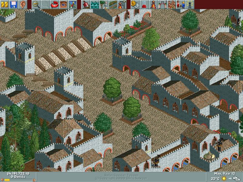
Part of the entrance area, Villain's Port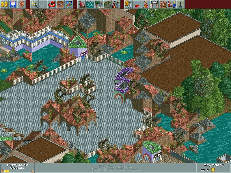
The first of several Villains-themed areas. This is Ursula's Grotto. The queue line is for an as-yet-unbuilt ride called "Ursula's Revenge". (Inventive ride name, don't you think? )
)
I'm planning on many more areas and rides themed to various Disney villains. So far I've got ideas for a Hades area, themed to the underworld from the movie Hercules, along with a Maleficent area, complete with a castle atop a small ridge that will house the Dragon's Lair (similar to La Taniere du Dragon from DLP). Of course, I'll have Captain Hook's ship and Skull Island, along with smaller areas for other nefarious villains from the Disney universe. And that's just the tip of the iceberg.
I've never done a Disney park before, so we'll see how it turns out. I might need some hacking done as well, so if you're good at hacking LL, let me know.
Hope you enjoy the screens! Viva LL!!
-

 Casimir
Offline
Uh, I don't know...
The first screen has a nice, athmospherical touch...
But it looks rushed in a way...
Not really my cup of tea, although it's nice and everything.
The second screen looks meh!
The brown roofs look random and annoying.
Plus, I don't think the path really fits there.
As a result:
First screen : Nice, but ordinary
Second screen: I know you can do that better -

 posix
Offline
whoa, segaman, you're crazy.
how much i envy you for building speed, really ....
i like the screens. but i have to agree, the first one looks a little too rushed. i can't really understand what each building is meant to be. and it doesn't look terribly much like disney.
still, it's classic rctll style, and i will never stop loving that. -

 Milo
Offline
Some lies are good. Glad to see you're sticking with LL.
 Anyway, I think you can do a little better than this. First screen is nice but a little rushed which detracts from the feel. And it could use a little more color. Second screen I'm sorry to say is not very good. It's just kinda random and baren. Keep going though because I know this will be awesome if you just try a little harder.
-

 JDP
Offline
^^^I basiclly agree with everyone...
one thing though, are the green paths over the que floating?
-JDP -

 Segaman75
Offline
It's interesting how opinions can change from one park to the next, isn't it?
 Thanks for the comments, people. I appreciate the constructive criticism.
The first screen is supposed to be my take on a "dark and sinister" port of call, although now that I go back and look at it, it does seem rather bland and rushed. I actually took this park from another I had started before WBMW, so I guess I'll have to go back and redo that area a little.
As for the second screen, it's meant to be under the sea, in a coral reef area. Ursula's Grotto. I guess I'll have to liven that area up a little too...
Seems like I've got some more work to do.
-

Silenced Offline
The first screen has atmosphere, but no color. I think a few flowers under the trees wouldn't hurt. the second screen just isn't my kind of park. -
 Valp
Offline
LOVE the second screen.
But maybe you can experiment with a different path, or perhaps no path at all, like in Metro's park. That might be... cool. -

 RCFanB&M
Offline
I like the traditional LL feel on the screens...
As posix said, it doesn't look very much like a Disney park...but apart from that, I think it looks organized and that it has a very pleasant atmosphere. On the second screen, I don't like very much the "rock rooves" mixed with glass walls, basically because IMO, it don't looks really good aestheticly.
Anyway, this is an interesting park to see. Keep going Segaman. -

 Ling
Offline
that first screen DOES look a little rushed, and does anyone else get the sense that the theme in that screen looks almost TOO repeated? I mean, I get how you have to keep with consistant themes in areas, but it's too grey... maybe some brown castle in there, or some more shrubs?
Just my opinion -

 lucas92
Offline
^ Agree for the first screen.
The second one is very nice to my eyes, I don't get how a brown plain roof would be "random"? I think you cannot redo the second screen without being rushed... I think you're doing a nice park, like all of your classic works... Excellent.
-

 JDP
Offline
^But i think of darkness when i hear the work "Villains Park". But yeah, maybe the brown won't hurt...that first screen DOES look a little rushed, and does anyone else get the sense that the theme in that screen looks almost TOO repeated? I mean, I get how you have to keep with consistant themes in areas, but it's too grey... maybe some brown castle in there, or some more shrubs?
Just my opinion
-JDP -

 Ling
Offline
what I mean is, it's all just the windows, the grey walls, and cobblestone paths. It's repetitive, but I'm not saying it's easily fixed, or that I could do anything comparable.
 -

 Lloyd
Offline
Well i like the idea behind the park, i've wanted to see a Disney Villains for a while. I think the first screen looks almost boring. It's repetetive and although the shapes are different, i think it needs more colour.
The second screen has a nice feel, but it lacks alot. That also looks pretty bare, and unfinished (which it probably is).
Dont try and work too fast though, you could ruin a good idea for yourself, keep going though, i'll be keeping a close eye on this.
 Tags
Tags
- No Tags