(Archive) Advertising District / Marriott's Project "Triple X"
-
 10-October 06
-

 geewhzz
Offline
I don't know if the shake roofs fit in with the atmosphere, but everything else looks great.
 -
 Carl
Offline
I am beginning to see why your project is 9 maps, all your screenshots capture very large structures or areas, which you are good at making; and the orange works well as a "contrast" color.
 -

 RCTNW
Offline
Well, after working on the map a bit more, I have decided that although I loved the structure of the orange line monorail, it just didn't give the look I was going for. I like the look of an open monorail station and the original version above was too closed in. With that in mind, I created a new version that I'm really happy with!
The insperation for this was a monorail station I built for my very first RCT2 project called "Northwest Adventures" that was my one and only unreleased solo of mine. In fact, I wish I still had it as it had some great ideas back then. Oh well.
This station came out better than I hoped it would and contiunes the clean lines of the project. I know it has white in it however I have recolored most of the other white in the area so that the monorial supports can keep that crisp look about it.
Thanks again for the feedback. It really has helped!
James - rctnw -

 Todd Lee
Offline
James, I'd guess that some of the "sterile" look is from the fresh cut grass. It doesn't look bad by any means, but it's definately something that no one else seems to do.
About the last few screens. I like them, the orange is very bold, it offsets the whites and grays well! -

 Turtle
Offline
That is a fantastic station. I really like it. Your habit of diagonally paterning flowers and bushes doesn't always suit the area though, sometimes a large bank of flowers or a line looks better.
 -
 JDP
Offline
James, you are something else. Every screen you show seems to have a clean look to it. I find it very nice to set eyes on. Great work on the station. It looks simple, but yet i have never seen it done that way before. You are quickly becoming one of my favorite park makers.
-JDP -
 Ling
Offline
It looks really nice, but again, try to cut back on the white. I also thought Turtle's suggestion was a great idea.
The only thing I think I should point out, people generally don't want to walk through a big old line to get on a monorail. I think cutting down on the queue size would help the realistic feel. -

 eman
Offline
Lovely. I think the station could do with some kind of added structure or complexity to the roof, since as it is now it is pretty pain and from a guests POV would appear to have no depth whatsoever. Maybe putting taller supporting on one side of the station or some kind of skylights to break it up a bit would work. Aside from that, it looks very nice.
 -

 RCTNW
Offline
Todd - Thanks and you could be right abot that.
Turtle - Good point. I'll take a look at other options. Thanks
Marchy - Thanks
JDP - Glad you liked it.
Ling - Thanks but the white on the monorail and supports are going to stay. I have recolored several items on this map so when you see the whole thing, it will look ok. Also, the que is not that long. Besides, you don't want it just straight down. Since the station supports monorails going is opposite directions, I need seperate ques for each side. With all that in mind, the length is not that bad. Thanks for the feedback
eman - The roof is also staying as it is. Like I said before, this was designed after my very first monorail station from my first park. So even though it's a bit plain, it has sentimental reasons for me. Thanks though for the comment.
James - rctnw -

 Lloyd
Offline
I like it as it is, wonderfull. It's definately realistic, and that orange is just used fantastically well.
Like JDP said; "You are quickly becoming one of my favorite park makers." -

 eman
Offline
eman - The roof is also staying as it is. Like I said before, this was designed after my very first monorail station from my first park. So even though it's a bit plain, it has sentimental reasons for me. Thanks though for the comment.
James - rctnw
Ah, I totally understand that then. In that case, great work, keep it up.
-

 RCTNW
Offline
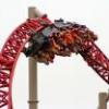
Just a teaser form one of the coasters in the park. Any idea as to the insperation for this coaster (RCTF members already know
 )?
)?
Thanks
James - rctnwEdited by RCTNW, 21 January 2007 - 09:53 PM.
-

 RCTNW
Offline
^ & ^^ Correct (Willard's Whizzer to be exact although not a recreation of the original)
 -

 eman
Offline
Sweet, the second I saw the teaser I thought Whizzer. IMO one of the most underrated rides there is. Nice teaser, not much but I like seeing a Whizzer-esque design.
 Tags
Tags
- No Tags
![][ntamin22%s's Photo](https://www.nedesigns.com/uploads/profile/photo-thumb-221.png?_r=1520300638)
