(Archive) Advertising District / Tussauds Thrill Lake
-
 07-October 06
-
 Loopy
Offline
Maybe you could use some land blocks to bury the base of Inferno in a mountain shape like you said it would make it look alot better.
 -

 JDP
Offline
Hold on, I just noticed something you also did in you last park. Can you use que lines instread of normal pathing. Its up to you but im throwing that out there...
-JDP -

 Loopy
Offline
To be honest i like that people are using the regular paths as ques now. Having to use the same old style que lines in every park gets extrememly boring it just adds more to the theme of the ride/area
 -

 Carl
Offline
There are literally 100's of different custom queue lines out there. Not saying you should use them, just saying theres no excuse for being bored of them, considering the variety that exists.
Carl
Offline
There are literally 100's of different custom queue lines out there. Not saying you should use them, just saying theres no excuse for being bored of them, considering the variety that exists.Edited by ride_exchanger, 23 October 2006 - 01:03 PM.
-

 Genius638
Offline
Is the gravitron pic unfinished? If it isn't then you definitely need some trees or something....if it is, then don't post unfinished screens any more. The building around gravitron is okay, but I hate the overhang above the path....it really doesn't fit with the building at all.
Genius638
Offline
Is the gravitron pic unfinished? If it isn't then you definitely need some trees or something....if it is, then don't post unfinished screens any more. The building around gravitron is okay, but I hate the overhang above the path....it really doesn't fit with the building at all.Edited by Genius638, 23 October 2006 - 01:12 PM.
-

 Lloyd
Offline
Whoa man, i would seriously reccommend you crop your screens better, the inferno one just hurt my eyes.
But anyway, not too much to say, you're getting better though.
I'd thicken that wall (as everyone has said), and just generally tidy up inferno. It does looks messy at the moment.
Also, the colours and objects you are using are becoming very repetative. Don't be afraid to throw something new in there! -

 Alex Rider
Offline
OK I know it took a long time to reply I was waiting till I had a screen to post before replying. I will go back and look at some of the rides in the jungle area when I've done some more work on the other areas of the park.
Tussauds have sent me a small teaser pic showing the station of Nosferatu (the invert.) Construction of the park is moving very slowly at the moment while the plans for the rides are finalised.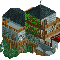
Enjoy. -

 Milo
Offline
Pretty good. A little boxy but the details are nice. Colors could also use a little work. It's an improvement which is always good to see.
 Keep going.
-
 Blitz
Offline
Didn't see this topic till now... so this is where the douchebaggery about realism came from. Hah.
Decent coaster layout in the first post though, tight and simple. -

 RCFanB&M
Offline
Looks nice...
In structure terms, the building is ok, but you could add some more details, and also, some windows. There are some parts on the lower balcony that you haven't fenced...you should fix that out.
As others have said, change the green glasses, they just don't fit very well. Anyway, you are improving, so keep building. Keep us updated. -

 Genius638
Offline
colors need changing...the black roof and the green windows....I don't know, turn them red or something...
 -
![][ntamin22%s's Photo](https://www.nedesigns.com/uploads/profile/photo-thumb-221.png?_r=1520300638)
 ][ntamin22
Offline
personally i think the green works fairly well. You don't have to have a completely nuetral pallete to make something look good in this game. it could use some touch-up type stuff, but that's just inexperience with the NE style.
 -

 Emergo
Offline
NE style is the result of people having bad eyes from playing rct too much =D
^ LoL! I agree somehow.
"Ne-style" is just ONE style....and not necessarily the only and/or the best one.....(but yes, too many young people are just impressed when they meet others with more "overweight", just like in real life... )
)
On the screen: I don't dislike the green glass as such here, could work out very nicely, but you definitely have to work it in then much more with the rest of the building: place some grey borders of any kind around it, to make a connection to the rest of the building.
And a low fence or Art-deco trim around the edges of the roofs could also do wonders I think. -

 Alex Rider
Offline
Thanks for the coments everyone. When I next play the game (I have no idea when it will be but it will happen) I'll make some of the suggested improvements to the church.
 Tags
Tags
- No Tags
