(Archive) Advertising District / Tussauds Thrill Lake
-
 07-October 06
-

 Genius638
Offline
Are you saying you don't like Disneyworld becuase it doesn't make sense? If you so easily discard the theory of themeing then why bother to do it at all, why not just build another six flags like eveyone else and pass it off a realism.
I'm insulted by that. Realism is a completely separate thing from what you've said. Realism is an attempt to caputre real-life theming, and that includes Disney World style, so realism is itself a theme. Maybe Alex Rider is attempting a realistic park with a jungle theme, and didn't think the dirt path was realistic, and it isn't.
As for Alex Rider's latest photo update....the scenery under the coaster is scant. It just looks rather bare in the center left side of the pic there. But the station and other buildings in the picture are pretty good....not complaining on that aspect. -

 JDP
Offline
a far screen shot and not too much there. But for what is there looks pretty good..?..
-JDP -

 super rich
Offline
God yeah they are lacking abit them skills if your telling me that was done in photoshop lol. Erm and with the last srceen, i duno something isnt right but that vertical drop looks pretty bad, and the station is way too small.
 -

 Panic
Offline
That looks like a nice realistic style vertical coaster layout. But maybe try mixing in a couple more above-ground turns?
 -

 Ling
Offline
yes, it looks realistic for a vertical drop coaster, but the station looks... empty. And on the left side, one of the slanted supports doesn't connect to anything.
Nice overall, though. -

 RCTFAN
Offline
Okay,I'm insulted by that. Realism is a completely separate thing from what you've said. Realism is an attempt to caputre real-life theming, and that includes Disney World style, so realism is itself a theme. Maybe Alex Rider is attempting a realistic park with a jungle theme, and didn't think the dirt path was realistic, and it isn't.
Realism is not a theme but rather a style. Trying to capture realism in an RCT park is about trying to recreate the realistic details you will find in any park. For example the ride operators booth for a ride, the staff entrance to the park or even the pumps for a waterfall. What you are suggesting is that realism is in fact a theme and that you could create it just like any other, which is wrong.
You can on the other hand build in a realistic style and apply that to your themes. So for instance if you wanted to construct a building. You can do it in any theme and any design you want (as long as that correlates to the theme that is) but it's down to the style you are adopting that determines the overall appearance of your building. For instance if i approached with a minimalistic style, i would simply build a box and a hole and call it a building. If i then chose to construct it in a realisitc sense then i would build a box but make enough holes to give sufficient lighting, ducts for air conditioning, enough access for staff and guests, disabled access, fire exits, etc. You could then start applying more styles and merging them together and you could go on merging and changing a building until there is nothing else you can do to it. However all of the above would only apply to RCT because you assume that a wall is that thin graphic that says its a wall. In real-life a wall is made from a material, which determines how it can be made and what shapes it can create.
I think a lot of people get confused when they say something is realistic.
It could be:
Realistic themeing in real-life,
Trying to transfer that themeing into RCT (i.e recreation),
Trying to create realism in RCT becuase they are all completely different.
I interpret Realism in RCT to be the latter, trying to create realsim in RCT and i believe it's what everyone should be thinking. I'm sick and tired of all these new topics of six flags-esque parks and people branding it realism when in fact you are simply recreating it. What realism is and what realism needs in RCT are different.
-----------------------------------------------------------------------------------------------------------------------------
However realism could be interpreted as a theme in real-life, for example take Epcot's World showcase. It's not real becuase it's an amalgamation of cultural styles, therefore making it themeing. When this happens i can agree with what you are saying becuase you are right in the fact that it's trying to capture real-life.
This is where it get's phylisophical becuase you said
and that's either misjudgement or a confused statement. Applying that to the world showcase you are suggesting that the source from which the world showcase came from (i.e. different countries) is in fact themeing itself and that the world is one big theme park that we are guests in...........which is another topic all together.Realism is an attempt to caputre real-life theming,so realism is itself a theme
-----------------------------------------------------------------------------------------------------------------------------
There are factors of realistic themeing in RCT that collide with other styles. For instance my comment about using the dirt path over the crazy paving. I would use the Dirt path in RCT to help emphasise the theme you are portraying, realisticly or not. Whereas in real-life you would probably use some painted concrete or something similar. I guess a simply solution to this would be to make a new path in RCT, but at the same time i think that's wrong. Believe it or not RCT is not real, it's a game and therefore most of the rules and regulations of real-life don't apply, which is why you can have a huge cantilevered floor only a sprites thick.
Therefore in my conclusion:
For RCT Realism you have to learn to balance the rules of real-life against the rules of the game. Additionally there are more factors to adhere to such as aesthetics, whose rules also change when transfered to RCT. The use of the word Realism in RCT is commonly used to describe a theme rather then a style. Realism should be about creating a theme within realistic boundaries i.e if you wanted to create a show facade (for exapmle in an amphithere or for wild west themeing) it will need proper supporting, likewise if you want a waterfall or a lake, it will need to be pumped from a source.
Unfortunatly for us parkmakers (and i say that with everyone in mind, not just the elites) that the game we use to convey our fantastical ideas is limitied in a realistic sense in many ways, mainly with ratios. For example the trees are too small in relation to the rollercoasters.
This is why we must learn to balance our ideas. If i wanted to make a waterfall i would just have it and make something that represented a pump simply becuase there is no point making a painstakingly accurate pump and pipe that fed to the waterfall.
This whole balancing act is why we get so many differnet types of themes, for example there were about 2 parks which both tackled and African theme which both looked completely different. It is also why we get some many variations on styles which is the source of this whole 'is it realism' debate.
Everyone has a different approach to a style just like architecture. If every building in a certain style looked exactly the same then it would be pretty boring after a while.I'm not saying there is a wrong way of making realsim I'm saying there is a wrong way of representing it.
I wouldn't build a palladian house and pass it off as modern would I? which is what a lot of people are doing. I see all of these six flag type parks and their builders are saying it's realistic when it's not! It's a representation of what is realism but not nessecarily realistc. As you can see, we have just gone in a circle back to my first paragraph of this conclusion. Balance.
But you must understand that this park is not realistic, and if you don't understand why then keep reading this until you do.
Alex, the park is looking good but in my eyes it is not realism. By all means ignore this post and continue because it is only my opinion.
RFan
If anyone want's to talk about this then join in the debate in the RCT Discussion forum.Edited by RCTFAN, 18 October 2006 - 09:33 AM.
-

 Alex Rider
Offline
Thanks for the coments everyone.
Genius638: I will add a few more buildings maybe some wierd totem pole type things and statues.
JDP: Thanks.
Super Rich: It's so hard when people can see something wrong but are unsure what. I may make some changes to the station I'll think about that one.
Panic: I may think about that but I'd prefer to concentrate on theming. I may add a log flume/splash boats running up that hill instead.
Linq: Thanks I'll sort that support and may add an operators box or something in the station.
RCTFAN: I'm actually quite chuffed you've choosen my topic to make a pretty decent post. Thanks. -

 RCTFAN
Offline
Lol sorry Alex i didn't mean to whore your topic. It does look like a good park though.
 -

 Genius638
Offline
Wow....I guess I don't have much to say to that, except that you've made some good points. I hope you devote this much time and thought to things outside the game and forums, because you seem like you could really succeed.
 -

 Alex Rider
Offline
Don't worry about it. I'm glad that my park has encouraged you to post interesting posts like that.Lol sorry Alex i didn't mean to whore your topic. It does look like a good park though.
-
 z3r0-G
Offline
The lift, turnaround, and first drop on that drop coaster look very appealing to me for some reason. I like the foliage and how the coaster fits in with the surroundings. I think the archy could be better, but I don't really know what to suggest. The first two screens look very nice as well. That first building looks good, but it wouldn't be a very good home. The layout on that inverted coaster looks very appealing too. I'm looking forward to seeing how this turns out. Good luck!
 -

 Alex Rider
Offline
z3r0-G: Thanks I've already made a few changes to the house (i will post a new screen of it eventually.) Thanks for the coments on the coasters.
The park is coming on slowly but steadily and I have two new pics: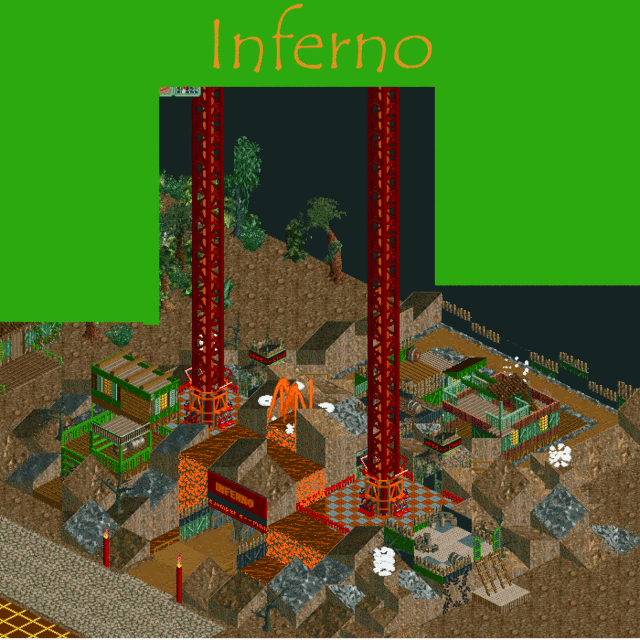
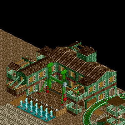
Enjoy! -

 RCFanB&M
Offline
Looks nice man.
Your architecture skills are getting better with the progress of this topic. The top spin ride looks ok, the building which surrounds it is well done, I like the colors, although some more details wouldn't hurt. Also, if I were you, I'd put some 1/4 blocks in the entrance of the building, for making the walls look thicker.
Inferno is just ok, but I don't like it very much, because it looks kinda messy and kinda random.
Anyway, those screens show improvement. Keep going. -

 Ling
Offline
the foliage is extremely lacking, but the building around the Gravitron looks good, although I agree with RCFanB&M on the detail comment. As for Inferno, it looks nice, but ...
1) try spreading the fog around more
2) try making the fog grey instead of white
3) the waterfalls aren't... fitting. Are there any white water objects in the workbench? -

 JDP
Offline
I agree with RCFanB&M... and one more thing, can you try to post completed screen instead of unfinished screens...
-JDP -

 Alex Rider
Offline
RCFanB&M: I'll try and add a bit more detail to the building and I'll do what you said with the blocks.
Linq: I'll do those ideas but do you mean make the lava into normal water? The map does have white water I'm not sure if they are recolourable I'll have a look next time I work on the park. I'm glad to hear I'm improving.
JDP: I'll make sure I cut out the unfinished parts next time. But both those screens are finished apart from improvements and folliage surrounding them.
Another thing I may do is make the volcano around Inferno taller and more of a mountain shape. Oh and the top spin is called Humidity.Edited by Alex Rider, 22 October 2006 - 02:44 PM.
-

 z3r0-G
Offline
The first screen doesn't really appeal to me much. It just looks kinda plain and rushed, and doesn't really compare to the rest of the stuff you've shown so far. The second screen looks much better. It looks a lot more organized and the archy really makes the area stand out. I like it. A couple of things I'd change in that screen...
Left: I know there are slanted pieces holding it up but I'd put some walls on both sides of that. I just think it would look a little better.
Right: Make that wall thicker. It looks very thin and sticks out from the rest, ruining the look. Otherwise, nice. -

 Ling
Offline
no, Alex, I mean most white water is re-colorable, so make it orange and put it there so it doesn't so lame
But, if it ain't in the bench you can't use it.
 Tags
Tags
- No Tags
