(Archive) Advertising District / Tussauds Thrill Lake
-
 07-October 06
-

 Alex Rider
Offline

In an unknown location in the UK a new themepark is being built by the Tussauds group. They have decided to give the enthusiasts on this and two other forums the unique oppertunity to view and coment on the designs of this new themepark. They will also be posting pictures of the actual park and asking for coments. In return the people on these forums will be offered free tickets for the Premier Screaming of this park.
A wealthy professor has strangely and mysteriously disapeared while in studying the dense Rainforest. He was last seen in his rainforest home (pictured below.) You need to treck through this untamed forest and find out what happened to the professor.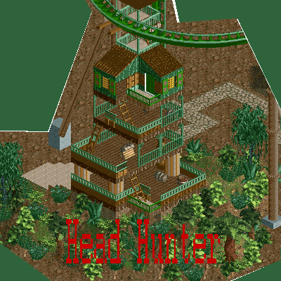
Tussauds also have a picture of an early design for one of their rides. They would like oppinions on this design: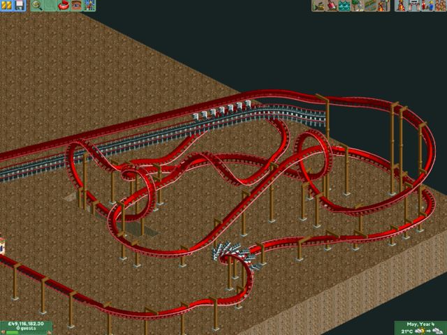
-

 X250
Offline
Firstly, i love the layout for the invert. Very compact and i can imagine its pretty nippy, which i like being a massive nemesis fan. The Headhunter screen is okay but i think your foilage needs a bit of work, the actual archy is okay. =)
-X- -

 Metropole
Offline
Hm. Not sure how in the first pic, that could possibly be someones' home. There's hardly any indoor areas. Can't really comment on the Tussaudsness of it as it is still incomplete.
The invert layout is ok. I'd take it away from the map edge a bit. That lift hill is going to be very hard to support, the coaster goes underneath it too much. I'd have a helix or something after the final corkscrew maybe. Looks quite nice and flowing.
Metro
-

 Turtle
Offline
Lovely layout for the most part, up to the bit where it goes through the loop. From there on in, you could do more with it. I'd imagine some flybys with a rocky wall, a corkscrew in and around a ditch, maybe. It's up to you, of course.
 -

 JDP
Offline
Alex, i wanna see where your going to go with this. I think your going to rise up pretty quickly... screenes look okay. First screen dont show too much and i agree with turtle with the layout...
-JDP -

 Alex Rider
Offline
X250: Could you be more specific on what exactly I need to do with the foliage?
Metropole: I will make another floor on the house indoors. And I will se how that helix looks and move it away from the edge of the map and terain it while I'm at it...Wow that's a lot of work. Now you mention it supporting the lift will be tough but I recon I can do it.
Turtle: I will definetly terrain this ride a lot better.
JDP: Thanks for the compliments. I will really see what I can do with the terraining. It's not always been on of my better areas though. -

 X250
Offline
Okies no prob, making foilage look good in RCT is quite difficult, and takes a bit of getting used to. For a jungle theme i would make it denser, so no (or little) gaps, also mix in some taller trees and some full tile trees, and maybe some flowers. As i said before, good foilage is quite hard to do, so I'd go looking at other rct2 jungley-themed parks to see how its done, for example, Kukuana in last week's H2H was just about as perfect as you could get for a dense jungle atmosphere.
-X- -

 Genius638
Offline
Layout of the coaster is fantastic! Only problem is the diagonal lift, I personally don't like it, its not very steep. The house, as said above, doesn't really look like a house, but it's a decent building anyway.
 -

inVersed Offline
Some more 1x1 foliage would go nicely in that first screen. I really dont know about the layout, it seems very short -

 RCFanB&M
Offline
That layout is awesome. The first screen shows a good archy, not terrific, but ok... I like the fact that you're improving. As X said, you should make a denser foliage, considering that it's a jungle theme.
Anyway, this looks pretty interesting. Keep going. -

 Metropole
Offline
Metropole: I will make another floor on the house indoors. And I will se how that helix looks and move it away from the edge of the map and terain it while I'm at it...Wow that's a lot of work. Now you mention it supporting the lift will be tough but I recon I can do it.
Yes, it is possible with some creative supporting. I'm interested to see how you manage it, good luck -

 Trajan
Offline
Nice layout for the invert. It's VERY unique, but not completely off the walls (by this I mean you didn't do stuff just to make it different, which people get caught doing and taking it too far sometimes).
Work on the supports. They look a little whack right now, tbh. -

 Alex Rider
Offline
X250: I will look at this park and see what I can do thanks for the help.
Genius638: Thanks. The reason I had a diagonal lift is so that I could almost get it to go across the whole layout which would give the riders a chance to see what they're about to experience.
inVersed: I will add more 1x1 trees. Tussauds and long rides rarely come in the same sentence!
RCFanB&M: Thanks good to hear I'm improving. Also good to hear that my layout is good and hearing that encourages me to keep going.
Metropole: Thanks and good luck with your park as well.
Trajan: Thanks for the coments on the invert I'm glad everyone likes it. When you say work on the supports do you mean the invert or the vertical coaster?
Oh and the theme of this ride will not be based on Nemesis it will be based on the other Tussauds suspended coaster.
EDIT: Sorry for missing you out before TrajanEdited by Alex Rider, 08 October 2006 - 12:15 PM.
-

 Ling
Offline
looks nice but yes, the foliage needs to be more thick-jungle style. And depending on the look you're going for, maybe some overgrown-ness on that house/tower building would help the appearance. Just a suggestion.
And I love the invert's layout, however it seems to lack something (beyond the obvious theming). Great job, keep it up! -

 RCTFAN
Offline
Okay.
1. I hope that isn't the final logo for the park becuase it looks like you have spent two seconds on it. I'm sure you can do a better job if you leave it til the end when you can get a better feel for the park as a whole, therefore giving you more ideas as to what logo would best summise it.
2.You mention that the guests have to trek through the rainforest because it is 'untamed' even though you have a path? I suggest either changing the story slightly or using something a little less obvious like a dirt track or invisible path on dirt/red sand.
The structure itself is interesting. I like it's fottprint set on the side of a hill, where i can see the professor looking out for intruders into his little peaceful sanctuary. However i think it is overdone. The way i interpreted teh story is that the Professor is out there on his own studying the Rainforest and therefore went and built a small shelter for himself. The magnitude of your structure is too monumental for a one man band. If you are really keen on the idea, have a look at some malaysian or thai vernacular architecture for some simple wooden shelters, which should point you in the right direction. On the other hand if you can't be bothered here are some tips:
a) Don't have windows becuase it is very humid in the rainforest and he will need all the ventilation he can get.
 The roof will most likely be made from vegetation, so try and hack some bushes together to make some form of thatching. I also remember Rohn Starr making some cabanna rooves which might work here.
c)Get rid of the lower floor. This is so that it is harder for predators to get into his shelter while he is asleep.
d) Try using smaller columns because the ones you have used suggest they are made from marble, a material not easily found in Rainforests
e) Nothing to do with the house as such but try to give the Rainoforest more depth. Don't be a fraid to just cram a much foliage in and don't be afraid to use flowers.
3. The Invert looks ok IMHO. I think the colour chocie is good and i have no qualm's with the diagonal lift hill apart from the fact that you will have one hell of a time trying to theme it with the lack of custom diagonal pieces.
There are a few bits i would change to the layout itself. add another section of track between the bottom of the first drop and the vertical loop. This straight bit of track will make the ride look 'smoother' and is strictly an aesthetic i use becuase at the moment, the speed of the train going through that banking transition will look painful.
Secondly i think you should move the final corkscrew back by getting rid of some of the banked straight pieces near the back. This means you can then start the brake run earlier, then move the station back and giving you enough room to have some pre-lift action a la Nemesis: Inferno.
Lastly i just want to say that if you are srious about branding your park under Tussuad's that you take Metro, Turtle, X250's and my advice seriously. We will be harsh at times simply because we don't want the Tussaud's brand being used to raise interest in parks. There is a very special niche in Tussuad's parks that some people call 'the magic' which is very hard to pull off in RCT2 and i don't think you are ready for it.
In my opinion i think you should make this park for yourself and get rid of the Tussaud's moniker. Then having developed your techinque (as you will with every park) and start to understand how to work with the restraints and limitations of RCT then come back and give it another go.
On a final note i would like to finish saying that this is only my opinion and you can work with or without it, i'm just trying to help you make the best park you can and to get the best enjoyment out of the game.
RFan
-

 Trajan
Offline
Trajan: Thanks for the coments on the invert I'm glad everyone likes it. When you say work on the supports do you mean the invert or the vertical coaster?
Well, in particular, the lift on the invert, but the entire ride could use some supports.
Keep going.
-

 Alex Rider
Offline
Obviously my photoshop skills are lacking slightly. I will keep the logo up there for now and may do a new one I'll see.I hope that isn't the final logo for the park becuase it looks like you have spent two seconds on it.
The problem with this is that no majour park I can think of has a dirt footpath. Also many themes on real rides don't make complete sense.You mention that the guests have to trek through the rainforest because it is 'untamed' even though you have a path? I suggest either changing the story slightly or using something a little less obvious like a dirt track or invisible path on dirt/red sand.
I will use a few of those ideas but I will also change the story slightly. Go to the first post to see the revised storyline. I will have a look at alternative columns and the folliage will definetly be changed.The structure itself is interesting.
I will do one or two of the things you said the ride is fairly slow though so extending the layout may be hard.The Invert looks ok IMHO
I will release a few more screens later and let see if everyone thinks they are Tussauds enough if not I will take your advise and make this a non Tussauds park.Lastly i just want to say that if you are srious about branding your park under Tussuad's that you take Metro, Turtle, X250's and my advice seriously. We will be harsh at times simply because we don't want the Tussaud's brand being used to raise interest in parks. There is a very special niche in Tussuad's parks that some people call 'the magic' which is very hard to pull off in RCT2 and i don't think you are ready for it.
The ride will be custom supported and themed once I've finished my jungle area. I'm trying to do just one area at a time. I will keep going as well even though it's taking me a while.Well, in particular, the lift on the invert, but the entire ride could use some supports.
Keep going. -

 RCTFAN
Offline
The reason i mentioned using the Dirt footpath is becuase it would help establish the theme, something that is hard to do in RCT compared to real-life.
As for your other comment about themes not making sense is ignorant. Theme parks are there to engulf you in a new environment, take you on a journey and let you forget all of you so called 'real-life' problems and endulge in a bit of fantasy.
Are you saying you don't like Disneyworld becuase it doesn't make sense? If you so easily discard the theory of themeing then why bother to do it at all, why not just build another six flags like eveyone else and pass it off a realism.
I know this is probably going off on a wild rant but to me that is one of the worst things you could have said on a forum like this. I could give you a lecture on themeing alone but i'm just getting angry so i'm just gunna finish this post. -

 Alex Rider
Offline
Personal I'm not keen on the dirt path and I think the crazy paving brings extra colour and texture to the area. I'll compromise and make the queue's and exit paths dirt though.The reason i mentioned using the Dirt footpath is becuase it would help establish the theme, something that is hard to do in RCT compared to real-life.
I meant that there is often little things that are strange about the theme I should've given an example when I said that. I was thinking about Nemesis where it has great theming but why are you queing up to ride on a monster that may kill you? Of course you don't worry about this when at the park. I hope I make sense. I want this park to have imersive theming but I also want it to be like a realistic theme park and in a real park you wont find dirt footpaths. As I said though I will compromise this to make the queue look better.As for your other comment about themes not making sense is ignorant. Theme parks are there to engulf you in a new environment, take you on a journey and let you forget all of you so called 'real-life' problems and endulge in a bit of fantasy.
No I do like Disney (although IoA is miles better) I can't disgard the idea of theming while in the park but I can outside.Are you saying you don't like Disneyworld becuase it doesn't make sense? If you so easily discard the theory of themeing then why bother to do it at all, why not just build another six flags like eveyone else and pass it off a realism.
Well maybe it was stupid to say but I've forgot about it already really and I see no reason to have this arguement over a path (not that I'm saying the small things don't count.)I know this is probably going off on a wild rant but to me that is one of the worst things you could have said on a forum like this. I could give you a lecture on themeing alone but i'm just getting angry so i'm just gunna finish this post.
Anyway Tussauds have released a new pic: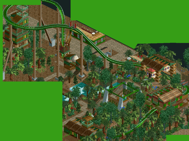
They've taken into account the coments on folliage and made it more dense and jungle like. The planting still isn't finished. And there's still one or two things I need to change (I forgot about a few of the coments while I was building it.)
 Tags
Tags
- No Tags