(Archive) Advertising District / Project Metro
-
 10-September 06
-

 Roomie
Offline
Unfortunatly not but they do slow down. And speed up on the highway. seems to work quite well.Do the cars on the drive test ride stop at the intersections? Because I hope so
-

 Roomie
Offline
Hello
since that hosting service has gone down ill have to re upload the pics (may take a few days)
but for now heres 2 more.
this is one of the newer areas im working on. theres lots of little hacks in here that may take a while to notice.
This one is some experimentation using codex/track for architecture. -

RMM Offline
I love that screen but I don't like the gray supports of the coaster sticking out like that.
Maybe raise the land to cliffs or something.
I dunno... but it looks nice so far.
I like the little hacks that come together.
LLLL -

 Jazz
Offline
That's some awesome stuff there. I agree that the color scheme on that woodie should be changed, but besides that, an awesome screen.
 -

 SenZ
Offline
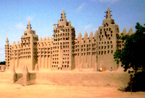
those wooden poles jetting out of the topof the windows on that tower
That's realism. The desert-buildings in Mali have those wooden sticks. Examples:
-

 Milo
Offline
Two very nice LL screens there. I really like how your using the Codex as well.
First Screen:
I really like all the subtle hacks in here. The building is nice and love the coasters' interaction with it. A couple things I don't like are how close the coaster is to the edge (just minor tho) and also the jagged rocks at the bottom left corner. That space could be better used imo. I also feel the building(s) lack something. I don't know what exactly; maybe a sense of completedness.
Second Screen:
Like this as well. It's nice to someone experimenting around with trackitecture (I've been working with rapids track myself ) . The loops are a neat touch.
-
 zodiac
Offline
That's realism. The desert-buildings in Mali have those wooden sticks.
OHH now it makes sense. plus that "trackitecture" your (not Senz, Roomie) using with the looping coaster is wicked sick.... i wish i could play LL...
plus i think the riders heads would be chopped off by some of those sticks
Edited by zodiac, 07 November 2006 - 06:33 PM.
-
 z3r0-G
Offline
The trackitecture is insane! I agree that the woodie colors should be changed. The gray doesn't really fit in with the rest of the screen. The rest looks pretty nice though. Not much to complain about. Awesome stuff.
 -

 RCFanB&M
Offline
Post Nº2
I like the little hacks you made (screen 1), I'm glad that you take your time for making RCT stuff.
The 2nd screen is sweet, really creative idea. This is looking pretty nice...looking forward to more. -

 Ride6
Offline
I <3 the first screen. The grey supports on a woodie always give me warm fuzzies because of Cornball Express @ Indiana Beach and my lovely experences with that ride. The 2nd screen I admire but do not yet love as the forground seems to be a mess not yet cleaned up. However I imagine that the "new area" as you call it will swiftly evolve into one of my favorites.
Keep up the excellent work Dave.
Ride6 -

 Roomie
Offline
Just a very small update. but its something that took a while to do and im quite proud of it.
As you know my parks are always peep accessable so to get these stairs to work is awesome for me

 Tags
Tags
- No Tags


