H2H4 / Week 1: Hurricanes vs. Strangelove
-
 24-June 06
-

 iris
Offline
The Seige at Castle Grijs by Strangelove

Download "The Seige at Castle Grijs"
Vs...
The Ragnarok by The Hurricanes

Download "The Ragnarok"
Overviews:
Downloads
Next deadline is July 4th. -

 Evil WME
Offline
I'm leaning towards the rct2 park from screens, i'll have to open it up when i'm at my place though to vote. Very nice first matchup :).
 -

Xcoaster Offline
Damn, that actually looks like a pretty nice LL park from the screens. Now I really need to get Rct1 working soon. -

 Leighx
Offline
1=
Unable to see our teams park but from screens it does look very very good.
2=
As for the hurricanes i didnt understand what the park was about? i mean the buildings were well done and it was kneat. But why? could someone explain what the storyline/why the park was.
The car jam was done well:)
vote = Strangelove -

 Magnus
Offline
HahaHurricanes:
That "U-Bahn" sign gave everything away.
Well I finally understood the park made by the Hurricans ( ) after searching wikipedia for Ragnarök. So the crash of the tram and most of the cars (apart from the parking one) made sense.
I still think it didn't create the atmosphere needed for such a story. If you are going for such a theme it should be way darker and more frightening.
The architecture was good, but reminded me a lot of the pt2 park made by darkjanus and that one was much better. The fair could have needed some custom flatrides, maybe with a reference to a god and have that one crash ...
The coaster looked a bit like, 'ohh they said darkjanus pt2 park wasn't good because there was no real coster, so lets build one in that edge'. Well it should have breaks at the end at least.
Apart from that there was too much water. Seems like you didn't get it done in time. With a bigger fair and less water that one could have been better already. Still there is this problem with the story.
Next time add a readme file at least when you are refering to a story nobody knows. (Well maybe I'm just not literate enough.)
All in all the park shows some good skill on details, but lacks atmosphere, good coasters and a fitting story. That makes 2.5/10 for me.
Didn't look at the LL park yet. If I find some time for that I will comment on that one later. -

 Coaster Ed
Offline
This was a good way to start off the new season. Both are very accomplished parks. Excellent work from everyone involved. I'll start with Castle Grijs cause that's what I looked at first.
The Seige at Castle Grijs
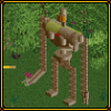
Impressive detail work for LL. The first things that stand out are the trebuchet sculptures. Very well done. I know as well as anyone how much work goes into planning and constructing something like that so I'm doubly impressed. There are some clever architecture ideas throughout as well such as the wooden coaster roofing (not a new idea, I believe Nate was the originator of that - or at least the 'popularizer', but you used it very well here) and especially those gothic arches. Hadn't seen those before, and they work well. Good idea. There's a pretty pleasant mix of walkways, trees, and buildings within the castle and also outside it. I like how you went high with the castle too, although the upper parts of it got pretty boring architecturally. Square towers just aren't that impressive, even when you try to dress them up with contrasting textures and lots of windows. Nice work on the drawbridge and entrance gate in particular. The whole outer wall is very well done. It definately feels like a castle. The layut of the map is also a plus I think. Just enough water to make it look pretty. No wasted space here.
Dislikes: The first question I always ask myself when I open a H2H park is "what's here that I haven't seen before". Aside from those gothic arches, and the trebuchet sculptures, the answer here was not much. The main coaster wasn't particularly memorable. Good stats, but there isn't any segment here that stands out. The adventure ride outside the castle looks good but it doesn't really do anything. And it seems to stick pretty closely to the typical formula for a next generation NE LL park. Lots of landscaping, detailed architecture, a few sculptures, adventure ride, coaster. The explosions at the beginning seemed like an after thought. Almost like they're only there cause this kind of park is supposed to have explosions now. I see what you were going for with the destroyed walls (and I think you actually did as good a job as can be expected of portraying that) but it just wasn't enough to feel like a seige. If you're going to have explosions, you should have more than just two at the beginning and name the rides something better than just 'Explosion'. There's nothing there to cue my imagination. The textures in the castle area got repetitive. I know you're working with a very limited pallette here, and I took that into account, but it's repetitive enough that it started to become a problem for me.
Oh and one last thing. Castle Grijs? Really guys, is the unpronounceable name thing neccesary? I know it's kind of an LL tradition at this point, but it's always irked me a bit and it still does. I didn't mark you down for that or anything, it's just kind of a mini-rant.
I put a lot of dislikes there, but I was actually very impressed by this park. The kind of stuff you're doing here is expert level LL. Those sculptures and architecture tricks are very hard to pull off and you did them consistently well. I'm judging based on the complete package though, not just difficulty level and I thought overall something was missed here either in the conceptual stage or the execution. A really good ride could have made this the winner. A hyper coaster just wasn't really ambitious enough I don't think. Not without some kind of unique element or memorable scenery piece to go with it.
Overall I would rate this park very highly. Considering it's LL, probably 7/10. You lost some points for originality mostly and the lack of a killer ride to top it off. But the parkmaking itself, the skill level shown, is excellent. It just wasn't enough to win my vote in this matchup.
The Ragnarok
I didn't know what to make of this from the screens. It looked like formulaic RCT2 work with above average architecture. And the LL park was pretty impressive. But when I started looking through this park, it was clear to me which was the winner. First of all, the style of the buildings is familiar 'RCT2tecture' but very well done for that style. Superbly well done actually. Maybe it's because I've been away for awhile, but the level of detail throughout is stunning. It's not perfect, it tends to be overly geometric which is mostly a fault of the custom scenery, but I've seen others do a better job of hiding the games geometric nature. But even if the buildings tend to be mostly rectangular, the detail work more than makes up for it. Every building is unique, yet they fit together thematically. I particularly like the underground area in the corner. Very well done there. And you did a good job of mixing up the shapes and textures on the larger buildings so they actually look like real buildings instead of large chunks of glass and concrete masquerading as buildings.
The Ragnarok coaster is short, and ends with a jarring brake run, but the layout is silky smooth and fun. Lots of interaction with the dam (I think it's a dam) and the surrounding buildings which is great. Good speed too. Nice ice flows. Oh, and very good landscaping too. The landscaping 1/4 tile blocks are maybe a cliche at this point, but I thought you used them well anyway. And the landscaping work in the corner by the 'underground' was all very good too. All in all you've got one slick looking map here. Perhaps a little too flat, but very slick looking.
Dislikes: Flying cars? I can see what you were going for with the 'track jump', but I don't think it really works. That was the first thing that bugged me a bit, but that's minor. The main problem with this park, which is holding it back from being really great, is just the clarity of theme here. It's hard to tell what's going on. I gather there's some kind of natural disaster taking place which may or may not involve a water demon. The dam is flooding the city or something like that and the people are panicking and trying to get out. Unless I'm way off there. But if that is the theme, than it's definately too static. There isn't really any sense of panic. It looks quiet and peaceful.
Where you start the viewer is very important. It's their introduction to the park. It's like the opening scene of a movie or the first pages of a book. You want to grab them and take them into your world. This park doesn't really do that. A trolly slowly crashes. Okay, that's interesting. But then where do we go from there? If the cars are trying to escape, have them crashing. More cars driving around looking for a way out would have been good. And I really wish you'd had the coaster running. I consider that a mistake. You've got to have your key rides running when you open the park. As it is, you've painted a very nice picture, but now you need to animate it. Watching a lone car drive around an empty map by itself isn't really that exciting, no matter how pretty your buildings are.
Oh and that lighthouse doesn't work for me. Maybe I'm just picky, but it definately stands out compared to how detailed and realistic all the other buildings are.
So you've got a very nice looking map with a sortof vague theme, a plus coaster (though somewhat short), and a sortof interesting car ride/animated scenery deal going on. Mainly you just need more rides. More movement. Bring this thing to life. It would have helped to have more names for everything too. If you put as much time into designing rides and naming things and making the experience of viewing the park fun as you did constructing the buildings you'd have a possible park of the year nominee. You're getting there. Just push yourselves a little more. Overall I'd give it a 7/10 as well. Lots to like, but still somewhat lacking. I gave it the edge over Siege at Castle Grijs though because ultimately I thought this park left me slightly more impressed.
I think RCT2 and LL were pretty even in H2H2. In H2H3 RCT2 started to take on a slight advantage. Now it's to the point where I think it'll be very tough for any LL park to compete. Siege at Castle Grijs is very impressive work for LL. But it wasn't even close for me which park I liked better. I think you have to work twice as hard now to get the same effect with LL and that's a lot to ask of anyone working under a deadline like this. Maybe you guys will prove me wrong though. -

Wicksteed Offline
Hurricanes:
As the others said it was quite pleasant to look at, but you could have done much more with that story/idea.
Strangelove:
Very nice one, full of great ideas and very well executed.
so my vote goes to the siege at castle grijs -

 Titan
Offline
Nice way to start the season here, but if you can't tell who made the majority of Ragnarok, you need to check out the AD...
Honestly I felt the overviews were fantastic, but great overviews don't make for the best impressions when you open the actual park. Ragnarok was a little flat, but the ice-scaping was very well done. The coaster was a little wierd for me, didn't really care for it. It was kind of realistic, but not really.
And strangelove, props on the trebs, they look nice. I think if you wanted to make the most of that coaster, it needed to feel more like a traditional hyper. Too much of an adventure ride really, and you already had another one.
In the end I had to go with Ragnarok. Both teams put forth a very solid effort, can't wait to see what's in store for the rest of H2H4. -

 mantis
Offline
Since I have neither game installed I have to refrain from voting, but I like the looks of both screens. It's a great idea to have overviews on the h2h4 site - it means I get to get a better idea of what the parks are like. And Ed's post helps a lot too - thanks Ed.
So good job to both teams for getting the season off to a great start! -

 trav
Offline
I voted for The Hurricanes. It was a good park, but maybe a little influenced by DJ, but not pulled off as well as he did it.
 -

 Ling
Offline
My vote goes to the Hurricanes, because their idea was pulled off greatly.
For all of you who can't seem to READ: The Ragnorök is based on the end of the world as told through some Greek legend. hence all the icebergs and emptiness
good job, Hurricanes! -

 Leighx
Offline
Yes well then the idea wasnt pulled off very well if not everyone got it.
i mean end of the world would be explosions and more than icebergs.... -

 eman
Offline
The Hurricanes. While the story was actually very poorly pulled off IMO (Sooooooooo much could've been done with the Ragnarok basis), the archy and the creativity and details made the park for me. And I tend to be a bit biased to RCT2. The Seige was nice, but just nice.
Ragnarok-7/10
Siege-6/10 -

 Titan
Offline
My vote goes to the Hurricanes, because their idea was pulled off greatly.
For all of you who can't seem to READ: The Ragnorök is based on the end of the world as told through some Greek legend. hence all the icebergs and emptiness
good job, Hurricanes!
I'm almost ashamed that I knew it was Norse mythology without having to look it up... -

 Ge-Ride
Offline
I voted for Strangelove. Their park seemed more organized and better as a whole. The Hurricanes' park didn't do too much for me with the random architecture. The only thing I really liked about was the ride hacks.
 -

Fatha' Offline
Well, the considering the other park has three substantial buildings and is half water....i feel its not even close....
Ill write more later
 Tags
Tags
- No Tags


