(Archive) Advertising District / Disneyland Rome
-
 21-April 06
-

 yeshli2nuts
Offline
i was just at MGM four days ago and this looks really like it. the brown fits since most of the buildings at MGM are that beige/brown studio looking buildings. i'd like to see what you can do with tower of terror.
 -

 Lloyd
Offline
Thanks for the comments!
I'm trying not to make it all brown, but alot of the buildings there are just studio buildings, so that's what i'm aiming for. I'm trying to change textures a bit too.
I'm gonna start Tower of Terror next, but i have one question. Is it ok to use the TOT custom scenery pack. I know that when i used the Disney scenery a while back, everyone thought it looked rubbish. So is it ok to use it for TOT? Or should i try and build my own? -
Xcoaster Offline
I think you should try to do it on your own, especially for the parts that you can do on your own. If there's some part that's impossible to do without it, maybe use it then. Also, since you're park isn't MGM or DCA or whatever, your ToT should probably be different anyways. -

 RCFanB&M
Offline
Let's see...
I don't like too much the hotel...is kinda simple
I like the Rock'n Roll Coaster area, and the Entrance and Bag Check area is also cool.
In Tomorrowland, I suggest making it with less grass (lower the land 1 level and put something, replacing the grass, I don't know...some kind of blocks, etc.)...I think that would be a good option for making a "Future" theming.Edited by RCFanB&M, 12 June 2006 - 08:04 PM.
-

 Lloyd
Offline
Yeah, i'm not really satisfied with the Disneyland Park, because i've improved alot since i started making it, so i'll probably remake it, so you can ignore those earlier screens.
Just so everyone knows, i've started on ToT, but i dont want to post pics until it's finished. -

 Grand Admiral
Offline
Will you be doing anything like Toon Studios or Muppets. I would love to see an Incredibles or Monsters Inc.
 -

 Lloyd
Offline
Sorry for the lack of updates, i've been really busy lately.
Here's the still unfinished Hollywood Tower Hotel: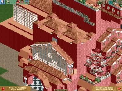
I'm going for a warmer feel then usual. Almost asif the hotel is still in use, as opposed to totally ancient
Also, here's the Earful Tower: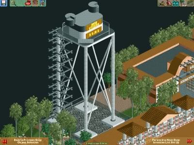
Well guys, comments are helpfull as always! -

 RCFanB&M
Offline
Yeah...the 2nd one is nice. I don't like too much the Hollywood Tower Hotel, because it seems a little unrealistic...
 -

 Lloyd
Offline
Too big? Well i suppose it is different from usual, but i'm trying to create a new design. Like i said, it seems slightly 'grander' then usual.
Just so you know, i'm starting Star Tours next.
Screens up later. -

inVersed Offline
My only suggestion for the Hollywood Tower Hotel is play around with different textures in order to develop and more haunted look. Also you really should study images of the ride and the theming of the ride in order to pull it off better. As of right now its looks kind of like you havent really seen the actual one and just built it based off of what you think it would look like. I know this isn't a rec. but in reality most of all the T.O.T.s have the same basic concept, which is includes a subtle-creepy feel (except for the one in Tokyo which I believe they made look extremely dark and horrific). I also hope you plan on detailing the queeue lines I mean I've been on TOT quite a few times and I remember the queeue line really adding to the ride and was almost a nice as the ride itself. I am not a 100% sure but it seems like you built the building right on the edge of the map. Please tell me you didnt do that because that would not look too nice.
As far as the second screen I really like it maybe just work on the foliage a little bit.
Keep working at it!Edited by inVersed, 14 July 2006 - 12:03 PM.
-

 Lloyd
Offline
Yeah actually i did build it on the edge of the map. Why is that such a bad thing?
I see what you mean about it not looking dark and creepy, but like i have said before, i'm trying to make it look like it would when it was still operating. I'm not going for the scary look if you like.
Thanks for the comments, any more? -
 Loopy
Offline
But isnt that why its called Tower Of Terror? Its supposed to look scary it wouldnt be Tower of Terror if it wasnt scary
 -

 Lloyd
Offline
Right, you guys know the story of tower of terror i take it? The whole fact that you go back to the desserted hotel after the accident happened blah blah blah...
Well on this version the hotel is perfect,you check in, but as you are going up to your room in the elevator.....(need i say more)
Is that any clearer about what i'm trying to do. -
 Highball
Offline
The only thing I used for my Tower is the sign, which is also the only thing you used. Your ToT appears way to bulky in the front. Also, might I suggest that you switch from the marble walls to the castle walls? They have far more texture in them and would fit the Tower better.I'm gonna start Tower of Terror next, but i have one question. Is it ok to use the TOT custom scenery pack. I know that when i used the Disney scenery a while back, everyone thought it looked rubbish. So is it ok to use it for TOT? Or should i try and build my own?
Like Tokyo's.Also, since you're park isn't MGM or DCA or whatever, your ToT should probably be different anyways.
 That one looks to be a real winner already.
Interesting take, especially since it would put the guests in the story for real. Maybe come up with a cool post-show to go along with it?Right, you guys know the story of tower of terror i take it? The whole fact that you go back to the desserted hotel after the accident happened blah blah blah...
Well on this version the hotel is perfect,you check in, but as you are going up to your room in the elevator.....(need i say more)
Is that any clearer about what i'm trying to do.
Your park looks pretty good thus far. You have you own style which is definatly good, however there needs to be more variation in just about everything in the park. The foilage, structure shapes, sign designs, etc. all need some variation to help spicen the place up. Good luck with the park. -

 Lloyd
Offline
Thanks for the comments Iceman, i have alot of respect for you as a Disney parkmaker, so i appreciate you helping me out.
I never saw your Disney Studios park, i saw the thread i think, but i dont remember seeing a completed version. I'd really appreciate it if you could hook me up with a link or something, i do find your work inspirational.
I agree that my parkmaking needs alot more work. My foilage is still not good enough, and the sign designs are definately all the same. I'm just gonna keep playing though, and i will get better, i know it.
I'm glad to hear that you think i have my own style though, thats sorta cool.
But like i said, thanks alot for the comments.
 Tags
Tags
- No Tags

