(Archive) Advertising District / Disneyland Rome
-
 21-April 06
-

 Lloyd
Offline
Hey guys, i've never actually posted here before but i figured that you could really help me out. I'm currently making Disneyland Rome over on Coaster-Net, so to save me posting all that i have already posted again, here's the link: http://coaster-net.c...?showtopic=4769
Well the thing is, this is my second park ever and it's a great improvement on my first, but i'm trying to improve more. So please could you help me out and i know that the park isn't the best thing you've ever seen, but if you could try and tell me how i can improve i would really appreciate it!
Thanks,
Lloyd
Oh and i'll post all my new updates here now.Edited by Lloyd, 14 February 2007 - 04:33 PM.
-

 SenZ
Offline
I don't think that 99% of the poeple over here will like very fake-looking plastic objects thrown together and than hopefully forming a building.
 -

 Lloyd
Offline
ok, but that's why i came here, to try and improve.
So if you could actually give me reasons and ways i can get better i'd appreciate it. Like i said i know the park isn't great, afterall, it's only the second one i've ever built. -

 Casimir
Offline
Well... I.... don't like it.
Except of the castle, it all looks waaaaaaaay too blocky and annoying.
Try to work with landscaping a bit, too! -

 tracidEdge
Offline
well. aside from the horrid custom scenery, your buildings are very simple. especially that red one. try to add more details, or maybe some different parts, i guess, to make them more interesting. right now they're all blocks with some windows and maybe doors.
your foliage seems very uninspired, as well. -

 Lloyd
Offline
yeah i struggle mostly with landscaping and foilage.
what kinds of different things can i add to my buildings? -

 JKay
Offline
Yeah, some poor scenery choices, for sure. And as also mentioned, some of the buildings are really blocky, which distracts me immediately. I see a lot of Iceman influence in your work, just with worse scenery choices and decreased architectural quality. I'd really try to work on making your building forms more complex.
But overall, I'd say you're on the right track; just keep practicing. -

 trav
Offline
First off, welcome to NE.
Secondly, your park needs a touch up. At the moment, your using shitty custom scenary to create ugly blocky buildings. I suggest looking at something by Iceman or Meretrix, both of which are very skilled Disney builders. Look at the way they use the scenary to try and capture the Disney feeling and vibe. If that doesn't help, look at real pictures of Disney and try to copy them into Rct. Disney is a hard theme to do and it comes with practise.
Finally, FFaF rock and I'm having that bar signature on my signature too. -

 Lloyd
Offline
^well that last bit's true!
Thanks guys, i'm going to look at some more of iceman and meretrix's work and see what i can get from them. how can i improve my scenery choices? to me, it just seems right for now, obviously it isn't but i'm sure i can improve on that. -

 tracidEdge
Offline
most good scenery actually looks like it belongs in the game. toon's stuff, mostly. i'm not quite sure how to else to explain it.
 -

 Metropole
Offline
What's with the funeral for a friend sig thing? And the user name (goes to the topic creator)
As for the park...not bad but as people have said, the scenery selection is poor in this case. -

 zburns999
Offline
A bit off topic, but I really hate the Disney scenery pack, and it would seem that everyone else shares my opinion. I've seen on many forums people who post parks with all that scenery and everyone is always like "Woah! That's Amazing," never realizing how simple the buildings really are, and how little effort is usually takes to make buildings when you only have to use 6 scenery pieces.
Anyway, as for the screens, there not too bad. I actually like that one brown building, but ome of the other stuff is too blocky. Keep working on the park though. -

 posix
Offline
i think it's not bad at all.
however, you might want to take some screenshots, make them jpg or gif and post them directly in here using a free image hoster. linking to other communities where people will have to search for the screens first doesn't make a terribly good impression.
anyway, i'd say keep the high recreational percentage of your parkmaking up but at that, think of ways how you can create things a little more refined. -

 Lloyd
Offline
Thanks for the comments everyone, i've been working real hard for a while and i think i've definately improved. Disneyland Rome isn't cancelled or anything, infact, i do have more screens to show of that. But i thought i'd introduce MGM Studios Rome. It's just another park i'm working on, but i'm much more inspired with this one. I'm trying to keep a Disney Feel, and in parts i kinda am, but i'm struggling to capture the feel on the Hollywood Boulevard(sp?) section.
Any help would be much appreciated!
Pics:
Entrance: http://i10.photobuck..._ffaf/SCR63.jpg
Rock 'n' Rollercoaster: http://i10.photobuck..._ffaf/SCR69.jpg
Start of Animation Courtyard: http://i10.photobuck..._ffaf/SCR70.jpg
I can tell that my work is missing things, but i just cant put my finger on what. So like i said, help from you guys would be much appreciated! -

 supertrooper
Offline
What a huge improvement!
I suggest using a different land texture under the paths (either dirt or one of the sands) and also either change the land texture next to the large building in the first screen or make the bottom of the building gray or black to look like a concrete foundation. It's only a personal preference of mine, but I think buildings look more realistic when buildings are not sitting directly on top of grass. -

 Roomie
Offline
heya.
welcome to NE
theyre a deffinete improvement on the first lot of screens.
as said before little details are often the key to less blocky buildings. use balconys walkways and changes in colour to make it look less like a big cube with some windows
I find looking at other peoples parks helps a lot. just study what they do and absorb things.
I like the guitar on rock n rollercoaster.
just keep at it and things will improve -

 Lloyd
Offline
^^ Thinking about it that makes alot of sense, why would there be grass indoors?
I'm surprised i didn't see that actually!
Thanks for the comment, it can only help me get better!Edited by emo_ffaf, 09 June 2006 - 07:10 AM.
-

 zburns999
Offline
That was a nice surprise. Deffinitely a nice effort here. Maybe a bit too much of one texture type, but deffinitely not bad all. That first screen is my favorite. Nice work.
 -

 Lloyd
Offline
Wow, thanks for the positive comments everyone. I will now try and start woking with mor textures. I can see what you mean, it needs some variety.
I did what you all said though, and looked at other peoples parks, spotlights have helped me alot! Especially (what is now my favourite park) Walt Disneys Tilted Acres. It blows me away everytime i load it! -

 Lloyd
Offline
I hace completed one area of the park called 'Disneys Animation Courtyard'. Please tell me what you think:
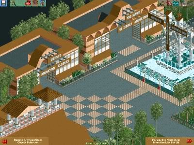
Also, i've started on the mickey water tower: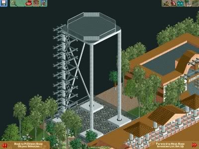
Comments please? I'd appreciate it!
 Tags
Tags
- No Tags