General Chat / The Offical Photography Thread
-
 19-March 06
-

 hobbes
Offline
I disagree. The first and second are wonderful, though the second could use a bit more brightness/contrast. I love the water though, and the color of the first picture is stunning. The last pic is also nice, but doesn't stand out too much.
 -

 JBruckner
Offline
In my opinion the first two are poorly composed and boring, while the last one is well composed and interesting.
 -

 eman
Offline
Thanks for the comments. Could you elaborate on how the first 2 are boring please Jbruckner.
 -
 Jellybones
Offline
They all seem a little too grey. Especially the first one. It would have been better had you stopped up (I think?) so you'd get more detail and texture in the rocks. Overall, though, I thought they were pretty good compositionally.
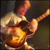
Here are some of my latest, taken at a Slip show last Saturday. In color, no less. Too bad concert photography is a miserably frustrating experience.
CVS Pharmacy 1 Hour Photo presents:


-

 eman
Offline
Ah, okay. I just wasn't sure what you meant by that. It's understandable, the stereotypical ocean with rocks and w/e is way overdone, I just couldn't resist the beautiful view.
-

 Jellybones
Offline
I guess it's good for texture, but I don't like how there's little focus to it. I like pictures where you know what the focus is. And there's too much blackness, but maybe there is something in the shadows and it's just not coming out. I know for me personally that my scanner likes to obliterate detail and I don't know it well enough to figure out how to possibly fix it.
 -

 JBruckner
Offline
I guess it's good for texture, but I don't like how there's little focus to it. I like pictures where you know what the focus is. And there's too much blackness, but maybe there is something in the shadows and it's just not coming out. I know for me personally that my scanner likes to obliterate detail and I don't know it well enough to figure out how to possibly fix it.
darkness is intentional, i burned the blackness to make it more black. the focus i upper left.
this is digital, as are all my colour photographs. -

 hobbes
Offline
Well I'm not much of an expert at all, as I've never even taken a photography class, but I do consider myself fairly artistic, so I guess that can make my opinion "valid." Personally, I think it's compositionally unbalanced. It's interesting, though, because there seems to be enough there to make it balanced...
Mostly, it's the colors and focus. The blackness is obvious negative space, which generally takes away from the "weight" of an area. You said this was intentional, and I'd like to hear your reasoning behind that, as I think it makes the image rather one sided. The vibrant hues of the left and bottom also contribute to the off-balanced-ness because they draw even more attention away from the entire shot and more to just themselves. On top of that, because they've such bright contrast compared to the rest of the shot, the eye is naturally drawn to them. And because the bottom is out of focus, the only spot I find myself really naturally gazing at is the upper-left corner. Which is decently interesting, for a piece of clothing, but doesn't hold my attention long enough. It's the colors that make this piece, because the balance is, in my opinion, not evenly distributed. -

 penguinBOB
Offline
i want to focus on more than what's there and it's screwing with my eyes. i like the colors and the 'glowy-ness.'
 -

 hobbes
Offline
I'm pretty sure that's a girl. And that blue spot is a piercing.
I wish I could see her right eye.
The rest is very well done, again great colors.
 Tags
Tags
- No Tags

