(Archive) Advertising District / The Grey Havens
-
 09-March 06
-

 newk
Offline
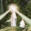
Apurimac is still under construction, but here's the newest project I'm working on. I'm currently building a park called The Grey Havens, the final site where Frodo, Gandalf and others depart from middle earth. There will be several elements from all three movies but the landscape will resemble drawings and pictures of the Grey Havens Ive studied.
No rides are built yet, but I've got some ideas. I'll show my progress so far as an introduction. I'm looking forward to see how this will come around!
I'd appreciate any comments and suggestions.Edited by newk, 28 May 2006 - 07:09 PM.
-

 Shamu
Offline
I'm certainly no expert but this is beautiful. Intricate detail, though not exactly realistic. I love it. Are you using invisible paths?
 -

 JDP
Offline
dude thats cool lookin man. nice details and looks like something i would see in an adventure movie or somin.
nice use of scenery paths and stairs...love the one by the water fall.
-JDPEdited by JDP, 09 March 2006 - 04:13 PM.
-

 Ride6
Offline
I think the 2nd screen is wonderful because of the questionable foliage... Anyway it's looking pretty good.
ride6 -

Silenced Offline
Wow. I like it alot. There's a bunch of little details in there that i like. Those staircases make it wonderful. The foliage, as ride6 states, is what makes that screen so great. -

 Toon
Offline
The foliage is fine if that's what you want, but the trees shouldn't be growing on top of the bushes, it looks very strange. I also think you need to adjust the rock work at the top of the second screen.
 -

 Ride6
Offline
Well that and elevation shifts. Oh and just use zero clearences with 8 cars to get those trees down where they belong!
Ride6 -

 Metropole
Offline
I think it needs more colour perhaps. But you've studied the grey havens, and I haven't. Saying that, there is a cool map you can play on in LOTR: Battle for middle earth 2 which could be helpful.
I like the foliage.
Metro
-

Corkscrewed Offline
Shouldn't it be... um... gray?
You need a lot more articulation on the buildings though. The area had lots of arches and fine moldings and carved cornices and plenty of embellishment, and this doesn't really have that much. It also feels a lot more temporary than what I'd imagine. I'd use more stone and have the vegetation solidly green to play a cool contrast to the stony gray (seriously... it should be gray). -

 Akasha
Offline
I really like how the stairs go into the mountain in the first screen. Maybe use some path on the walkways, because it looks a bit plain now. Love the second screen, maybe ad a cover to the brdge in frotnt of the waterfall. Also cover the tree roots.
 -

 Levis
Offline
nice .... yes
gray haves....no
I think it doesn't give the feeling of the gray havens but it is still very cool .
.
-

 newk
Offline
Well, I haven't worked on this project for a while, no time. I'm still picking at it though. It honestly isn't looking much like LOTR, I guess it'll end up like a fantasy park. Here's a new screen of a marketplace area tucked away in the mountains. I wasn't sure what to do with the roof, so I'd appreciate a little help. Thanks.
-

 geewhzz
Offline
Too much dirt is showing on the mountain...its sorta bare...
Very detailed though, I admire anyone who can take that amount of time to landscape. -

 trav
Offline
That building is way too detailed. It just looks like a blob of 1/4 tile objects...
The landscaping is good though, but maybe make it so you cant see so much of the bare rock faces? -

 Paradox
Offline
I'm getting dizzy just looking at that screen...

Edited by Paradox, 30 May 2006 - 08:25 AM.
-

 Carl
Offline
Id say the foliage is perfect for LOTR. The integration of landscape and architecture is key, and you have done well in that department too.
 Tags
Tags
- No Tags


