(Archive) Advertising District / - Bays Of Tropica -
-
 12-February 06
-

 eman
Offline
Great screenie. The details are fabulous, and the hacking is subtle and well utilized. The atmosphere is tremendous as well. Keep up the good work.
-

 tracidEdge
Offline
i think you should make some other scenery peice resemble speakers, i'm not sure how though. make them something more fitting of the theme and not an object that sticks out like a sore thumb in my opinion. like for instance, in hersheypark, all around the paths, they have fake rocks with speakers in them. anyway, i'm not sure what yo could do for that, but i'm not a fan of the speakers.
other than that, it's a great screen. i like the overgrown mine scenery on the roof. -

Xcoaster Offline
Great stuff. There's not like any one thing about it that stands out as being particularly amazing, but as a whole it is awesome. There's just a lot of very nice little things you included that work together really well. Like the queue rails - very nice. The banners. The ladder. You mostly only used brown as a color, since it's ideal for the theme, but it doesn't look drab at all, thanks to the excellent foliage work. That actually looks like a queue that would be pleasant to be in. I think the speakers work (EDIT: though after a few more seconds of thinking, you may want to consider what tracidEdge said and keep in mind that speakers don't need to stand out to play music). The hacked track is nice, though I imagine the connection might not look so good from the other side, since the water from the flume will just sort of drop off. The rams heads are custom scenery, right?
Anyways, I'm looking forward to this park. Great work so far. Make sure you include some Viking longhouses. -

 Akasha
Offline
Just wow, love almost everything about it, the mill, the 'arches' , that small plant at the top of the ladder and the lights! Very nice custom fences, and they work well with the non-custom ones.I'm not really sure about the speakers and minetrack though.
But it lost a bit of Vinkng-ness compared to the previous screen. dunno what you vould do about it though. It is realistic, but I find the rollers a bit weird, the look good, but in the downright corner the track could just be water.
May I ask what those two wierd poles are, near the minetrack? -

 egg_head
Offline
Nice, dude.
Just nice.
I love this park as you know and I think if you go on like the things you already have there, it could get a well remembered park
egg -

 X250
Offline
Thanks for the comments everyone!
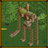
Those two poles are not 'scenery' pieces, but path pieces. (ie:- lamps).
They are in the shape of a rams head, which i thought would be cool for this area. Here is a screen of how they look, just in case you were wondering:
-X- -

 JDP
Offline
Nice realism but I do noticed something no one did not. I know that your going for realism but the speakers are right by the log flume. Electricty and water dont mix, so try to put the speakers in like the tunnel or something, i dont know, i did like the rock idea some one said up there^. Just figured ill let know know since your going for realism. But other than that, great park.
-JDP -

 Toon
Offline
The speakers are well placed (I have speakers on my patio and they've survived for 10 years in the rain and snow), but the object itself sucks. The shading is backwards and there is that graphics halo around it that looks terrible. If I were you, I would just stack a couple of deco blocks instead. (it's a case for me of one bad scenery choice ruining the screen) I'm assuming you have something invisible to supply the music as well
 Everything else looks great
-

 Six Frags
Offline
Yeah, I really like that screen X! Especially all the realism in there..
I would love to see this hole park hardcore realistic (if you know what I mean) because I think you could be able to pull that off amazingly..
I remember you once said to me you are always trying to find a balance in mixing fantasy with realism in all your work, but I think if you go all the way for one of these two styles (like I said I prefere the realistic style) your park will only benefit from it and be really good instead of somewhere in the middle and missing its target (wow, that's a long line, lol)..
Anywayz, nice work!
Shame I was planning a Viking section too in one of my future projects though..
SF -

 cBass
Offline
When I've seen speakers in queue in real parks they've been imbedded in the ground discretely near some flowers or other foliage and barely noticable if you didn't hear them, which is to say maybe you should just skip it.
 -

 Leighx
Offline
Very little screen.
I like the different que idea, i actually think the speakers fit in quite well. Better than hiding them (cos then when viewing the park u wouldnt be able to see them).
Coming along nicely... -

PBJ Offline
X great work and thanks for the help you gave me...
Screen 1:
1.000 words are not enough to say how great i like it.
the fence is pulled of very nice!
Allthoug i really hate those speakers, the way you used them is great! the hack on the waterride is great to see.. it gives a big push towards realism. maybe is the "run out" after the drop on a to small size, but i don't know how big the fall is... so i could be wrong on that one! the lamp's used in this way is a new thing for me in RCT and like the speakers they are very well done!
screen 2:
small but great
---
X keep on this great work... i really love this thing you have here!
Adios -

 J K
Offline
I love all of it, the interaction with the path is excellent. I love the chain pulling it along the track, it makes the ride seem more run-down imo.
 -

 postit
Offline
I usually don't do this, especially for such small screens, but

It's so clean and refined, and still has impeccable details. Just stunning. -

 penguinBOB
Offline
i've made some with 6 total stacked deco pieces and a circular window all painted black, and it looks pretty good. more like a PA than striat speakers, but you should try it, X. see if you like it better.The speakers are well placed (I have speakers on my patio and they've survived for 10 years in the rain and snow), but the object itself sucks. The shading is backwards and there is that graphics halo around it that looks terrible. If I were you, I would just stack a couple of deco blocks instead. (it's a case for me of one bad scenery choice ruining the screen) I'm assuming you have something invisible to supply the music as well
 Everything else looks great
 -

Corkscrewed Offline
What this park has taught me is that I better really bust out some "little things" in my park. Stop making us look bad, Simon!
 Tags
Tags
- No Tags


