(Archive) Advertising District / - Bays Of Tropica -
-
 12-February 06
-

 X250
Offline
Yeah i see what you mean, i've done a mix now, some buildings with the X-sector roofs and some others with the normal Toon roofs, and it looks better.
The multi-coloured roofs are very awkward to build with, because they are not as 'multi-coloured' as everybody says, you only have one colour available for change cos the peach is compulsary and the base colour must match the buildings. =/
-X- -

 Phatage
Offline
this is a situation where the rooves would look better if all the rooves were the same pattern.
 -

 X250
Offline
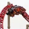
Not really an update... just letting you all know im still working like a dog on this bitch. Nearly finished the Cadbury area now, and am working on a new area with a vertical coaster. The theme of the area is an 'explosion theme' lol, its called "The Danger Zone", an area with bits of shrapnel, nuclear missisles, landmines, reactors and just general stuff to do with blowing things up.
This is a teaser screen some may have seen before, not really anything comment worthy cos of its size... although u can comment if ya like.
Overall progress around 35-40%.
I'll finish it this year sometime hopefully.
-X- -

 ACEfanatic02
Offline
I love the details on that tunnel, X250. But I think the coaster could use a slightly lighter/less saturated red on the rails... just to offset it (and to emulate wear and tear.)
-ACE -

 RCTNW
Offline
Amazing how something so small can give such a great impression of the ride!
Glad to see you still working on this!
James - rctnw -
 Levis
Offline
looks nice X
 .
.
this will probally my favorite area in the park I can see with this screen already .
.
-

 RCFanB&M
Offline
Looks really nice...
I like the walls you used and the detailed looks of the tunnel. The red track fits perfectly there, keep it.
I'm glad that this park is still going, keep us updated X. -

 Phatage
Offline
I say make it less like oblivion: something cool would be to change the path's color gradually as it gets closer to the hole with something like bright red/orange near it like the coaster track and gray far away. I think the fence surrounding should all be the same, so if you don't have those diagonal meshes then use the method you have with the poles and whatnot. I think it would be cool if you condensed the hole as it got deeper minus the side where the track exits, but that could be hard to pull off (yet that should not be a deterent)
 -

 RCTFAN
Offline
I'm sure it looks better with the rest of the area accounted for but at the moment the track really sticks out in a bad way. The hole looks good but as with Phatage it has been done before and i know you can make it your own by giving it some sort or difference to everyone elses.
Keep up the good work though Si.Edited by RCTFAN, 01 January 2007 - 07:39 PM.
-

 X250
Offline
Thanks for the response so far. I was thinking of putting those floor-objects (the ones in that area of Shadowlands), to make it look like circuitry on the floor by the hole, although i have no idea how Xcoaster did it.
 *hint*
-X- -

 geewhzz
Offline
Okay...I have seen this screenshot before. It looks nice and I agree with Phatage about the fences. Also, the wooden fences seem to be a bit small for people to be walking up to and leaning over towards a coaster.
Also...the screenshot is small, yet you can see back to the left a few tiles, and yet there are no supports visible. I suspect you probably used angeled ones from the top of the drop, but I think you could do a better job at making some supports visible connecting the track inside the tunnel.
It just looks funny having equal space on all sides of the track. So unless you could, like Phatage said, make the tunnel shrinking towards the track and pull it off well, I would suggest moving one side of the tunnel closer to the rear of the track.
Can't wait to see more Xsi. -

 Genius638
Offline
as everyone else says, excellent details. The variety of texture is eye-pleasing, and I can't find anything wrong with that picture.
 -

 X250
Offline
Back to the Cadbury area... which should be one of the last screens from this section. Its my favourite area of the park, its designed to be bright and aimed at the younger generation filled with a mixture of low and medium intensity rides. Featuring two roller coasters, seven flat rides and 12 shops and outlets. Its quite a large area, but its pretty damn mint- you have to see it in game to get a real feel of this area. However, here is a screen of what i did with the sign that Levis made for me (thanks dude).
The entrance to the area adjacent to the main central plaza of the park, showing the monorail travelling down the Cadbury Main Street (the monorail travels from the car park to the main entrance, passing through every area on its way).
-X- -

 lucas92
Offline
I really like the stairs, but why is there a 1/4 pathway? Peeps could just pass by the main pathway??
I like the sign.
-

 Metropole
Offline
Ah, looking at that reminds me of when I was building the Ribena area in Boscastle Heights. Great work with the colour X. Pretty nice screen!
 Tags
Tags
- No Tags
