(Archive) Advertising District / Project Dread
-
 10-February 06
-

 Ge-Ride
Offline
http://img330.images...9/robots9ww.jpg
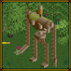
robotic infantry on recharging pads with detached weaponry -

 Phatage
Offline
i bet the map looks like a blank pt bench that has a dam on one end and whatever that is on the other
 -

 Ge-Ride
Offline
I'll be placing something on this part soon. The landscaping near the dam is finished.
 -

 CedarPoint6
Offline
Too much of the same thing. It coulda looked better if you just used a quarter of this.
But right now I don't see how it connects to the park. There's no scenery to guest interaction and no rides at all. Where is everything? -

Xcoaster Offline
As for this screen, I think one of the big problems is that everything is either black or orange. I think you need to mix it up a bit. Make the robots different colors from the pads. Maybe you could make one of the robots have a different rank from the rest. I also have some trouble seeing them as robots. With them being so bottom heavy I immediately think of them as rockets or something. I kind of get the general idea, but it'd be better if their torsos were of a size that matched their legs. Also, try to build some other structures nearby here, since all we have right now is basically the same thing, four times over. Maybe a power plant or something where they route the power to the pads. Laser turrets? I don't know, it could just use more. And like someone else mentioned, remember that you're making a park. At least, I think you are.
As far as the other screen, I admit it's kind of weird, especially for a dam, and especially since the dam portion of it seems very limited. But I sort of get the idea. The colors still need some work, though, as in this new screen. -

 penguinBOB
Offline
About the first screen:
Hey, there's a difference between making random ugly pointy and crazy structures and making random pointy and crazy structures... Not to be mean or anything.
You have to invision something, lay pathways out, consider foliage, stores, rides, peeps in general. Right now, it seems like you're thinking, "OMG, let's make something REallY crAzY and BiG!!" and not thinking about anything else.
Edited by penguinBOB, 12 February 2006 - 07:15 PM.
-

 hobbes
Offline
I really hated that screen, pBob, when I first saw it.
Seeing it now, though, and I really love all the intricacy of the architechture.
About your screens, Handy, they're creative, but not consistant.
To put it simply, have a plan, work with the colors, and allow your buildings/scenery to accentuate its surroundings, not erupt from them. -

 Toon
Offline
I agree with Phatage...
Oooooh look at me, I built a crazy whacked out building that serves no purpose at all and will never actually become part of a park! -

 Turtle
Offline
I don't see how they are in any way creative, sorry. They are different from the norm, sure. But they're not creating anything. And as such I don't like them.
 -

 postit
Offline
Exactly. Don't build random, thinking it's creative, for the sake of being "creative".
postit
Offline
Exactly. Don't build random, thinking it's creative, for the sake of being "creative".Edited by postit, 13 February 2006 - 12:01 AM.
-

 Metropole
Offline
Yeah, I agree with Phatage, Toon and Turtle pretty much. Perhaps next you could take a screen where these "creative" things are put in context, ie. with paths, architecture, scenery or even a ride so we can see what purpose they serve.
Metro
-

 JKay
Offline
WHAT THE FUCK IS THAT?
http://img330.images...9/robots9ww.jpg
robotic infantry on recharging pads with detached weaponry
Creative, maybe. Ugly, yes. Well-executed, no. -

 Enigmatic
Offline
AHAHAHAHAHAHAHAHAHAHAHAHAHAHA!!!
You might very well be the worst RCT player I've ever seen. Those abominations you call buildings look like you decided to put shapes together while you were high -

 Ge-Ride
Offline
Too bad you haven't shown any work, are a complete arse in every thread, are as cracked out as Moediaz, and probably don't have any friends. Otherwise you wouldn't have come back here under a different name and insulted everybody who's a million times better than you are, and I've never smoked anything in my life.AHAHAHAHAHAHAHAHAHAHAHAHAHAHA!!!
You might very well be the worst RCT player I've ever seen. Those abominations you call buildings look like you decided to put shapes together while you were high -

 Enigmatic
Offline
Dunno who you're talking about with that modaz guy but I've got plenty of friends. I've got a group of six of us who've been homies since like first grade so up yours.
 Tags
Tags
- No Tags


