Released / Moon Mountain
-
 23-January 06
-

 J K
Offline
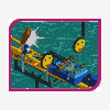
Hey here's my last project. It's a coaster design, enjoy some of my best work yet. Click me bitch
 -

 Ge-Ride
Offline
It's an interesting ride. I like the layout and the architecture. The foliage is alright, but I really despise those yellow flowers.
 -

 Turtle
Offline
I like the layout.
I think you need to brush up on your foliage selection, some of those trees just didn't fit.
The architecture was nice, but looked as if it lacked thought in places, just a bit of filler.
Very good release, though. -

 X250
Offline
Its a nice little design, the coaster layout is very good. Its smooth and has a good inversion order, good use of colours and i liked your overall architectural style. This is promising JK, you have improved sooo much!
-X- -

 trav
Offline
I think it's brilliant. I thought it would get design when you kept showing me the pics of it. Corky needs to lower the bar a bit if this doesn't get in or they'll all have to be like Helios or Fright Nights.
 -

 JKay
Offline
Your park has been invaded by little purple people!
Really nice coaster, at least based on the screens, although I get the feeling this was rushed. Just seems messy or somethin' Eitherway, I love the colors you chose. -

 J K
Offline
Your'll need the download and to see it in game to apreciate it and the screens shown on miracles really dose'nt do it justice.Ive tried to add a heck of alot of details. I know what you mean trav the bar has been raised slightly for designs but hey you just have to try again.
 -

 Emergo
Offline
Nice ride, and certainly nice colours.!
You have approved quite a lot since you posted your first parks at those "unknown sites". so.. go on!!
Am not sure if the bar has been raised here much, but anyway, friend, just keep practising (especially to give your parks/designs something "personal" apart from nice colours) and hey you just have to try again and it will be a hit,here anyway, easy enough
Edited by Emergo, 24 January 2006 - 07:45 PM.
-

 CoasterForce
Offline
The foliage hurt the design a lot, I think. That might sound like a bit of a stretch, but it makes sense. I'm not sure about the places you put your flowers, and like Turtle said, some of the trees. Foliage is very important.
Also, it didn't really seem to have anything that make it separate from the rest. If you're pretty unknown at NE, you have to really make a bold statement to get something like a design, and in this case, a much more bold statement than this.
But not a bad release, I'd say. -

 Ride6
Offline
Tis pretty. Some additional land-height variations and some more care with the flowers would've pushed this over the top for me. Though the coasters 2nd half was as mantis once put it "a right-hand turn lovers wet dream".
Just try to get more of a mix in that way. Otherwise it's quite beautiful and with some brilliant details (like that graveyard for example).
ride6 -

 newk
Offline
i really liked the color of the coaster and the archy was very pretty. the coaster design was a little unoriginal when it came to inversions but it was nice to look through. great job!
 -

 zburns999
Offline
Great colors judging by the screens. Usually, when you choose brighter colors like that, its a hit or miss. In this case, it worked very well. Overall this seems to be some amazing work.
 -

 Toon
Offline
This was good, but I don't disagree with it not being a design. I think that if you are doing something on the scale of a design, it really should be exceptional to be recognized. To me everything about this displayed that you have the potential to make something great, but it was a little to unrefined imo to be posted as a design. The one thing I loved, tho I'm sure it wasn't meant to be, was that the underwater part of the building looked like a reflection...I think if a design or park were done with this effect thru the whole park so it was meant to look like a reflection, it could be really cool.
