(Archive) Advertising District / Cedar Point Recreation RCT2
-
 11-January 06
-

 geewhzz
Offline
The next teaser brings us to Raptor. I'm only going to show off a section of this coaster. The track is spot on with the real life version, which is very hard to do in RCT2. It took me many many attempts to get it the way I wanted it, but it finally came out nicely.
Here is the shot:
Questions? Comments?Edited by geewhzz, 16 January 2006 - 01:25 AM.
-

 Phatage
Offline
The difference between the last couple of screens and the first couple is that you took the accuracy that you already had and better transposed it to rct. I think you should go over the work you've done in the first couple of screens because these last two are looking spectacular.
Even with that being said I'm not fully in love with the track layout of Raptor. I'll upload a track file of my interpretations of the layout later today maybe, but for one I think it should be the steep twisting drop and large loop.
The Confection Connection looks great! Maybe you can add some ventilators to the top of the building that aren't necessarily visible to guest but should be there for realism. -

 newk
Offline
yeah i definetely think it needs a larger loop. the coaster looks so close to the ground also. but the supports look good and im very excited to see how it'll turn out.
 -

 egg_head
Offline
Do you have a screen Phatage?
@geewhzz: Wow. Never been to CP but i think it's very cool what you're doing. -

 Stargazer
Offline
I agree, from the photos on RCDB, that should be a large loop. But apart from that, this looks awesome.
 -

 ChillerHockey33
Offline
Phatage, I am having a problem placing your layout in a park.
It says the track is not a complete circuit..
-Ryan -

 geewhzz
Offline
I assure you guys, Raptor is perfect. There is not a twisting drop on Raptor. Placing a large loop on Raptor makes the layout flow inconsistantly. I had to shorten the height because inverts have no large pullouts which makes it look sloppy. If you could see the way my Raptor flows it's course you would agree it's perfect.
Phatage, I'm not sure what you mean about my first couple of screens. Hofbrau looks fantastic, the main gate entrance is a little bland, but that's how it is in real life. And I agree with the vents on the top of the buildings. I will add some I just don't have an object that looks good at the moment.
Phatage I took a look at your Raptor, you did a pretty good job on it, as it's one hard coaster to recreate. I guess you used some zero clearances on it, as I did on mine, so we can't play that saved track anywhere :-\
The only problems I saw with your layout is the loop went the wrong direction, and the inline twist did also. I understand why you had to do a lot of elements on your track, like the flat piece of track in between the half corkscrews on the cobra roll. IMO I think those flat pieces look ugly and totally take away the realism of the weightlessness of that element.
I think once you see the full layout of my Raptor intact with the main midway and bluestreak midway you will like it better. The flow of it will remind anyone who has been to Cedar Point of the actual thing. It's simply amazing.
Thanks for your comments guys, I'll try and get a shot of the back half of Raptor whenever the theming comes along.
Oh, and btw, here is a little peak at how I have done of the entire 256x256 map;
Progress is coming along slowly but surely
Edited by geewhzz, 16 January 2006 - 04:43 PM.
-

 Phatage
Offline
The flat piece in the cobra roll was to make it more realistic, not to fit in the elements. And I still don't see how that small loop is realistic:
-

 geewhzz
Offline
The flat piece in the cobra roll was to make it more realistic, not to fit in the elements. And I still don't see how that small loop is realistic:
http://www.rcdb.com/...m?picture=1.jpg
I still don't see how a flat peice on a cobra roll makes anything more realistic. If it was there in real life it would destroy the weightlessness the element provides. Plus it just looks ugly. But I guess that's just my opinion.
Anyways, I took your advice and tried out a large loop in my design, and I have to say, it does look pretty good. I'm going to redo it tonight and touch it up. I'll post a screen for comparison later. -

 Kumba
Offline
I need to go with Phatage on the large loop issue, but I think your right about the cobra roll, there sould not be sright track in it. Also you got the first drop right, it's a banked twist.
Very good work, can't wait to see more of the layouts, it brings me back to rideing them in 01...
I'll back up my points with Photos if anyone wants, maybe i'll even toss in my perfect rec of Kumba's layout
-

 geewhzz
Offline
Yeah I'm most likely going to change to the large loop.
I'd love to see the Kumba recreation, is it for RCT2? Tell me where I can get it!
-

 Kumba
Offline
Im not gona post a track file or a DL coz one day im gona send it in for NE design, first I need to theme it tho.
It was a real bitch to make coz things like the loop and camelback sould be diagonal inversions. If I ever play RCT3 it will be to make this right, tho I did a nice one in NL a long time ago, shame its lost forever.
-

 zburns999
Offline
I see what geewhz is saying here about the flow. Whenever I make an inverted coaster, I either go big or small, never in between. With a large drop, you can have a large loop, then maybe a large cobra roll after that, and with a small drop you can do exactly what geewhz did, but when you go in between, the elements dont really flow. For instance, there will be a large loop, medium zero g roll, and a small cobra roll due to lack of speed.
Anyway, I really like what your doing geewhz. It looks very realistic so far. If there is one word of caution I would just tell you to keep your buildings varied in texture, so they dont all look the same (like I always do accidentaly). If you keep this up, it will be one of the better recreations I've seen!Edited by zburns999, 16 January 2006 - 06:29 PM.
-

 geewhzz
Offline
MCBR looks a little low to the ground, is there a blocked section there? If there is it must be doing that back half very slow.
 -

 ChillerHockey33
Offline
The straight piece in the cobra rolls add realism, because the corscrew elements in the game are too small for a B&M cobra roll.
Because of the signature 'V' shape the B&M cobra rolls make, the only way to make the cobra roll look ralistic is to throw in one or two straight pieces, and just look at it as if the corkscrews have been extended.
I would rather go fora realistic look rather than a realistic 'feel', because Im not the one riding the coaster.
-Ryan -

 Phatage
Offline
...but I think your right about the cobra roll, there sould not be sright track in it. Also you got the first drop right, it's a banked twist...
Well you used that straight track in your Kumba rec right there...
As for the drop, there really is no better time for the steep twists in rct:
For the side view, you can see that although the curve is taken at a less steep angle relative to the ground compared to the rest of the first drop, the entire drop is still pretty much the 45 degrees that it is listed as: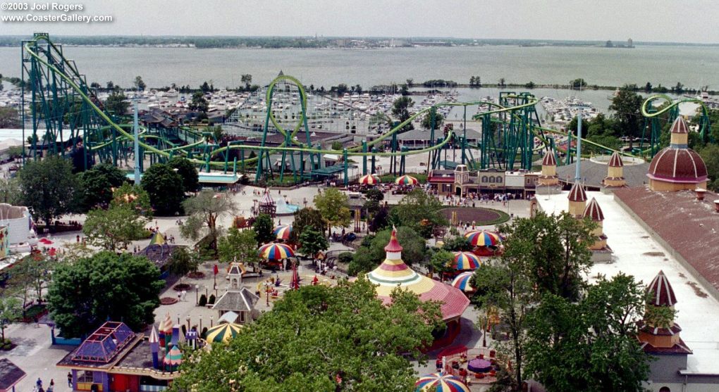
Rct offers a 30 and 60 degree drop, so by that picure alone you could choose either being that they are the same amount away from the 45 in real life. But when taking the first picture into account, it is more logical to use the steep twist. -

 newk
Offline
in the park map, what is the other ride that goes straight forever? is that the wooden coaster?
 -

 geewhzz
Offline
I understand what you are saying phatage, but from that side pic, it more looks like a banked small turn, into a 60degree drop....So thats what I might go with into the large loop.
I'll look into the steep twist though.
Thanks for all your comments and suggestions guys, I will definitally take a look into everything you guys say, as I want this recreation to be amazing!
EDIT:in the park map, what is the other ride that goes straight forever? is that the wooden coaster?
Blue Streak
Edited by geewhzz, 16 January 2006 - 08:10 PM.
 Tags
Tags
- No Tags
