(Archive) Advertising District / Parc de Chateau
-
 10-January 06
-

 zburns999
Offline
Hey. I've been visiting this site for a while now, and I really wanted to post some stuff. I'm working on a project called Parc de Chateau, which is an all French park set in France. I am almost done, so I guess I will have a download soon. Im a noob, so go easy on me
 . Here are a few screen shots...
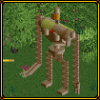
This is an arrow floorless suspended coaster called "Sinistre." Here you can see its ominous setting next to an old castle.
Here youn can see "Tonnere Francais," and its French Flag themed station.
This is a pretty random screen shot, but I just think it looks nice/realistic.
Here you can see the massive sign for the mack bobsled, "Voyage Prehistorique."
I hope to finish this project soon, and I will post a download when I do. Please feel free to comment and critisize! -

 JBruckner
Offline
It would be crazy cool if it read the same thing both ways, like illuminati or some crazy shit.
 -

 Ride6
Offline
^All the WW sceanery there has been transferred to the original rct2 so I don't think that's nessisarily the case. My french is also a bit rusty but if I remember right Parc de Chateau would litterally mean "Park of the Castle" in english, or Castle Park if you want a "good" transulation...
Anyway it's definently not too bad. I really like the covering over the "tea cups" ride in the third screen and some of the other little bits of architecture scattered about here and there. What I don't like are those grey "brick-like" paths. Terrible, ugly things they are, blah. The treeing could use some trimming back away from the walkways in favor of some gardens too.
Not at all bad, you're on you're way for sure but don't be expecting to clime the ladder of popularity here too quickly. Just do your own thing and success will tend to keep up.
ride6 -

 Ge-Ride
Offline
It looks pretty good for a noob. The pole supports for the stations look kind of weird, but who am I to talk? When I first came here in 2004 I was making buildings out of ice cubes!
Ge-Ride
Offline
It looks pretty good for a noob. The pole supports for the stations look kind of weird, but who am I to talk? When I first came here in 2004 I was making buildings out of ice cubes!Edited by HandyAndyG, 10 January 2006 - 10:45 PM.
-

 deanosrs
Offline
put the walls on the inside of your buildings, not the outside, try some landscaping, and for the love of god lose the yellow trees! they're horrible. apart from that a good first park. keep building and enjoying it.
 -

 JKay
Offline
I'm very mixed on these screens, but I do think the pros outweigh the cons.
Here are my pros/cons:
Pros:
1. You obviously have a knack for 1/4-tile building, which is a great skill to possess imo. For instance, the custom "Voyage" sign and the teacups structure; great stuff, albeit a little amatuer, but still nice nonetheless. Keep attempting structures like these; you will only improve with them.
2. It looks like you have a good grasp on being able to add just enough to your park without drowning it with too many details, yet still keeping the viewer wondering what lies ahead. For example, little details like the banks Pepsi machines (screen 4), the cute purple building (screen 3), outdoor eating areas (screens 3 & 4) and the lockers (screen 2), all make for nice additions to both the atmosphere and practicality of your park. Keep adding stuff like that.
3. You obviously have a creative urge in you. I can tell by how your park flows from one creation to the next, each being a new idea. Don't lose that; thrive off it.
4. Colors. I think your colors show enormous potential. The teacups are a good example. Even though I think they need a lot of refinement, I really do think you are excelling in that aspect of parkmaking here.
Cons:
1. First and foremost is your foliage. IMO, your tree/foliage selection is quite poor and the placement isn't much better. For example, the large oak trees just seem to dominate every screen, and that wouldn't be so bad if they weren't placed in such large clumps. I would also highly consider getting rid of those ghastly yellow trees; as they just litter your landscape imo. Same with the pink trees, except not quite as bad. The pink trees could be incorporated there, but I think you could do it in a more subtle manner. Be careful with those pointy Cypress trees too, as I think they are horribly drab and ugly.
2. Your landscaping is pretty bad here, imo. The park seems kinda flat, but that doesn't bother me as much as the checkerboardish use of landtypes (mainly seen on screen 3 where you go from grass to sand to red sand, it looks very unnatural). I'd also like to see some jutting rocks or small mountains in there somewhere, but thats just me.
3. Your scenery selection isn't the best, imo. I do think you've used what you've got to its best potential, but items like those yellow trees, the tables/chairs and the tall black lamps are just no-nos for me. I'd try to be much more selective next time you make your bench.
4. Lastly, your textures. This one is hard to explain, but I really think you have a lot of texture clashing going on in those screens. The paths especially.
Ok, enjoy, since I usually don't give this much feedback.
Welcome to NE and I can't wait to see more from you! -

 laz0rz
Offline
Too much 1/4 tile stuff.
Use some flat roofs.
And work on your fences.
It looks pretty wierd, but it still has some appeal. -

 ChillerHockey33
Offline
You should make the 'Y' in your 'Voyage' sign the same height as all the other letters...
-Ryan -

 zburns999
Offline
Wow. Thanks for all of the feed back guys! While I dont plan on changing this park much, I will take all of your suggestions when I build a new park (for example, terrain, better scenery, better foliage, etc).
zburns999
Offline
Wow. Thanks for all of the feed back guys! While I dont plan on changing this park much, I will take all of your suggestions when I build a new park (for example, terrain, better scenery, better foliage, etc).Edited by zburns999, 11 January 2006 - 08:51 PM.
-

 hobbes
Offline
zburns, the edit button has a purpose. Please don't triple post again, lest we delete the posts and possibly you.
 -

 hobbes
Offline
I stand corrected.
zburns and counterpart, please refrain from bantering back and forth online if you're in the same house. -

 zburns999
Offline
^No, we werent in the sam house. Sorry about that. It was just a friend of mine being an idiot. Im sure he wont come back again though.
zburns999
Offline
^No, we werent in the sam house. Sorry about that. It was just a friend of mine being an idiot. Im sure he wont come back again though.Edited by zburns999, 12 January 2006 - 06:03 AM.
-

 trav
Offline
Um...I think he's referring to your IP address which is probably the same, so therefore you created 2 accounts...maybe.
 -

 zburns999
Offline
^No, I only have one account. You can check me on that. Really, Im upset that this happened. So much for a good first impression huh? Five posts and Ive been threatened to be banned and some people probably think that I have two accounts. Look, Im really sorry my friend had to be an idiot. Hopefully a mod will delete the posts and we can forget about this...
On another note...
I was wondering if anyone wanted me to post a download for this. I just posted it to get some feed back on my first real park, and I understand if there is no one who wants to download. But, if you do, just tell me and I'll be sure to post one this weekend. Thanks.
 Tags
Tags
- No Tags

