(Archive) Advertising District / A new Attempt at Theming for a Park
-
 03-January 06
-

 Jwood
Offline
Ok Guys, This is a current worx or things to come. I'm basically Making multiple theme's in one park, but mostly It's just a work with architecture and such, but here goes nothing.....
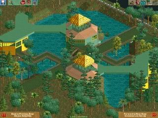
Info and lookout tower in Jungle themed area.
Just a general area kind of mini boardwalk for the jungle area.Edited by Jwood, 08 January 2006 - 02:34 PM.
-

 JKay
Offline
hmmm...
I suppose the first screen looks ok, but the rest look really flat and dull with boring colors to boot...
Keep workin' on it though. It shows some potential. -

 JDP
Offline
your work is pretty simple and is just okay, but im glad your trying and it is different work than from what i have been seeing. Keep it up.
 -

 Dan
Offline
I love the station for the coaster. Simple, yet nice.
That red building, though, looks like it will fall over..
Dan -

 Jwood
Offline
ya i was Thinking about adding more to it and make it more elongated. I'm also adding more color maybe and some different things to it, but those are just the basic themes for each section, I've barely scratched the surface of what's going there in each of the sections. that's usually what I do, I design one specific kind of architecture for each section and I develop from there.
 -

 JBruckner
Offline
Damn, he really IS trying. I like the first one, I would work on your colour more.
 -

 Jwood
Offline
Heh. thanx guys, I got the idea from "Islands of Enchantment" by Kumba, and I changed alot of stuff LOL, made it more original to me. LOL, but IM more proud of this very "colorful" restaurant shown here...
http://img225.images...keside025bm.png -

 Jwood
Offline
wtf, oh n/m lol i read it wrong, i just like looked at the page and randomly picked the first name i saw, even though u'd think it'd be artist but idk. LOL. Whoops, sorry Artist!
 Tags
Tags
- No Tags


