(Archive) Advertising District / Royaume des Reves
-
 01-January 06
-

 Geoff
Offline
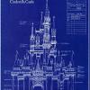
That is the most amazing screen I have ever seen on this site.
The atmosphere is just incredible. I can't stop looking at this beauty. -
 Highball
Offline
I'm shocked to see that I haven't dropped in to say what a great job you're doing, Trix. Everything looks fantastic and has the best RCT3 Disney feel ever. Sadly I won't be able to see it in game, but the screens do it enough justice. Great work, and I look foward to more.
 -

 Meretrix
Offline
Sadly a lot of peeps won't be able to see it in game, as I'm sure that at it's present size (22 mb) it will crash all but the hardiest of comps. (Mind you, the landscape park (the one without the dark rides is only about 70% done...but DOES include a themed coaster...Big Thunder Ridge......I'm not showing screens of that area on purpose.)
 -

 Highball
Offline
It's not that my computer can't handle RCT3, it's that I found the game rather lacking for my tastes. I may reinstall it just to view this park, but that would take a little more convincing.
-

 Meretrix
Offline
Lacking how, exactly?
With the first person experience, plus the amazing stuff that is now available, not to mention the long awaited coaster elements that have been added, the only thing I find lacking from this game is flowers, and I can fake that, or even just let it go. -
 Evil WME
Offline
Someone will come up with custom scenery flowers, i'm sure. Just a matter of time...
The game is awesomeness =D. -

 Highball
Offline
I found it lacking for my tastes. I don't know, it just rubbed me wrong. I feel I can do much more stuff in RCT2 than RCT3. Just my opinion so take it with a grain of salt if you will.
 -

 JKay
Offline
You know, that screen reminds me of a holding a park map for an amazing themepark I've always dreamed of going to, but know that I will never be able to. Its a mixed feeling of disappointment and joy.
-

 JDP
Offline
Thats a nice shot man. I have to ask though, is your game lagging a lot form this park?
Nice screen. -

 Meretrix
Offline
No, because there aren't that many rides in it....also, because a lot of the "scenery" is actually just land that has been terra formed.
 -

 J K
Offline
That screen has got great character, if you wer'nt around i would'nt apreciate rct3 so much, as i do when i see some of these screens from you.
Cool foliage it represents the area well. Your map overview looks incredible. If Ne did rct3 spotlights (i don't know if they would start to) but this would be one.Edited by J K, 19 February 2006 - 03:30 PM.
-

 Steve
Offline
I don't like how the rooves don't allign, but nothing to worry about.
Not sure on the cobweb fences...unless its supposed to be a haunted western town.
 Tags
Tags
- No Tags

