RCT Discussion / The little things...
-
 19-December 05
-

 Scoop
Offline
Is this supposed to be a topic where we praise known amazing work or highlight work that isn't significant? I'm sincerely wondering too.
Sorry I meant highlight work that isn't as well recognized. -

 bigshootergill
Offline
Kind of.
From what I see, it looks like the small, subtle details tucked away throughout great parks that may not get noticed or the praise they deserve, but the many minor touches contribute to the overall impressiveness of the park. If many of these little details were missing, the park wouldn't be as high quality.
That's often where a lot of a parks 'atmosphere' comes from that many struggle to include. Often bronze and silver parks (perhaps even some gold parks) neglect that acute attention to detail, whereas the parks in this thread thrive on them.
-

 Jaguar
Offline
I thought it was more of a stylistic thing than anything having to do with accolades. There are a few bronze and silver parks that have neat little things, e.g. Taboo or some H2H parks while there are some golds and spotlights that are, due to their scale or style (e.g. NCSO/Old school LL), more sparse. A simple but pretty park will usually outscore an ugly but intricate one.
With that being said, if there is any park that belongs on here, it's Scientifica. That park is just dense. -

 Lagom
Offline
Budapleasure is a park that I come back to again and again. I just love the overall atmosphere, and the architecture still blows my mind. But what makes this creation truely special are the little things, in my opinion.
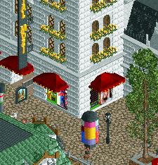
For starters, the clever use of vending machines is so good:
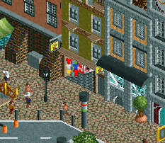
The little shop here is so charming:
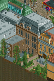
I love the little things in the backyard such as the bike, stairs, and the little garden. Beautiful.
The facades in this picture are epic. I just love how real they look. Also, the McDonald's sign... Jebus. At first I thought it was custom made. But apprently it is /\/\
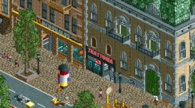
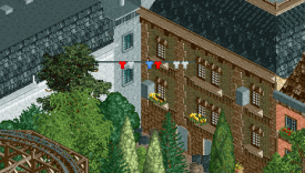
Lastly, the line drying clothes. Just adds that extra charm, that I like:
 Tags
Tags
- No Tags


