RCT Discussion / The little things...
-
 19-December 05
-

Wicksteed Offline
Did you notice the bats too?

Thanks for the post Wicksteed! There's so much more to discover though I'm sure nobody noticed everything yet.
No I hadn't noticed them, but now i've found them - makes it even more amazing!
Of course there is much more, i do have found alot more details. but i'm sure i'll still find more. -

 Xophe
Offline
I thought I'd add a few more of my favourite little things from Legacies...
1 - The ghosts around the York area!
2 - I found the bats haha.
3 - extra points for this The fountain is beautiful too.
4 - tiny little baby columns! I just thought that was cool haha.
5 - the pipe organ is just fantastic!! And even a guy operating it.
6 - amazing touch with the cable cars.
7 - fish swimming in the lake and fish food dispensers!
8 - even the backstage areas are beautiful.
9 - the architecture is brilliant - you really nailed the old English style!
10 - I just love this bridge
11 - took me a while to notice the miniature viking boats landing on the coast - fantastic! And I also love how this area is visible from the entrance plaza across the water - very easy to visualise this being in a real park.
12 - finally, the 'pralines' going up the conveyer belt. The extra effort to make this operational proves how deserving of spotlight this park is.
I should also mention the amazing readme that comes with the park - it provides a really useful insight into the thought process behind making the park and it shows how accurate your architecture is! -

Wicksteed Offline
Here we go again...This time from Dreamport
I loved all these entertainers:

lol.
and of course the Zombies:

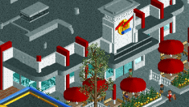
I love how you used the back of that huge building as the sky. It creates a great atmosphere. The lighthouse is equally cool.
So many cool animals in the park:


did Kumba name this one?
More animals, and great landscaping and foliage. Also, what I loved most about this park, was your amazing use of colour. I think one can see that here very well. The land texture in contrast with the water and the black panthers. Its wonderful!

I love that station and how the entrance area is surrounded by the coaster track.
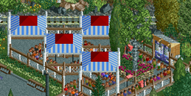
great use of the flower baskets.
lovely.
makes me hungry
just one of all the great entrance signs.
and...salsa time! so cool.
-

 J K
Offline
More animals, and great landscaping and foliage. Also, what I loved most about this park, was your amazing use of colour. I think one can see that here very well. The land texture in contrast with the water and the black panthers. Its wonderful!

Just want to add with this one, the gorilla in the bushes is a native tribes person stalking the panther to try and kill it for food. -

 J K
Offline
No worries, thanks so much Wick, it makes me proud what you've posted and I know theres about 100 more of them
-

 Austin55
Offline
Damn, I had forgotten how many Legacies and Dreamport had! And heres another damn good 'light full of little things.
The car is kinda blocking the way...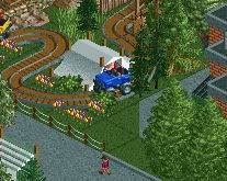
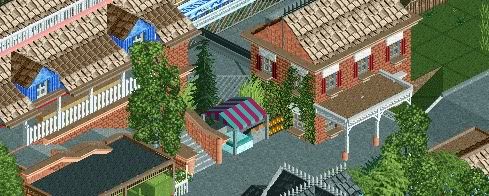
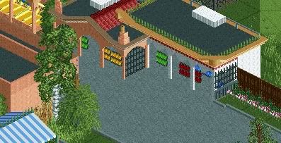
\
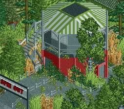
signs...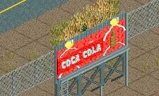
Thanks for making the Gio nerds happy
The napkins might blow away!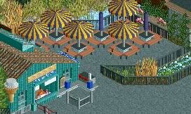
Best themed kiddie flat ride ever?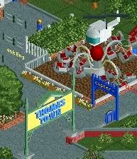
 \
\
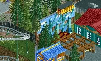
EDIT: more\ \
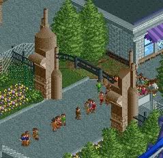
\
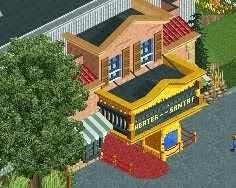 \
\
"Excuse me sir, can you tell me how to get to Expedition Everest?"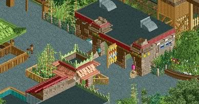
Congratulations on spotlight, spectacular park. -
 Steve
Offline
I've been wanting to do this for awhile, so here is some (or a lot) of my favorite things from what I think is the best park we've seen in quite some time: Rob's Six Flags Santa Fe park.
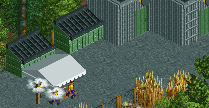
Employees taking a smoke break backstage.
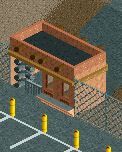
Employee's entrance from the parking lot.
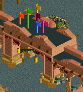
Great flag execution, with some great stucco/rock entrance work.
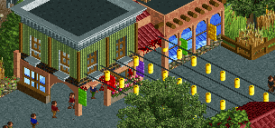
More flag banners, stringed lights, and store interiors through the glass.
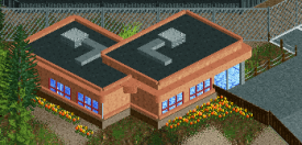
Park offices.
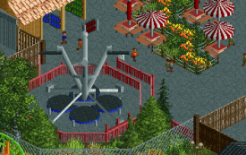
Sick trampoline attraction. Gifts on racks outside with nearby seating.
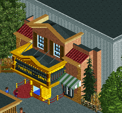
What an entrance: flashing lights, red carpet, ticket booth, and movie posters on the walls. Six Flags goes Hollywood.
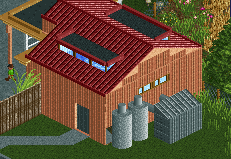
Nice touches on a restroom building!
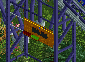
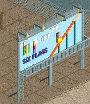
M&M's sign on Batman. Lots of great signs for advertising in this Six Flags park.
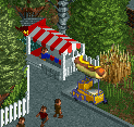
Neat little custom food cart hiding behind the theatre.
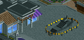
Batmobile! And neat building.

Cool Batman queue theming.
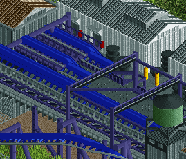
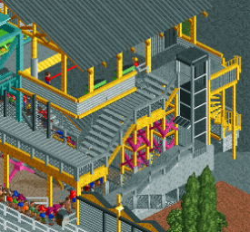
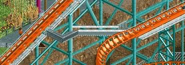
Great detailing on the transfer tracks.
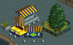
Neat little gaming carts in Gotham.
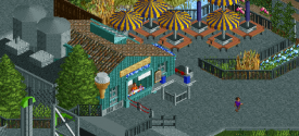
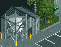
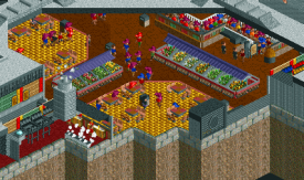
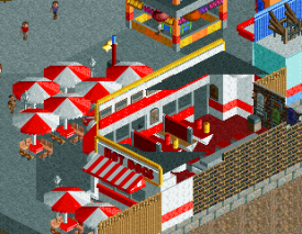
So much to see here. The custom ice cream cone sign, the menus above the cashier, the condiments/napkins, cool silos on top of the building backstage, and a great seating area to top it off. Great atmosphere.

Frozen leaks being sprung in Gotham.

Misters over the photo pick-up for Medusa.
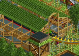
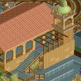
Awesome lattice work on Medusa station.
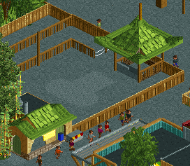
Looks like an old attraction has been removed!
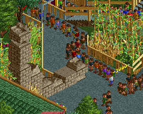
Cool rock structure for the entrance to Leviathan, not to mention the queue is so long it's flowing out into the path!
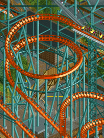
This support work is unreal. Just. Un. Real.
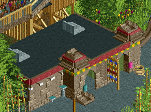
Nice details here: water fountains, merchandise outside, and neat deco work on the building.
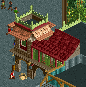
Some nice details on this building.

Way cool tent in the Looney Tunes area.

Elmer Fudd shooting at Bugs Bunny. Seriously?
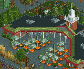
The whole area for this food court just feels so real. Reminds me of America at the World Showcase in Epcot.
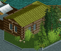
Log cabin in Looney Tunes land.
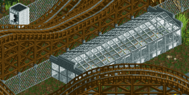
I dig the custom photo spot on the ride. Nice greenhouse too.
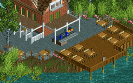
Lots to see here: separate lines for the counter service, more napkins/condiments, signs for feeding the ducks, and serene seating.
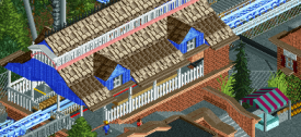
Giving off a serious New England seaside vibe with this station. Picket fencing is spot on. Neat little food cart down there too.
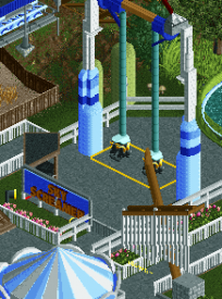
Sky Screamer! And check out the falling sail over the log flume queue.
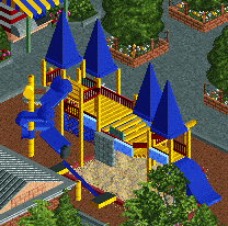
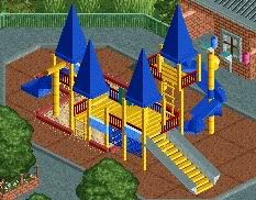
Never seen a better playground in RCT.
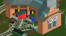
Thomas and his pals. Genius.
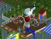
Subtle but great theming for this copter ride.
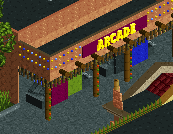
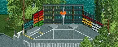
Arcade complete with custom made games to be seen, with flashing light adorning the building.
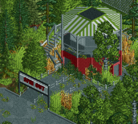
A now defunct ride in the park's center, covered in overgrowth. Awesome. A spot for smokers disguises it's once proper entrance to the area.
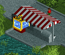
Look at the popcorn machine! LOOK AT IT! Mind blown.
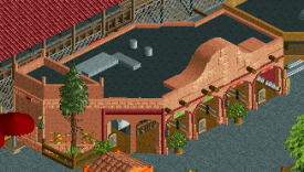
Another great counter service building. Red and green signs designate the open lines, with menus and potted plants outside. Looks like napkins and condiments line the wall!
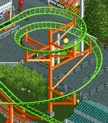
Great supports for Pandemonium. Pulled off cleanly and accurately.
I have some more I'd like to add but it's late, and the uploader's not letting me. Also hate how it stretches the smaller screens, but oh well. Well done, Rob! You have a park to be proud of! I'll try and post the couple more I have left tomorrow. -

 Steve
Offline
Here's the rest...
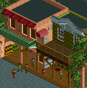
Some nice facades here, with detailed windows and cool door with an awning up top. Also more gifts can be seen inside stores.
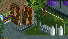
Killer custom rock climbing wall, accompanied by Gotham theming with pipes and do-dads.
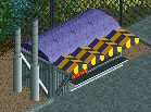
Awesome custom food cart outside of Gotham. Great colors here.
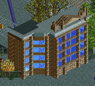
Really nice facade at the entrance of Gotham to give off the urban vibe in the area.
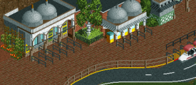
So much to see here: vines/flowers climbing the buildings, custom ticket prices signs, and th-- wait, how'd this get in here?
-

 alex
Offline
^ good idea. Here's a little things post for Liseberg by Lagom:
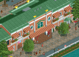
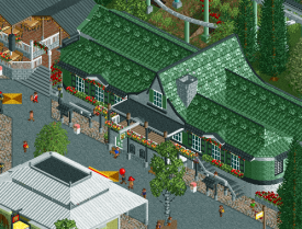
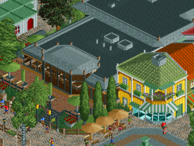
Generally what struck me as the most interesting thing about this park was the architecture. The traditional Scandinavian architecture was interesting because it's rarely seen on NE outside of themed areas - in this park it is the 'generic style' so to speak.
These two buildings stood out in particular because they felt incredibly Swedish but not in a cliched way:
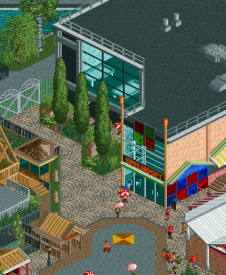
I also liked the friction between the traditional style buildings and the modernist/post-modern architecture. This is something I love about European cities and you captured it perfectly both inside and outside the park.
This subtle restaurant is a good example. The brown windows make it look very 80s:
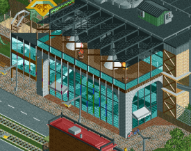
I like the awkward shapes and bare walls on this one:
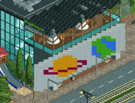
Then of course there is this stroke of genius:
-
 G Force
Offline
Going to highlight a few things from some of my favorite parks since H2H6
Extinction by Stoksy:
Wonderful detailing and midway games, curved roofs executed perfectly, monorail support, everything is immaculate: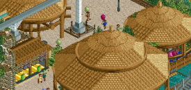
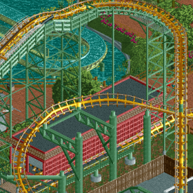
BGA by Robbie:
Phenomenal support work and transfer track house
Great terrain and backstage detailing:
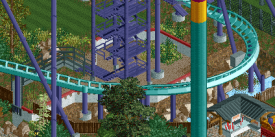
Awesome foliage and eating area details:
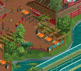
Thorpe Park by Airtime:
So much atmosphere and creativity in this little area, tent roof is the highlight for me:

Great queue, great backstage, wonderful integration of the abandoned dock and boat ride queue into the new coaster:
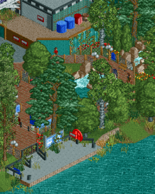
Top tier theming, 1k ruin usage, water, and spotlight placement:
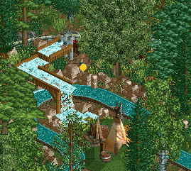
VIP eating area is wonderfully executed and incredibly believable and atmospheric:
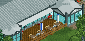
Lovely entrance area and theming, again, just so believable and atmospheric.
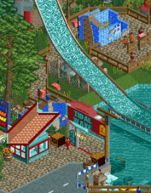
More post coming soon! -

 G Force
Offline
Starpointe by Pacificoaster:
Just a few of these things that make this the best full scale park ever:
PERFECT usage of diagonal here, accented by the train, just perfect:
Johnny Rockets logo is instantly recognizable, facade is very believable as well:
Wonderful little backstage building to fill in the space around the edges of the map:
Facade showcases seamless usage of trackitecture and is very believable:
Queue is instantly recognizable and the custom sign is perfect:
Lovely games building and a great use for the defunct chairlift support that blends perfectly:
I could just picture myself there:
-

 Scoop
Offline
Is this supposed to be a topic where we praise known amazing work or highlight work that isn't significant? I'm sincerely wondering too.
 Tags
Tags
- No Tags
