RCT Discussion / The little things...
-
 19-December 05
-

 J K
Offline
Ok quite a few screens just to show some details I added to Spiderman. Some of this is my best detailed work I'd say.
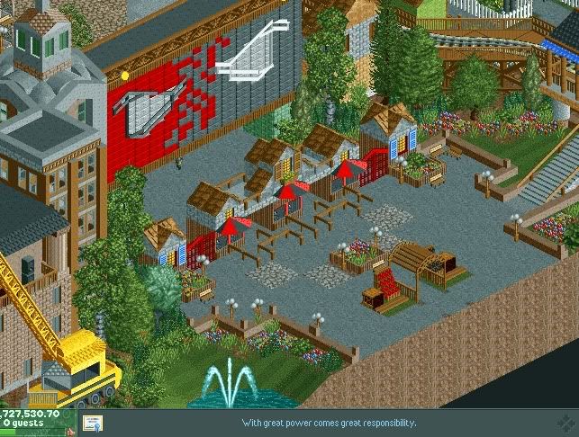
Ok a massive screen to start off but the facade was made up of such small objects. i couldn’t have really created the billboard inspired entrance with anything else as I really like the transition from dark suit to good suit.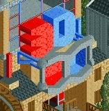
A 3d glasses symbol in front of the Spider sense experience ride. I love this detail.
A broken fire hydrant. Small but I think it works.
A drinks stall for guests to refresh themselves.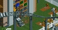
A moving animatronic symbiote attacking the church. A small hack but I wanted to add some movement to the area other than rides.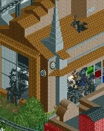
More symbiotes attacking the church. I love the messy-ness of this and the alien substance really reminds me of this dirty vine kind of being.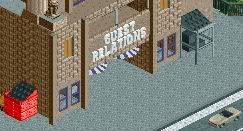
Some general theming around the city including a dumpster and working telephone box.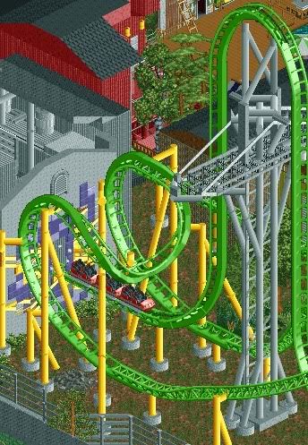
The best Roller coaster I have ever built. I love the themeing behind it as well as the main support structure. As a guest this would just make me say "wow". I love compact coasters and I just feel this one packs a punch.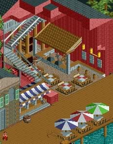
The insides of the lobster grill in the pier of the park.
An electric shock chair near electro so people can have fun with the attraction. There is a gauge behind the chair to show how powerful the shock is that you get. The walls to the side are even blown away to represent it being shocked by the attraction.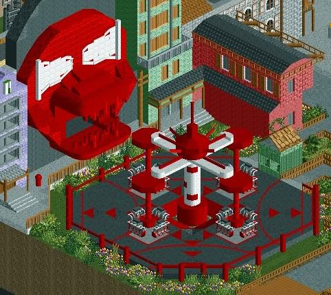
I added a lot of details to this thrill ride just so guests could get really involved with the ride. Anyone who knows Spiderman will notice the symbiote spray coming from his mouth.
Some unfinished building steelwork left in the sandman’s coaster area.
Quicksand scenery along the que for Sandstorm.
Even more scenery in Sandstorms que. I like the directional arrows as well as the traffic cones and construction tape.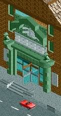
Nin's facade for the NY city bank. Beautiful.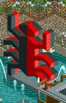
The spider symbol suggesting a good and bad side of the park.
Hog dog stand ftw!!!!!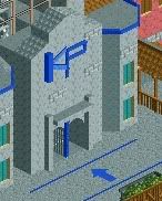
I love the que entrance and exit for Kingpin.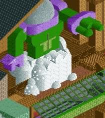
Mysterio at the heart of his illusion ride. This was hard to build but worth it as I really can imagine this in a real park.
Dock Ock's custom ride has his arms as the support grabbing the car waiting to fling guests through the air.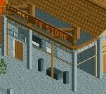
A TV store in the middle of the park. Massively bad idea for guests to haul a TV through the park but I like the detail I added to help the city shops and stalls out.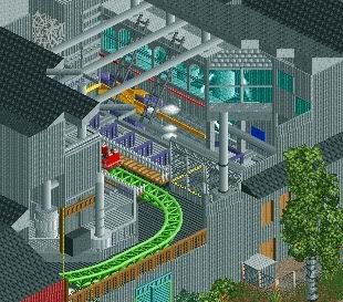
Nins godly station for Electro.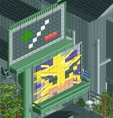
Also surrounding scenery including electros face as well as a positive and negative sign to carry on the electric theme.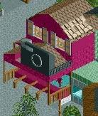
A camera shop. I love this little shop. Just such an easy detail and it suits the park so well.
That’s about it although i can think of a few more now I have done all this lol enjoy.
Liampie - Those were such nice details. It makes me love the park even more. I definitely look for things like this in work and I think your one of the games best for it at this current time. -

 K0NG
Offline
Louis!, on Jul 25 2009, 04:47 AM, said:

^It's not Six Frag's idea, CP6 did a coin horse in Firefly

I did a coin horse once. But I was really drunk and my bandmates triple dared me.
A couple of things I really liked from Belmont.......
Claw grab game thingy (not sure what they're actually called but, Gee brought it up and I made one).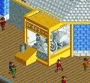
Newspaper racks by Bubba Gumps.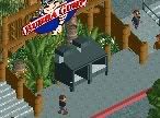
And the pay phone at 7-11.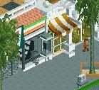
I dunno...I thought they were cool. -

inVersed Offline
Spidey got robbed. Should've won IMO. Though some areas were really lacking it was still overall a great park -

 J K
Offline
Nokia - thanks dude, for the time constraints and other problems I thought it came out so well.
Gee - I know I feel bad this park couldnt have some more of the sparkle that is represented in the screens but unfortunatly this was the best I could do for a Week 3 park. Still I think it wasnt far off.
K0NG - Lmao coin horse hey? The details are really nice. That claw grab is very fucking special.
InVersed - Your right, a lot of ideas were really lacking and thats why i got crucified. I feel bad I couldnt have put any more time into a park I loved so much but beleieve me when I say I worked like a bitch to complete this thing to its current standard. -

 Milo
Offline
hey thanks sammy and liampie
that was a nice little suprise to come in here and see that someone enjoyed my work enough to post some little things they liked about it. I think Tempest, for all its flaws, is by far my best rct experience so far because so much of it came out exactly as I pictured it in my head so there were very few times where there's that disappointment when you have to face up to the fact that the game just isn't able to execute what you have in your mind's eye. Tempest really just pulled together so well and looking at things like the bumper cars, station, docks, lighthouse, etc. and also what sammy posted... they all came together just as I wanted them to. The problem is that I'm having a hard time replicating that experience... I'm wondering if I ever will actually.
In a way it's the materialization of how I approach the game. The flaws aren't based off any sacrifices I had to make (because all the hacking shows I refuse to make any sacrices in with what I'm making) but were either done in ignorance, lack of experience and/or lack of caring for certain aspects of the game. It's a great representation of where I like to picture myself and because of that is a very personal piece of rct work for me.
To me that is the core of the discussion of how people choose to play this game. Personally I want to make a place I'd love to be in and a place others might find beautiful, or at the very least, interesting. Others want their work to be the pinnacle of functionality with great layouts and organization either as a photocopy of real life (or real life locations) or from the perspective of the rct peeps. Still others want a functional but also beautiful work that mixes the best elements of both. -

 Goliath123
Offline
Ok i've decided to do things i like and dislike in Zippo's so here ya'll go.
This little ruin by the rapids is very nice and picturesque.
I didn't like this, the not fully supported coaster, also why no footers?
This is just great! Imagine entering the cannibal section walking right through an immelman, great placement.
My favourite train station in the park.
Also very nice
Best coaster station in the park and one of my all time favourites
What a great turnaround! Really good themeing and placement here
Yet again, great architecture
Great eatery, you've got the coaster roaring by, more good placement
Lots of good stuff here, especially the hammer game and prizes
This has to be the best placement ever for a dodgems ride, simply incredible
One of the best finale helixes i've seen for a while
Very nice turn here with the drop in the background
The best station area i've ever seen. Youv'e got the path and the smoke effects in the broken wall, just awesome
Hahahaha
Love the themeing in this queue line
I just like the theming and the entrance stucture
Again great park but i was just a little dissapointed with some things. -

 Casimir
Offline
I think you might've forgotten to point out what exactly you don't like.
As stated in your message before. -

 Xophe
Offline
Haha yes that's a new one - little things that you don't like. But I'm glad you only picked one! What do you mean by not fully supported though? I was basing the supports off Dragon Khan where the footers are hidden under the grass to make it look more natural. (But also because there wasn't any room to put footers under the slanted supports haha)
And I just noticed a mistake in that screen of the burning house. Those map racks that are sticking out of the building used to be little wooden poles until I switched the objects in Dimport haha! -

 Goliath123
Offline
You should look closely there's normal coaster supports that come with the game throughout the coaster.
Looks like no one bothered to check out BGNA when i mentioned the gardens had been done before with the side friction coaster
Oh, and steve are you being sarcastic? I can't tell -

 Xophe
Offline
Oh I see what you mean about mixing custom with default supports. I thought it looked ok though. And by the way, BGNA was released in November 2008 but I showed a screen of the gardens with side friction track in June 2008
-

 zburns999
Offline
The best "little thing" in Zippo's was the fish food guy in the river. I'm so glad I scrolled down the river to see that lol.
 -

 Steve
Offline
I was being sarcastic mostly.
BGNA may have done the side friction detail before Xophe implemented it in Zippo's, but there is such thing as taking an idea, recycling it, and improving and expanding on it. Xophe did that. Just because someone did it first means nothing. I suppose next you're going to tell me I can't build a log flume with a double drop just because SAC did it first in Rivers of Babylon.
 Tags
Tags
- No Tags


