(Archive) Advertising District / IOA
-
 09-December 05
-

 Turtle
Offline
I don't think it's very practical... What is the reason for the guest walking round that bit of path? It looks nice, but I hope there's something to the left of the screen that I can't see... Maybe a few more buildings and a few less patches of foliage?
 -

 postit
Offline
I don't know what to think. I love some of it, and don't like some of it. I thought this was the Seuss area when I first saw it, so maybe that's a bad thing. I thought the toon area had more pastel colors and low, small architecture. I don't know, maybe I'll just wait and see how it turns out.
 -

 penguinBOB
Offline
there needs to be more wacky theming, cause the buildings alone can't carry this theme.
 -
 Loopy
Offline
Thanks for all the comments so far, this is a very hard theme to do and is something very new for me so im trying all i can to do it well. I have added more to it now so it is looking slightly better.
Thanks alot -

 Loopy
Offline
Its been 2 months since the last update so i thought id give a quick progress report
Port of Entry= 100%
Utopian Market= 100%
 = 65%
= 65%
 = 0%
= 0%
Jurrasic Park= 70%
Marvel= 3%
Toon Island= 90%
Overall Completion= About 59.4%
This is getting completed slowly but surely, im hoping for a release towards the end of summer if possible (maybe sooner depends whether i have time to play or not)
Expect a screen sometime in the next couple of weeks but that may be the last update with a screen in until the parks release.
Thanks -

 Loopy
Offline
Well its been a long while since anyone heard anything about this project and to be honest I havnt really been working on it alot. I picked it up a couple of days ago and thought maybe I should give the marvel area another go. So heres a screen of the areas main coaster 'Captain America' its an Intanim Rocket Coaster with a simple and similar design compared to Stealth at Thorpe Park. It doesnt feature the usual turn around at the top of the hill as the other rocket coasters people create in LL
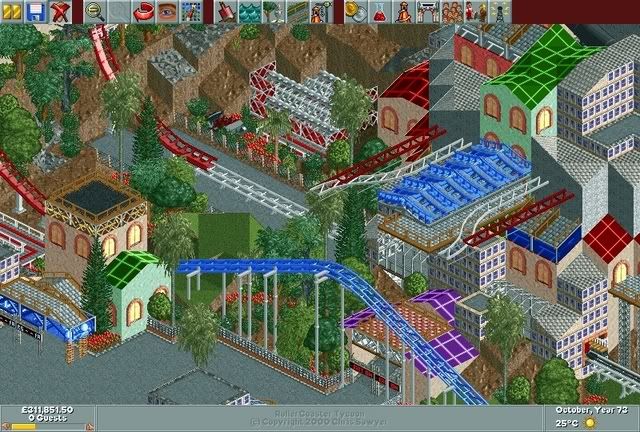
The screen is not totally 100% final yet so there could be some details missing, I just wanted to show that this project is still going.
Thanks -

 RCFanB&M
Offline
Looks nice...
I like the way you made the Intamin track (with the mini coaster tracks). The buildings are ok, I like the colors you chose for them. I just don't like very much the glass walls you used...they don't fit very well.
Anyway, this park has a pleasant atmosphere, looking forward to more updates. Keep going. -

 Leighx
Offline
I like it alot.....
Something about the overall look of the screen makes it look really good.
I think its the landscaping with the grass because that grass is perfect like that. foliage also great....
yeh i like itl........ nothing bad -

 Milo
Offline
I'm glad this project is still going. I was a little worried.
Anyway the screen is nice. It looks like to got some nice trackitecture going there and some nice details. On a whole, the archy seems a little random but I think this are might be one that comes together when you see it in game. Keep going with this. -

 artist
Offline
Dude...this is awesome. I love it.
The colours are perfect and you have got the foliage just right. My only suggestions, add some benchs and lamps.
Great work Ad. cant wait to see more.
Btw i checked the older version out and i agree this version is alot better. Duelers were amazing though. -

 sfgadv02
Offline
Very interesting screen, I like the themeing and looks very Marvel-ish, but the double tracks dont look right, it would had been better if you put them diagonally.
 -

 JDP
Offline
I really like that screen. Everything seems cluttered, but it looks good if you know what i mean. Great job.
-JDP -

 tracidEdge
Offline
i hate it and it totally sucks just give up.
by which i mean the complete opposite.
hah. -

 Drew
Offline
[font="Lucida Sans Unicode"]Very interesting screen, I like the themeing and looks very Marvel-ish, but the double tracks dont look right, it would had been better if you put them diagonally.
I don't think you can have a banked hill of any kind in RCT. I think you can only do that in RCT2.
I'm trying to think if it's possible, but I don't think so.
I think the only way you can do the diagonal track, like I think you're talking about, is when it's just a straightaway.
Anyway, I think it is looking great. I looked back at your previous screens and made me remember how much I was looking forward to this park. Glad to know LL is still getting some love.
Can't wait to see it in-game.
Keep up the great work.[/font]Edited by Drew, 26 September 2006 - 08:57 PM.
-

 Loopy
Offline
No it isnt possible in LL. Thats the only way to do it i do believe if you want it like it through alot of the track.
Thanks alot for all the possitive comments so far. Slowly but surely its getting done. -

 Trajan
Offline
[font="Lucida Sans Unicode"]
I don't think you can have a banked hill of any kind in RCT. I think you can only do that in RCT2.
I'm trying to think if it's possible, but I don't think so.
I think the only way you can do the diagonal track, like I think you're talking about, is when it's just a straightaway.
Anyway, I think it is looking great. I looked back at your previous screens and made me remember how much I was looking forward to this park. Glad to know LL is still getting some love.
Can't wait to see it in-game.
Keep up the great work.[/font]
*sigh* A font user. Remember when Posix used to always type in tahoma? -

 Panic
Offline
I do hope that Kumba and Cork consider this for spotlight, or at the very least SRU, in spite of it being built in an older style.
 -

inVersed Offline
Wonderful screen. The only thing I am not to sure of is the length of the straight away.. it seems very short for a rocket coaster.
 Tags
Tags
- No Tags
