(Archive) Advertising District / Enchanted Adventures
-
 29-November 05
-

 Xenon
Offline
Great job on the Mexican theme. The space theme seems pretty well done too. The entrance an mainstreet areas seem kind of ermm.
 -

 Turtle
Offline
Screen 1 - Looks nice, a nice blend of colours. Vegetation is nice, without being especially futuristic...
Screen 2 - I like it. It's quite small.
Screen 3 - I'm a sucker for enclosed plazas when done right, and this one is definitely done right. Excellent. I'd change the flowers to the original ones, but that's just me. Everything else is excellent. -

 laz0rz
Offline
Once again, I love the use of wooden coaster as a roof. And the 1/4 tile work is amazing, especially on that merchandise roof. It seems like you're really putting a lot of thought into what you're building, something most n00bs (and I know you're not new to parkmaking, just NE) don't do. I see a great career for you.
Oh, and Turtle, there's four screens there, not three.Edited by laz0rz, 06 December 2005 - 06:12 PM.
-

 Ride6
Offline
The 3rd screen in the new update fails to excite me, though it serves it purpose just fine. The three others though are supremly unbelievible. The first two screen's colors, textures, foldige and even the custom ride mix in a way that's very convincing. The last screen, as turtle said, shows a courtyard used to it's best. I don't like the custom flowers over on the left of the screen there but the over all composition is brilliant, to the extent that I should study it a bit because i've always had a hard time making something so convincing.
ride6 -

 Turtle
Offline
I'm sorry, I didn't see that the first two screens were actually two.
Please forgive me. -

 Transplant
Offline
wanted to ask if anyone would like to help me with this park,cause i seam to lose interest. but i already got so far that i don´ßt wanna throw it away. so if anyone would like to join just write it down here
 -

 Xenon
Offline
The first two screens are okay. The third screen is kind of boring, there's nothing that really stands out about the buildings. The fourth is awesome and very well themed.
 -

 Transplant
Offline
has been a few days, since the last update and i also haven´t built so much. all i can show you by now is a screen of the new area that i´ve started last friday or something.i know it isn´t much, but better than nothing.
guess that it will take a while until i post more screens of this area, so enjoy this one.
Edited by Transplant, 12 December 2005 - 05:44 PM.
-

 Phatage
Offline
tons of little details here, in a screen that at first seems like virtually nothing. All executed very well too, only that part where the land is being supported by the poles, the plane where the poles meet the land looks a little too man-made when it wouldn't be if those poles were there to support it. Nice job.
 -

 Turtle
Offline
Oh, wow. So many details, as Phatage said...
I don't like the colour blend, maybe the dull flowers are throwing it off? I've never liked those sort of flowers anyway... -

 Xenon
Offline
Nice how you fit so much into such a small area. I also like how you used color in a mine train ride. Usually they end up having a lot of browns and reds.
 -

 Transplant
Offline
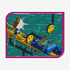
i thought that i wouldn´t have any time to build something new, but somehow i found it. i started to theme the area around a new river-rapid ride and also i brought you a screen which shows the real shape of the "mine-train". actually this mine-train is just a small part of a looping coaster.
now then to the screens:
what may lurk in those hollows?!
a part of the area and the rapid-station:
.......ain´t that a smooth transition......

just wanted to mention (once more), that all screens are unfinished
your turn.........
any suggestions??Edited by Transplant, 17 December 2005 - 05:38 AM.
-

 X250
Offline
Yes, sorry forgot to reply. They look good, the mine theme is definitly present there, and i am a big fan of the supports on the water ride. Good job.
-X-
 Tags
Tags
- No Tags


