(Archive) Advertising District / New Concept
-
 20-November 05
-

 JDP
Offline
creative with the whole dragon idea...very different...
JDP
Offline
creative with the whole dragon idea...very different...Edited by JDP, 28 November 2005 - 11:32 AM.
-

 Ride6
Offline
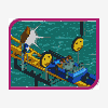
Very nice, great use of invisible track. Now the theming idea, while being creative, isn't all that original. The storyline leading either to or from the scene here could really make to break the ride, particularly with the dull colors and general lack of architecture.
ride6 -

 egg_head
Offline
In this area I was inspired by this painting.
I looked at it once and had the whole story in my head.
Then i build it and it turned out a bit different then the picture but i think its nice.
So there is no archy in the screen, but there is in the area. old ruins and wooden buildings from people who rediscovered that area after hundrets of years...
The ride don't meet this much archytechture but there are old aquaducts and overgrown towers deep in the forests. -

 RCTCA
Offline
This park is turning out really well. I like the dragon especially.
P.S. Can you send me your old project that you lost interest in. I really like it. My email is: nicholas@laselva.com. Thanks.
Edited by parkmaker, 28 November 2005 - 01:49 PM.
-

 FezziSusan
Offline
dragon...
Yes, a dragon, a beast, ferocious, or is it?
Is it Grendel or Puff the Magic?
I choose to interpet it as Grendel-like, with a certain child-like charm. Oh, what an emotional complex, especially for we humans, not to mention the dragons!
If I were to participate in such an attraction, it would inspire me to thought. I applaud your efforts.Edited by FezziSusan, 01 December 2005 - 04:24 PM.
-

 egg_head
Offline
The Sign of this Adventureride.
You can also see some parts of the ruins.
I hope you'll like it.
-

 Kumba
Offline
Make the second "o" in blood 1 notch higher. I really like the way this park is turning out, great use of realistic details, nice to see people thinking outside the box.
 -

 J K
Offline
I like that alot, it makes the park more realistic when people add the little details like you've done, good job.
 -

PBJ Offline
nice egg...
very nice... i love the letters... and i look forward for this park...
it's very grey... but it's very wel done... the green of the plants\thee's breaks the whole grey "block"... if you know what i mean... -

 Phatage
Offline
If you could some how find a way to create blood droplets or something that looks like running blood (please not coloured waterfalls), then bam.
 Tags
Tags
- No Tags


