Park / Cannonball

33 Comments

  • Corkscrewed%s's Photo
    Posted Image

    Cannonball

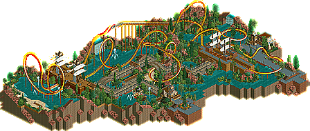
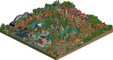
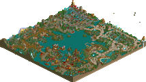
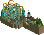
    What's this? posix playing RCT 2??? Blasphemy! Fresh off the heels of a Design that showcases the latest in brilliant RCT 2 engineering, New Element is proud to present one that full of old school nostalgia, substance, and beauty. It's not the eyecandy that ArchAngel is, but that doesn't mean it's not worth looking at. There's a sense of fullness in this Design that a lot of RCT 2 creations lack these days. Maybe that's because posix, a veteran of LL, has used that experience in crafting this coaster.
  • Evil WME%s's Photo
    Lovely posix. and i love the fact you used custom objects, even though very little. To me that's a much smarter choice than banning them alltogether and calling it "OMG no custom scenery". The coaster was nice, not the best yet not the worst either. And some of it screamed classic posix. The landscaping was definitely well done. Please please concider giving rct2 more chances than this, you know you can make it work!
  • Panic%s's Photo
    THAT'S IT, THE RCT2 DESIGN STREAK IS GOING DOWN.
  • X250%s's Photo
    lol. Nice job Posix, the layout was done very well- extremely well paced till the very end. It is strange how there is not much architecture there, but yet it looks 'full', its hard to put. Nice job though, does this mean your entering PT2 using RCT2? I wonder... ;)

    -X-
  • Magnus%s's Photo
    congrats phil
    i had the honour to make you play rct2 (:p) and also saw the design before it was officially released.
    you really deserve this design phil.

    and please play some more rct2. you really managed to get my favourite rct2er just with this one design.
  • artist%s's Photo
    OH MY FUCKING GOD!! PHIL!!

    you seriously have made one of my most favourite coasters yet and to top it off your playing rct2, we need to talk today, seriously.

    congrats man
  • mantis%s's Photo
    I love that oversized batwing - I always thought of doing it with merged vertical coaster in LL but it always looked cumbersome. Glad to see you doing it in rct2 (even though it is you playing rct2, which is verging on unforgivable :p)
  • posix%s's Photo
    hehe, i know. i can't wait to get back to ll, honestly.
    might give rct2 another try in the future though, we'll see.

    cork, i don't understand, why would you kill the welcoming message. i had planned it since very early stages of the project's developement and liked it a lot. :(
    thanks for the awesome logo though. i'm loving that.
  • Ride6%s's Photo
    Posix still has it! Something beautiful because of simplisity without minimalism. The colors and textures used are absolutly heavenly. The sand under the ride with the red rock and the thick tropical/sub tropical folidge. Beautiful. The lack of architecture didn't matter too much with the near-perfect landscaping and treeing along with the theming of the ships, which I guess could count as "architecture". The few buildings that were there served their purpose without distracting even slightly from center of attention, the ride. Which reminds me, Cannonball itself is a rather perfect too. The pacing is wonderful and the colors couldn'tve been better.

    Good to have the you back that I love posix. Beautiful simplisity without becoming minimalistic, please continue with that.

    ride6
  • inVersed%s's Photo
    In no means is this the greatest NE Design, but it was pretty damn fun to look at. The archy was solid, yet nothing great, but it really wonderfully captured the pirate layout. Yet I am stunned that you built in RCT2. Well Done Man
  • JKay%s's Photo
    What a fun ride this was! I loved everybit of the coaster design itself; every inversion perfectly timed and placed. The theming definitely fit your minimalisticness, but its just wonderful to see you doing some RCT2 now. :D
  • Geoff%s's Photo
    I knew this day would come.

    I enjoyed it. Not my favorite thing, but a very good firstie. The layout was excellent. Lovely pacing, and concept.
  • Dixon Steele%s's Photo
    This just proves that no matter what game you build in, skill is skill. Very nice work, Posix.
  • postit%s's Photo
    Well yeah, the foliage was excellent and it oozed experience in things like that photo spot, which couldn't have been placed better, but it still had some problems. I thought the beginning half of the ride was too slow, the second half too fast. Why was it necessary to use an alternate paint scheme thrown in here and there? The brakes clearly were pointless because they didn't slow the coaster down at all...

    Yes it showed years of experience and overall great composition, but I guess I don't really like the style much.
  • Corkscrewed%s's Photo

    [font="tahoma"]hehe, i know. i can't wait to get back to ll, honestly.
    might give rct2 another try in the future though, we'll see.

    cork, i don't understand, why would you kill the welcoming message. i had planned it since very early stages of the project's developement and liked it a lot. :(
    thanks for the awesome logo though. i'm loving that.[/font]

    Oh shit... the message!

    Argh... what I did was I thought the file did not export scenery, so I saved over it with scenery exported, and I totally forgot about the message!!! :(

    I'm just going to upload the version you sent me instead, and if there's a problem, then we'll deal with it then.

    Many apologies!


    Okay guys... DOWNLOAD IT AGAIN!!!!!!!!!!!!!!!!!!!!!!!!!!!!!!!!!!


    EDIT:

    The brakes clearly were pointless because they didn't slow the coaster down at all...


    A midcourse break run doesn't necessarily have to stop the coaster. They could have simply been trims.. if the coaster is going too fast, then it slows it down, but if not, it keeps it going. I've been on coasters where that's the case. Actually, Expedition Ge-Force has like four trims that only tweak speed (but also act as block section dividers), and you really don't notice them unless your train is seriously front-heavy and is going too fast.

    Although I would have like a catwalk or something on the MCBR. :D
  • postit%s's Photo
    Yes, but when I see brakes, I'd like to see the coaster slow down. If the brakes slowed the ride, the second half wouldn't be so fast. Whatever.
  • Jellybones%s's Photo
    Best logo ever.
    More logos with pirates, less with moons and stars and boring shit like that.

    Pirates are the coolest.
  • artist%s's Photo

    Best logo ever.
    More logos with pirates, less with moons and stars and boring shit like that.

    Pirates are the coolest.

    there is only one with moons and stars :fuck you:
  • sloB%s's Photo
    that logo is pretty pimp.

    but yeah, good work posix. you know you flattered me by trying rct2 out, you didn't have to do that.
    you might not have enjoyed playing the game, but i think the final result of your work is fantastic. great layout, awesome queue line and exit pathway placement. the whole thing was just really fun to explore. i also was surprised - and happy - to see you used the black tiles to get rid of the rest of the land. didn't think you'd bust out custom scenery like that. anyway, thanks for this but just play the game that you enjoy more.
  • CoasterForce%s's Photo
    I quite liked it, one of the better designs recently IMO. I couldn't think of a more accurate word to describe this as "fun"...it all was just very enjoyable to look through. It was also very composed and seemed to have more to it than most RCT2 work. My favorite part was the Immelman which was very well placed. I thought all the inversions were timed nicely and the ride never seemed to lose its pace until the end, which I thought was more of a plus rather than a negative. Also very nice use of that martian land type...worked well here and it's hard to achieve that.

    Good work Posix...hopefully you'll have the inspiration to make an RCT2 park someday...but you build what you enjoy to do, so do what you want in your RCT career. But your LL work still is awesome, so keep up the good work anyway.