(Archive) Advertising District / Project K
-
 31-July 05
-
 marinersfan59
Offline
Before anyone asks about the name, the K means nothing really. I just don't like to build a park to conform to a name.
I posted a preview screen of this park at the last Fiesta, but I'll post that one here again, just to remind everyone.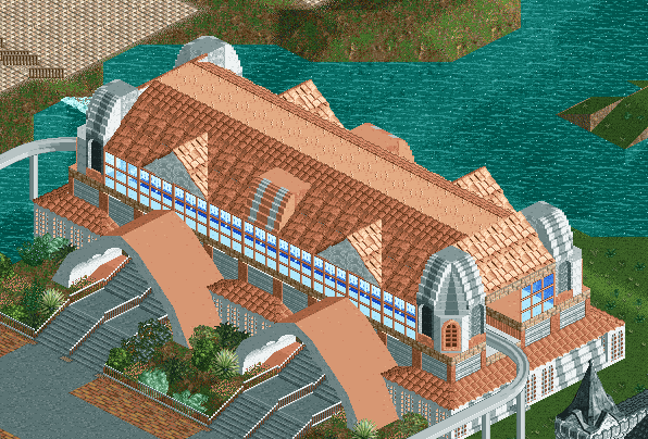
Monorail Station (tight turns have since been changed)
So I'm now getting close to the halfway mark of building this park, so I might as well post an update on it.
Just like any person, things that I see influence my work. Earlier this month, I got back from a trip to Alaska, which was easily the best vacation of my life. One thing that I really enjoyed seeing was a bridge that I saw while on a downhill mountain biking trip near Skagway, Alaska. It was a one-sided suspension bridge, something not seen too often. Here's a picture of it. (Yes, we were in the clouds)
I decided to put something similar into this project, which can be seen here. Near the top some zero-clearanceing will need to be done and the landscaping isn't complete, but you can easily see what the bridge will look like.
Thanks for checking this out, and I look forward to comments/criticism. -

 Atlus
Offline
Mmm...you're attempting too big. Go for small adjoining buildings to ultimately create a bigger one. This one has a dull and unimaginatvie shape, so it's hard to roof as a consequence. You can make much more detailed work with 2x2's.
 -

 Fisheye
Offline
I like the monorail station. To what Atlus said, i think you can put plenty of 2x2 buildings in the actual park, the monorail station is a lot like most i see in real parks, its not too big or underdetailed.
 -

 Phatage
Offline
I've liked you past work and this is no exception. I do think however that the suspension bridge should be more minimalistic like the pic as that seems to be the point of those bridges in modern times.
 -

inVersed Offline
The buildings very nicely detailed but it just doesnt go. It seems like a blocky building that is very detailed. I think Atlus gave you good advise about trying smaller buildings -

 SirSpinster
Offline
If you want to conform to a lot of other parks, make smaller buildings. If not, keep building like that. I think it looks great...nice detail and colors, and building large attractive structures will make your park stand out from the others.
I don't like the bridge, though. It looks too awkward and bulky and the gray is pretty ugly. Nice attempt, though; it would be cool to see one of those bridges done well in the game. -
 marinersfan59
Offline
I'll see what I can do about making the bridge better, but I want to try to keep it as true to reality as possible, gonna be a tough balance. As for the monorail station, I might make a few small changes, but like what SirSpinster said, I'm not gonna conform to others' styles. I may make a few small changes to it, but it's about 50/50 for people that like it and those who don't, and I'm happy with it, so for the most part, it's going to stay like that.
Here's a new quick screen:
-=-Click Here for screen-=- -

 Scorchio
Offline
That green building, combined with the contrast of the peach building next to it - nah dude, reminds me of a tuna milkshake, which is SO not good.
 -

 Ge-Ride
Offline
I think that some of the roof scenery clashes. Other than that, it's great. P.S. Mind if I steal that avatar?
 -

Rhynos Offline
Although atm the buildings do clash w/o foliage, I tihnk with it added, it could be the icing to your cake or the black eye to your park. Good buildings, but if they don't look good with the scenery in it, then you might have to change colors of change a building. -
Xcoaster Offline
I really love the monorail station, especially the two arches in front. Those really make it stand out for me, as they bring it together and add more detail that makes it less blocky. This new screen I don't care for though. The bridge is too drab with the grey and brown, while one of the other buildings is too much peach (Mostly just changing the flooring and the wood to a different color to have more of a contrast within the building would do it), and the final building has too many varying colors. So first, change the colors a bit so that each building functions on its own, then maybe try to have some cohesion between the buildings. The arcitecture itself is generally pretty good, though I'm having a hard time really grasping the wooden bridge. It almost looks like a pagoda style covering for the path. Finally, the peach building looks like it might need some supports for the overhang on the left, by the bridge.
 Tags
Tags
- No Tags
