(Archive) Advertising District / Port Azure
-
 30-June 05
-

 Metropole
Offline
You've come leaps and bounds Splash. Looks awesome. Although a little dull to look at, what you have done is quality work. Keep it up.
Metro
-

 Turtle
Offline
You've definitely come on a lot recently.
Screen 1 - Maybe just slightly too much of the dull brown colour, but since I don't know the theme you're going for, that could be right. I've never liked those flowers, but it's really up to you about that. The colour of them works really well. The top left building is by far the best. The path is a bit too straight and uniform for me, maybe make it a bit more random with seating areas and the like.
Screen 2 - I'm glad you've changed the path to dirt, it will fit a lot better. The architecture again is superb, good use of foliage and flowers here. The above point about the uniform path applies here too, especially in a jungle environment.
I'm very impressed, though, really nice stuff. -

 Splash-0
Offline
No, the project isn't dead.
Progress is going pretty fast again. I have taken a brake for several months from rct, but I must say I'm more motivated to continue building than before.
After 7 months of building the project is shaping up quite well. The overall percentage of completion is somewhere around 60%. Construction has started on all 4 areas. One area is already finished, another is done for 70% and the other two are about halfway done. However the 2 new areas will remain secret till the park is done.
Here are two new screens:
The entrance area, and the junior coaster which is shown is called 'hillibilly'
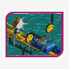
The jungle area, Port Azures monorail and an unnamed splash ride is shown
Hope you like the screens,
Feedback is welcome. -

 Phatage
Offline
That second screen has a great atmosphere, the lack of architecture really works here. The monorail's colors can use some work, as well as the supports of the queue line.
 -

 hobbes
Offline
The first screen looks really bland right now, I'd try to add a brighter color in there to make it more interesting. You do have it on the magic carpet, annd that looks good, so keep going with it and color the buildings a bit as well.
The second screen looks wonderful, except the two things Phatage pointed out. I do love the covering you designed for the que line though, that's awesome. And I think the bridges look excellent. -

 newk
Offline
i agree with hobbes.
will the park be peep friendly? if not then i suggest using scenery for the bridges maybe creating something like a covered bridge. do whatever looks nice to you. keep going, this will be a great park! -

 laz0rz
Offline
And thanks for bringing up a 6 month old post that someone already responded to!Mmm. I disagree.
The screen looks ok. Nothing different; a good quality. But I think it's time somebody moved on, architecturally, in rct2.
----------------------------------------------------------------------------------------------
Looks waaaaaaaaaay too much like everything else. It's good, but I can see Kevin, SA, Steve, Xophe, Turtle, Drew... -

 Jazz
Offline
The 1st screen is very bland and shows no creative value. The only contrast in the screen is the Magic Carpet. I think if you put more of those bright colors in there, it would look a lot better. Good, detailed archy though. The 2nd screen has much better atmosphere. Foilage is great, but, the monorail colors and path support could use some work. Also, maybe a border fence around the path?
Great work overall.
~Jazz~ -

PBJ Offline
looking at the 4 screens you posted here i must say we got here a winner! from the screens i see i think we got a big winner!
screen 1:
Nice use of 1\4 objects... it gives me a very big arabic feeling. maybe try some other colors on the flowers. a very pale\light blue can make it better (maybe)...
Screen 2:
when i first saw this screen the big thing i saw as the woody.. itlooks great.. i like the way the track bend over the queling line! maybe use less yellow flowers on one tile... and place some fences. never the less great work (again)
Screen 3:
again, like i said about the first screen, great 1/4 object work... it fits well togetter...
screen 4:
nice folige.. but leave out the forrest tree's. (the one at the end of the bridge at the left side) the building at the bottem looks nice, like the rest of the screen
-

 Splash-0
Offline
Thanks for the comments, they really help me.
Phatage, yea the colors of the monorail aren't that good. It're the default colors rct gave me and I somehow started to like it. But you're not the first one to complain about them so I'll see what I can do. Concerning the supports of the queue line; I really like them and it's just a minor detail so I don't think much will be changed.
Corky, the bridge is quite bare yes but it was meant to look like this. But taking it back into reconsideration I might add a fence or something else to make it a little more interesting. Not too much though because I don't want to over theme this area.
Hobbes, since you're by far not the first person to complain about the lack of colors in the entrance area I have taken your advice. I have been experimenting with the dark red color. I put in some red flowers and some roofs and windows were repainted in red. As a result, I must say that it does look good but if it's really better I don't know. So I'll be playing around with that a bit more. With the next update I'll show you how it looks.
Newk, no the park wont be peep friendly. Covering the bridge will result into over theming in my opinion. I will probably add a fence to the bridge though.
Atlus and LaLorz, well yea I agree that it looks similar but don't only blame me for that. All the rct2 work lately looks the same in my opinion with a few rct2 works being an exception. This is the style I like and suits me the best. I am doing my best however to make something new but is damn hard.
If you can do better, show me. Otherwise stop complaining.
Jazz, yep. See what i wrote to Hobbes.
All the others thanks for the replies.
Progress is going pretty fast as I have got Christmas holiday and hardly any homework. The entrance area is done for about 85% now and as soon as this area is finished I will move on to the next one.
Dunno when the next update is, but I can guarantee you that It will come!
 Tags
Tags
- No Tags


