(Archive) Advertising District / New LL Park
-
 01-June 05
-

 deanosrs
Offline
At the moment, it looks like you're building massive areas of pathing, then deleting things here and there. Try putting buildings and rides first, and pathing latter.
 -

 Carl
Offline
personally i would put in the rides first, but thats just me
definitely needs more rides anyway, and more buildings, and not just the little 2x2 or 2x3 building either. -

 rctfreak2000
Offline
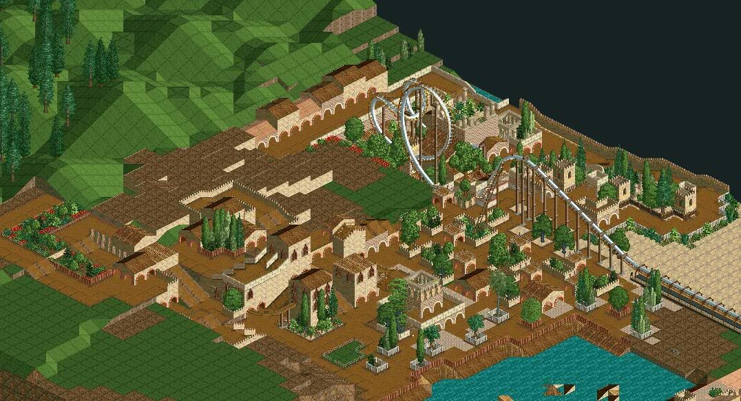
Well if it isn't the pot calling the kettle black...I'm sorry, but I find this utterly repulsive. The buildings are somewhat blocky, and the building that isn't just doesnt look right.
-

 trav
Offline
You're improving, it looks good. But I'm thinking it might be a little quick through the Cobra Roll.
Also, at the top, theres a row of buildings, maybe try some windows or coaster awnings? -

 RCTCheater
Offline
Coaster is unfinished, I will slow it down.
The row of buildings are also unifinished, but I like the idea of coaster awnings, I will try that out and post un updated screen later tonight.
more comments please.
-

inVersed Offline
It looks quite nice.
My biggest complaint is the coaster. I really don't like how it goes from a large loop to what appears to be a small, element directly after it. I looks like it would be very painful. Another thing I think you should do is experiment with buildings on a larger scale instead of these 1-2 level, 1x1 or 2x2 structures. Still as I said it is quite nice -

 Scorchio
Offline
Under the lift hill, I notice how you've broken up the path with single tiles. Good idea, but maybe not directly benteath the lift as this has caused an unnecessary amount of coaster supports.
 -

 spiderman
Offline
My main problem with that screen is that it is unfinished. I feel like theres barely anything to comment on...
 -

 CoasterForce
Offline
As said before the fact that it's unfinished hurts the screen a lot, but in addition to that I think the archy is uncreative, boring, and has no appeal. Try to vary it up a bit, I don't know. The pathing is also kind of strange, but it will be interesting to see how it turns out.
 -

 natelox
Offline
Suggestions for improvment:
-I doubt that the coaster makes it around the first inversion, but if it does, there is no way it is moving more than 5mph while accomplishing this. It defiently needs more speed/taller lift hill. Secondly, the ratings on this coaster must be off the chart unbareable. Going through a cobra roll, at the top, pushing 40-45mph (Or more?) is not plesent. Bring the ride above ground. A roller coaster with only three elements (Lift, Verticle Inversion, Cobra Roll) above ground is not very intriguing. The supports don't work too well. If you must use those kind of supports however, place them all along the track and remove the supports that come with the ride to give it some authenticity.
-The river banks would look better in something more nature, grass, mud or my favorite, rocks! I'm not sure rocks would fit, but grass with some trees would work well. Don't be afraid to have the path interact with the river aswell. Bring it right to the edge, it doesn't need a bank for its entire length.
There are a few other things, but those bother me the most. Looks like you're on the right track though. Colours are great. -

 JKay
Offline
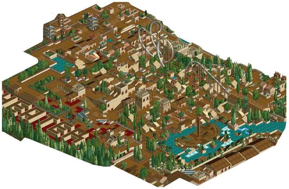
Reminds me of guljam's work. Pretty sub-standard to be considered excellent LL work these days, but it still isn't bad. Your architecture is really scattered and not really meaningful to me. I guess you could consider most of it theming, but plain old 2x2 buildings just don't cut it for me anymore. My favorite part would be the ship in the river; the rest, blah. I'd say finish and release it tho.
 -

inVersed Offline
For the 1st time I actually kinda like a screen from this park. It looks pretty good to me, there are some quite blocky buildings such as the coaster station. But I can say one thing my friend you are gonna have a rough time finishing the that layout and still making it look descent. good luck. -

 spiderman
Offline
It looks average, kinda boring, I could make a better judgement if the screen was zoomed in more.
 Tags
Tags
- No Tags
