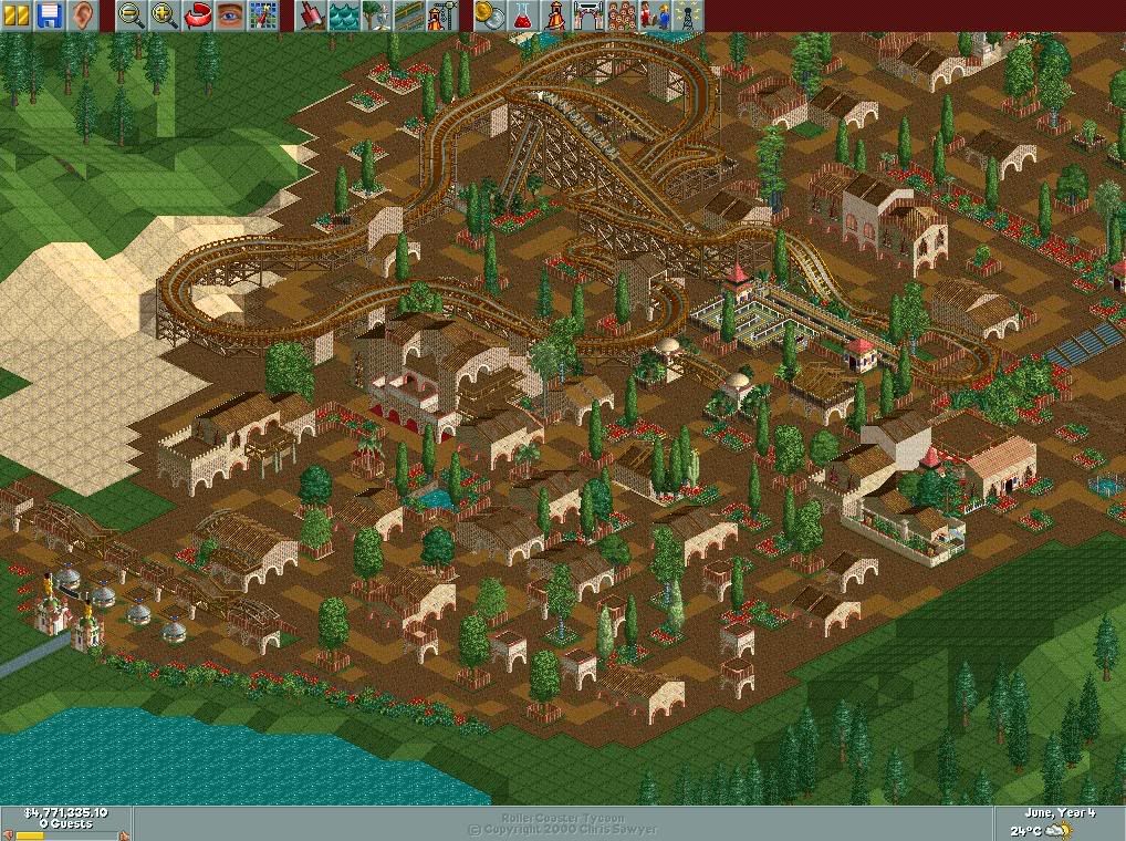
(Archive) Advertising District / New LL Park
-
 01-June 05
-

 RCTCheater
Offline
New Un-named LL park.
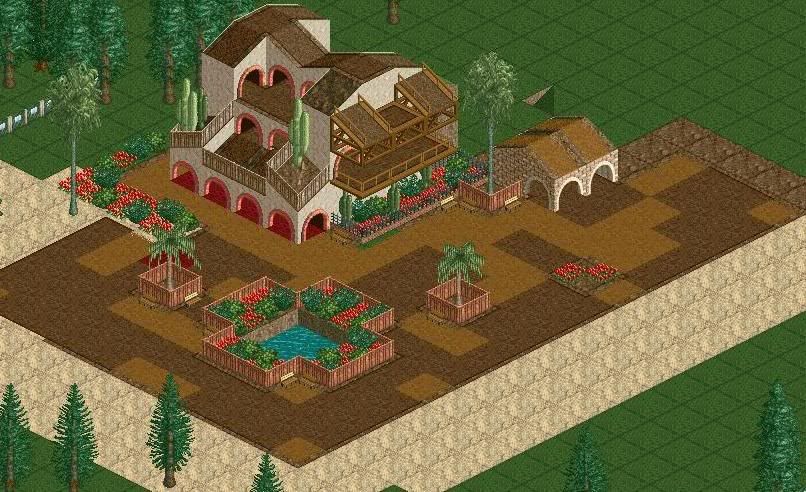
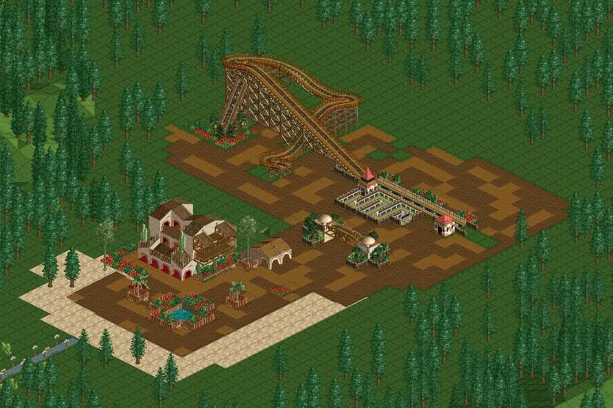
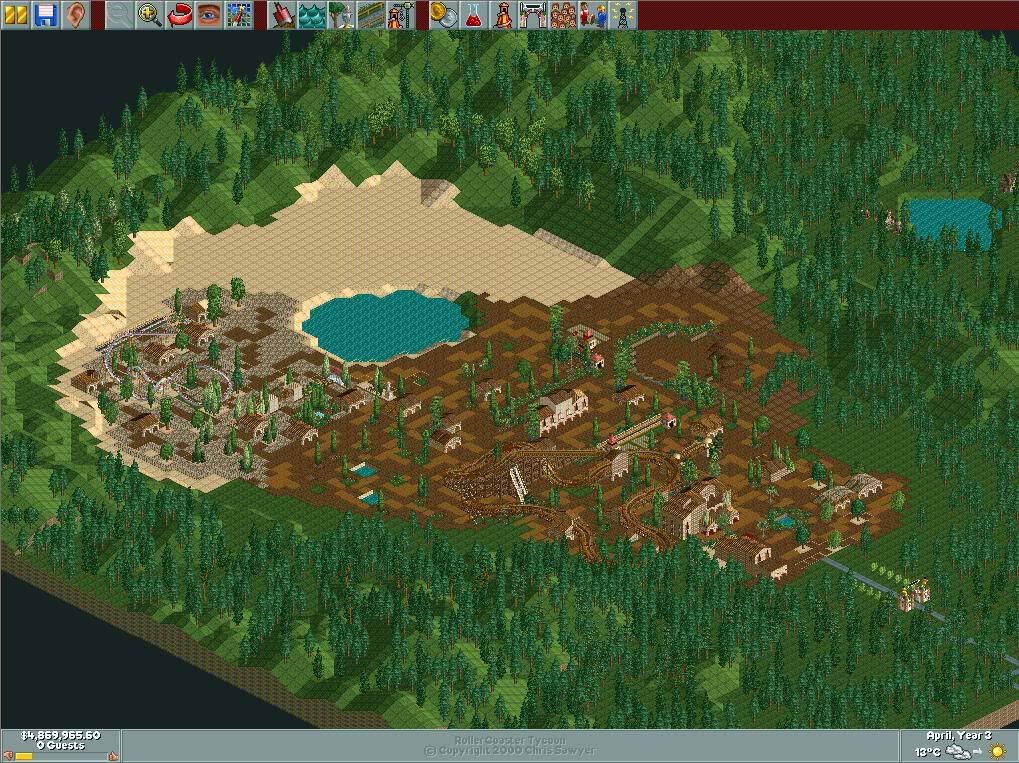
Theres a lot of path in the park, should I split it up with buildings and/or trees.
comment please.
-

 trav
Offline
I'm sorry, but I find this utterly repulsive. The buildings are somewhat blocky, and the building that isn't just doesnt look right.
 -

 RCTCheater
Offline
I'm sorry, but I find this utterly repulsive. The buildings are somewhat blocky, and the building that isn't just doesnt look right.

Havn't played LL for years, any tips on buildings?. Do they need balconies, etc. -

 trav
Offline
Try to use more than one texture, but not too many, maybe 3 at the most. Also, try to make them a little less square. I am liking the coaster though. But you do need to break up the path a bit as you said...
 -

 RCTCheater
Offline
Ok, I should have updated screenshots of the park later on tonight, if any one has any other comments please post them.
 -

 posix
Offline
i think it's actually not too bad and i always like it when people play ll but lol at forest frontiers.
 -

inVersed Offline
waaaaay too much pathing my friend.
I like that building in the first screen.
Cover up the coaster entrance.
Some foliage a bit random for Forest Frontie.
Maybe add some more buildings.
Its really not that bad at all for someone who hasn't played RCT in years (I was like that too a month or so ago).
lol trav, i remember your LL park. -

inVersed Offline
It looks nice now. A few things:
-Work on your coaster layout, its probably the biggest flaw here.
-Cover up your coaster station. It really improves the look.
-Add some flat rides mixed around there.
...nice work over all -

 tracidEdge
Offline
Try to get a flow. Right now it's just a huge mass of paths with a few buildings and plants thrown in there. Make actual paths, with scenery and rides and stuff around it.
EDIT: oh, and landscape variation will also help it a great deal. -

 trav
Offline
I really like the simplicity of the coaster. And the archy sort of thing (I dunno its term in LL) is getting better. But try to vary your sizes a little more, because that 1x1 tower thing gets repetitive.
 -

 RCTCheater
Offline
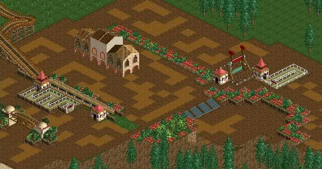
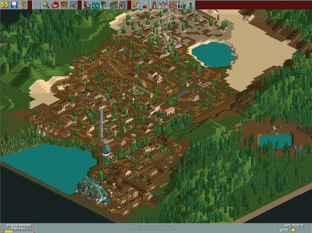
Update
Added a few flat rides need to colour them and hide the entrance and exit on them. Does the park need more lakes, rivers, ponds etc?. I have tried to break the pathing up a little, but it still needs more work, I need to add more detailed buildings, because the ones I have at the moment are pretty much the same and it gets repetative.
Enjoy
-

 Scorchio
Offline
Aside from making possibly the most boring wooden coaster on the face of the planet, I'd say that you've done ok, for a n00b.
 -

 Scorchio
Offline
Ok, well, for a start, you need to break up that path with more larger buildings. Try adding a few extra wall textures to your archy, and don't always go for 2x2 buildings.
Make your gardens a bit larger, and incorporate more shrubs and flowers into them.
That's an OK layout for a kiddie coaster, but I'd maybe change the colors a bit, as it somewhat looks drab...
 Tags
Tags
- No Tags

