(Archive) Advertising District / l'Aquitaine
-
 05-May 05
-

 SenZ
Offline
l'Aquitaine is a region in the southwest of France. Between the huge wine-fields around Bordeaux lays the l'Aquitaine Resort. The resort contains several hotels, a waterpark and a themepark. The themepark will have several themed area's, such as a futuristic area, la Vendee (themed to a french department), a Paris-style main street and many more.
Here are some screens:
Entrance/Hotel les Reves
This is the entrance area. Here you'll find the entrance to the park and a hotel. The park's entrance is under the hotel.
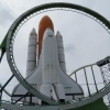
Futuristic Area: Space Port
The futuristc area of the park. There are several attractions, this area's main attraction is a launched B&M.
l'AtlantiQ Parque de l'Aqua
l'AtlantiQ is the park's waterpark. Here you'll find slides, several whirlpools, the biggest swimmingpool in Southwest France and a swimming stadium.
Park's current status: 30% Complete
Entrance/Hotel: 60%
Main Street: 5%
la Vendee: 70 %
l'AtlantiQ: 99%
Space Port: 40%
Rest: 1% (Planning) -

 sixflagsfreak56
Offline
1st screen is ok, to much of the same building style
2nd screen is amazing!
3rd screen is the worst of the three. It lacks something that I can't find right now. -

 tyandor
Offline
I'm not very certain about this park Michael (Senz)
-1st screen
problem: boring repetitive and nothing really outstanding
hint: try to get some warm colors in it. Also add some extra features on the hotel. Maybe round towers or something like that.
-2nd screen
Isn't bad, but I have the feeling that you need to figure out your color choices more.
-3rd screen
very similar problem as the first screen. It feels very empty.
what does it need: shops(terassen/parasols), play-areas, suntanning areas, waterfeatures, more contrast in color. Also waterbased rides could add something (like rollersoaker/splash battle)
Consider the hint I gave you. Maybe I can help you more if you show me more, so let me know when you need additional feedback.
off topic: I noticed that I completely forgot to release round 10 of the competition at rctcompo. Your wildmouse was something special in it's way as a compact ride. I'll release a complete package of the compo soon btw. It won't continue because I couldn't raise enough participants at rctCompo. But then again I can't say it wasn't succesful because otherwise we would never could have had 10 rounds
Tyandor -

inVersed Offline
I kinda like it but screen 1 and 3 suffer from repetitiveness man. You have the right idea but it is executed in a quite boring way, by nearly copying ever little piece multiple time to make a building (or thats what it seems) this makes it feel repetetive and boring -

 X250
Offline
I have to agree with inversed, the first and third screen are a little repetative. Maybe vary the roof colour or type a little.
The second screen is very nicely done, the architectural forms are quite impressive, and the colours match the theme very well. I would remove the tall fir trees though, as they look a little out of place.
-X- -

 CedarPoint6
Offline
Too much black I'd say. It just seems so dark. The enterprise is positioned very nicely, although with the paths under it, i'm wondering where the motor would go... but that's just getting very technical, so don't worry about that. I would also consider making the coaster stand out a bit more. Black on a black background just really doesn't work. Maybe that purple? Not too bad, though.
 -

 Scorchio
Offline
I tend to look at RCT parks from a realistic approach when trying to comment. For instance, if that were a REAL park, and it was a scorching hot day, that area would be absolutely horrible to spend time in. The ammount of black would reflect the heat something shocking. You need something to break it up... preferably a neutral beige or something.
 -

 sacoasterfreak
Offline
I couldn't help but notice... in the third screen the checkered pattern under the water drives me nuts. The buildlings are nice in that pic but I personally don't see a point in checkering the water.
The dark area will look good as a whole section in the park, rather than screens. The screens box it in and make it look a lot darker than it is.
You need a l'Aquitaine Hungre' Force ride. ... -

 Jo24
Offline
I like your logo. Some roblems. I don't like how the 4th through sixth screens, have nothing interesing about them. Let us see the coasters, and other rides. I know you had the enterprise there, but let me see more.
 Tags
Tags
- No Tags


