(Archive) Advertising District / Sands of Time- The Epic Journey
-
 21-March 05
-
 Ride6
Offline
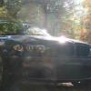
You've got good colors there, USE THEM! I see hints of yellow and teal, start making them accents rather than specks and add some kind of roof the the building in the foreground.
Other than that I rather like it. The low coaster doesn't bother me one bit since I'm pretty sure that's near the end of the ride and you did it for pacing reasons. The lack of folidge reall works for the nuke theme and I think it looks better in many cases where the landscaping is used well anyway. Come to think of it, some dead trees wouldn't hurt; and where are flowers?
Congrats, I'm quickly becoming a fan.
ride6 -

 CoasterForce
Offline
Very nice work, glad to see this is coming along. I love the interaction with the loop and the glass walls, and the coaster looks to be very unique and innovative, so congrats for that. Nothing much to fault other than there may be a bit too much path (?)...I donno, try experimenting and see what happens.
 -

 makonix
Offline
the last screen looks quite good, love the coaster and the architecture, but I think since it's nuclear age area, you should use the alien looking plants and I agree Fisherman's deco walls doesn't fit to an industrial theme, try put some more details, like pipes, machines

-

inVersed Offline
I dont know what it is but theres something there that I really like about that screen. The colors are quite nice as is the archy, very futuristic. The coaster is a bit, odd looking. probably just the angle. I've never been a big fan of putting loops in such tight spaces. But thats just me. -
 CedarPoint6
Offline
Geez, it's been a while, hasn't it? I guess I should update it with something at least...
tracid- The arches have since been removed, you're right about them not fitting the theme
X250- I didn't want too thick foliage, but I'll probably add more later... and I don't put it on rock
Turtle- I'll take a look at the building and see what I can do, I wanted to keep it sorta bland, but I dunno
Scorchio- Yeah, that part of the coaster is awefully low compared to most of the buildings... I think the first half is probably better
ride6- I always have trouble with color, I feel I build far too conservatively. I don't want to overuse something, I'll work on that, though. Flowers don't exist in the future. Personally, I don't think I need them, but I'll mess with it a bit
CoasterForce- I'll take a look at the path, although I think it's a pretty good amount right now... I want a bit more then normal.
makonix- I'll work on adding the details, glad you like it
Inversed- Thanks for the comments, hopefully the coaster will look better in other spots.
-------------------------------------------------------
So onto this update. I certainly haven't posted anything in months it seems... a lot of other things have happenned. Another large park has been started, and I also did a Pro Tour entry, allbeit unfinished. I'll post stuff on those eventually.
A lot has happenned with this park. 2 new coasters, and Arrow custom looper and a dueling wooden coaster (screen coming soon) have been put in.
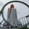
This screen is of the medieval section, with the Arrow. I tried to use the larger stone bricks on the castle as I think it looks nice in parts, but went with the small brick on everything else. Enjoy.
-

 postit
Offline
Although we've seen quite a few medieval themes lately, this one remains unique in its own sense. The colors are different, and the style is yours. Awesome job, CP6. Everything is great. Whether you like to or not, you manage to build with incredible realism. I love it. I just realized you might want to have some posts or poles holding up the canvas overhangs over the transfer track/brake run.
 -

inVersed Offline
It looks good.
The building with the coaster looks a bit blocky, and but the building with the topspin is very very good i really like it -

 Steve
Offline
Finally! A medevil theme that doesn't look like Gotheburg!
Haha, looks excellent. Maybe stick with the standard flowers instead of custom ones. -

 Kumba
Offline
Na, its kinda Gotheberg like, but I think you can get away with it. Its pretty good, just the flowers are really killing it, try the rounder looking ones in red, can't think of a second color tho, if you want to use one...
 -

 Phatage
Offline
I see how that transfer table would work but I think it would be more practicle to make it more like the mega loopers, which is just slightly different than a standard B&M one really.
 -

 CedarPoint6
Offline
Thanks to all who replied so far:
Postit- The reason that the canopy isn't supported is because the transfer has to move through that section.
Inversed- It's a transfer section, of course it's gonna be blocky, but I'll work on that some.
Steve- Thanks a lot. I've also looked into changing the flowers back to the originals... these seem brighter, though...
Kumba- Alright, I'll mess with the flowers and try to fix them up some.
Phatage- Yeah, I would've preferred that way for realism, but it came down to space and I didn't really have the room, unfortunately. -

 Emergo
Offline
Very nice screen!! Not too fond of the type of flowers you used, but I love the way you used the large brick walls
 Tags
Tags
- No Tags
