(Archive) Advertising District / Sands of Time- The Epic Journey
-
 21-March 05
-
 Marshy
Offline
Well, it looks much better with a different colour. But I'm not sure on the actual colour you have chosen. But I could be wrong.
 -

 penguinBOB
Offline
I'd say go with the lightest aqua color for either the track or the rails and either that light red, gold, or grey for the other.... but that's just my taste. You still could work a little bit on that tree placement, you're covering up some important parts. Landscaping isn't that great, but I really do like what you have going on there.
 -

 MachChunk 2
Offline
For some reason that screen is really refreshing. I like the new track colors, really nice choice. As for the foliage, I think some red flower's or something would revive it from looking kinda monitone with all the green.
-

 Panic
Offline
In my opinion the coaster colors in the first screen were better. Try tan as the main track color and faded dark brown as the rails, or vice versa. Don't stick to the combination you have now (no offense).
The building is excellently placed but I still don't know if you even need it. Maybe just a deck-style lookout.
You're turning out to be a great parkmaker CP. -
 CedarPoint6
Offline
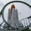
Marshy- Well, I guess I will experiment with more colors... there's been a lot of suggestions now, so I'll try them all
PenguinBob- That aqua and gold looks good in my head, so I'll give that a try in a bit and see what happens with it.
Sparky- I always hate adding flowers as it always turns out looking lousy when I do it, but I'll give it a shot and see what happens. That might liven it up a bit.
Panic- Well, I probably won't stick with the colors I have no due to the response, but I'll play with it some. The building looks better from another angle IMO, where you can see the deck sort of hanging over the cliff... And also right behind the building off screen, is a cliff overhanging the water with path for a lookout. I may show that a bit later. And thanks for your comments, I like to think I'm improving...
Thanks for the comments!
Random Update: River Rapids started in more of a 'town' type section of the ancient area with buildings and all that... -
 Ride6
Offline
Coaster= Beautiful. Still not sure about the trees and the building could use a tower on one side.
That is all.
ride6 -

 tyandor
Offline
I wouldn't change a thing about the color of the track. It's a more challenging and don't be afraid to use the entire color palette, especially because I think there aren't enough colors to chose from in the game.
 -
inVersed Offline
Woah that lay out is tight. I really like the coaster it self. I honestly like the foliage too, at least in the recent screen. The buildings archy is a bit... meh.; but i cant really judge it from that angle.. overall it looks very good man.
R.A.S. -

 CedarPoint6
Offline
Ride6- I still have a lot to go with the ancient section and that's on my list of stuff to work on. So I'll eventually get around to that I suppose.
Tyandor- I've always never liked the lack of color choices in RCT, but I guess I just have to use what I have, so this is what I think I'm gonna stick with.
R.A.S.- I don't know why, but I like the foliage as well. For some reason I find it appealing... don't really know why. The architecture hasn't really been thought much about yet so that building will probably change by the next update.
------------------
UPDATE:
The Tower of Time keeps watch over the ages. Located on a central hill within the park, the Tower of Time shines its fire beacon across all of time, onto the lands in the surrounding park.
So, like I said, it's the central piece to the park, and one of my larger pieces I've done in a while. It's on a rather large hill in the middle of the park and has waterfalls and paths coming off of four sides.
Enjoy, please leave a comment.
-
 Panther
Offline
I have always said that symmetry is usually not a good thing. But after seeing your "Tower of Time," my opinion has shifted a bit. I really like it.
And for the first two screens, I liked it okay the first time around. As for the second time around, I believe the orange is a little too strong and I prefer the green. However, I feel you should continue to experiment with the colors of the ride itself. I do think you should keep the supports the same color though, which it appears you will anyway.
Major Kudos to you for the concept, very cool, never would have thought of that myself. Just don't overdo it, please (though I don't think you will).
Just keep up the awesome work!
-Panther -
 Evil WME
Offline
impressive man.
maybe fiddle a bit with the landscaping to make it more beautiful and natural looking .
.
-

 artist
Offline
the structure of that is amazing. I love it all, my only problems would be the lack of colour in this screen, maybe try to add some loverly pink or blue flowers into the foliage, would work great imo.
 -

 MasterOfDisaster
Offline
cool!
i like all the screens, nice archy and cool planting.
good job!
so long
MoD -

 Ride6
Offline
The surrounding could afford from bits of archetecture themed to different elements or something like that to complement the building.
It's very good but it's hanging out on it's own a bit. You could even do mountains around it with each being a theme. Like one with a bunch of water falls (water), one that's wore down to being and arch (wind), a volcano (fire) and one that's all covered with plants (earth).
Yeah, you get my drift. Make is seem to be part of the environment.
ride6 -

 Hexiage
Offline
the coaster looks very good and the landscaping, too.
the tower has a very good architecture and many details!
very good! -

 CedarPoint6
Offline
Panther- Glad you like the tower... the color thing has been the biggest deal on all the sites I advertised it... I'll look into it.
Evil- I'll mess with the landscaping a bit and see what happens...
Artist- Glad you like the structure... means a lot coming from a Spotlight winner. I'll add some flowers in there when I get a chance.
Master of Disaster- Glad you like it.
Ride6- Love the idea, actually. That's really creative. I may go with that when I move back to that area.
Hexiage- Thanks!
----------------------------
Anway, here's the next update.
I stopped working for quite a while, but I've recently gotten back into it again. I worked for maybe 8 hours this weekend and have been doing 2 hours just about every weekday (nothing like squandering study time). But this is the Nuclear Age of the park with Meltdown, the temporarily named B&M 7 inversion Invert.
So please comment.

By the way... this isn't my favorite screen from here... you may get some clues to its location eventually... -

 tracidEdge
Offline
Hmm. I don't know. I like it, but I don't.
I don't really think the fisherman arches should be in there, since it's more of an industrial theme. -

 X250
Offline
Nice work. The layout of the coaster looks very well thought out and the landscaping is nice too. Foilage appears a little too sparse though. Keep it up, great work so far.
-X- -

 Turtle
Offline
I agree with tracidedge on this one. There's something about this screen that I just don't like. Maybe a slight overuse of black on the buildings.
 -

 Scorchio
Offline
I don't like it because it's an unflattering shot of the coaster. It looks bare and bleak, and I think the coaster layout is set too low.
 Tags
Tags
- No Tags