(Archive) Advertising District / -- The Masterpiece --
-
 18-January 05
-

 gymkid dude
Offline
i really like the foliage in that screen, also like how you made a "deck" on the grass leading to the seating areas.
 -

 Steve
Offline
Personally, I think it'd be better without the deck. It would make more room for tables.
 -

PBJ Offline
i like it alot (like all your work
 )
)
but a Palmtree with a irish pub don´t fit IMO
but i love your work!
PS. took the screen the a new page ;-) -

 jon
Offline
I find the building itself, pretty uninspiring, but the deck and surroundings are lovely.
 -

 Geoff
Offline
That's a beautiful shot. The deck, and the surrounding atmosphere are superb.
I think the actually facade is pretty good, but it could be tweaked a bit more. I think shutters for the windows would work well, and the building would be better off if you rid it of those checker siding things.
All in all, it looks like it's coming along great. I like it. Alot.
-

 Ride6
Offline
I agree. The building is nothing more than the common enhansed 2X2 ism that's so common in rct2. The surroundings though do great things for it and the fact is the building isn't so large or colorful that it decracts from the beauty of its surroundings.I find the building itself, pretty uninspiring, but the deck and surroundings are lovely.
ride6 -

 artist
Offline
[font="arial"]I think this screen is beautiful, the atmosphere is amazing, even though the building is very simple it really adds to the surrounding settings, i think if you add any more detail to that building it would ruin it.
Great to see you have picked this up Simon, brilliant work.
Also PBJ, it's not an Irish pub, it's an Irish cafe. [/font] -

 tyandor
Offline
Okay, as I said in the previous thread we'll focus now on X250 parks. Be it that all you'll see now will be mine, but since I won't be doing the theming alone....(since it got slightly out of hand concerning the size of the track...). The track work however will be completely mine.
This is a park to look forward btw

-

inVersed Offline
It is a bit unfinished i think, or atleast foliage wise
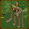
Very uniques custom supports.
I like the little structure before the drop.
Nice work man. -
Xcoaster Offline
Is that steel-mini track? Looks nice. Very Schwarzkopf-y.
I think the lower crate sticks out a bit (lower as in it's location in the screen, not based on the elevation in the game). Overall though, it all looks good, and reminds me of the Indiana Jones coaster in Paris. Nice work. I look forward to this park. -

 Elephant6
Offline
Very nice. My one complaint is the crates. The texture doesn't match the game, and the lighting on them is backwards.
 -

 RCTFAN
Offline
I like the look and feel of that coaster, even without themeing you can tell its gunna be one hell of an adventure/mine type ride. Iwonder if it will ahve any water splash's......
keep up the god work X25O becuase all the screens are absolutely amazing! -
 Tom_Dj
Offline
Oh i love this screen the custom ,are very nice and the thing on the top of the coaster is small but good
-

 tyandor
Offline
read the postkeep up the god work X25O becuase all the screens are absolutely amazing!

Anyway if you look at closely at the track you see that I hacked minetrain coaster track beneath the minicoaster track and it worked better than i thought since I was expecting white track.
The ride indeed has been inspired by Indy at DLP and it will be something like a adventurcoaster. -

 Carl
Offline
ok, im confused. tyandor, are you helping x250 finish his park?
either way the hacked minetrain track underneath the mini coaster track is an awesome idea and it turned out well, you can see just the right amount of wooden ties sticking out. -

 tyandor
Offline
I'm doing a guest entryok, im confused. tyandor, are you helping x250 finish his park?
either way the hacked minetrain track underneath the mini coaster track is an awesome idea and it turned out well, you can see just the right amount of wooden ties sticking out.
-

 CoasterForce
Offline
Hacking looks good and adds a lot to it, but besides that it looks horrible. The foliage is random, incomplete, and selected poorly, and the mess under the track before the first drop doesn't look good IMO.
 -

 laz0rz
Offline
X250 said this would be a solo, but whatever, let him do what he wants.
This last screen is amazing. I love the little sculpture near the track, and great use of flames. Excellent supprt work too. The only two flaws are the lack of foliage and the overall unfinishedness of the screen.
The rest of the screen is great though. Keep up the awesome work tyandor/X250. -

 Geoff
Offline
OMfg.
I recall a while ago x250 saying he was letting tyandor do a GUEST spot. It's not a joint park. At least not that I know of.
Anyways, I'm not crazy about the last screen. The track looks pretty, but a more finished screen would be better to comment on. -

 X250
Offline
Don't worry, Tyandor is only doing a guest spot.
Cheers Ty, i like the stuff you are doing in that particular area, very classy. I have the park now and am determined to get this thing finished soonish, i just finnished an area.
-X-
 Tags
Tags
- No Tags