(Archive) Advertising District / WALT DISNEY ESCAPE, in Spain [fine... here...]
-
 18-October 02
-

 Brent
Offline
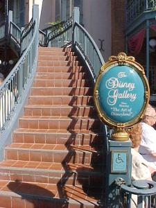
The gallery is very... crappy. This is a Disney park, isn't it? Because that doesn't look like something Disney would make for a gallery. Ever seen DL's entrance to their gallery? That's how it should be done, with eligance, not a boring walk in building.
 -

 Coaster Ed
Offline
Very, very nice stuff. The Disney Gallery is especially nice, great use of flowers and balconies. I would say to use less windows though. I think it's a bit much.
 -

 Brent
Offline
The gallery is crap! How can you say that? That's not NE Disney/Disney in general, that's like RCT Station Disney... ugh.
mmmmmmmmmmmmmmmmmm -

 Coaster Ed
Offline
Who said it has to look like that picture? I think it's a nice looking building. Too many windows perhaps but a nice varied roof, good combination of textures, and colorful flowers which compliement the brown and tan of the walls. I didn't way it was the greatest building I've ever seen, but it is worthy of note I think. Chill out, critisizing people for liking or not liking something is a waste of time.
 -

 Brent
Offline
So then what you just did, and what about COUNTLESS other people all over the net say everyday is pointless, which means that your post was also pointless, which means this topic is pointless, which means once again, that anything posted on this site, in this topic, or on the net is entirely pointless. Is that what you're saying, because it sure as hell sounds like that.Chill out, critisizing people for liking or not liking something is a waste of time.
-

Corkscrewed Offline
It's meant to be a new approach to it. This gallery is a bit more contemporary, dropping the classical sweeping stairs and gestures. There's more of an up front, straight to the business feel, as opposed to the grand, elegant, experiencial nature of Disneyland's Gallery.The gallery is crap! How can you say that? That's not NE Disney/Disney in general, that's like RCT Station Disney... ugh.


mmmmmmmmmmmmmmmmmm
Also remember that part of the reason the Gallery is up there like that is because it's on top of Pirates of the Caribbean's entrance. Pirates was there before the Gallery, if memory serves me right, and the building used to house something else before. The building was not originally built to be a gallery, though it still serves that purpose very well.
I appreciate the criticism, though. You can't please everyone, and while I'd honestly say that the building is far from crap, I'd agree that it doesn't meet the expected "fancy art display building" motif. Then again, the area isn't built in the classical style.
-

 Coaster Ed
Offline
Wrong. You misunderstood me. There's nothing wrong with commenting/critiquing other people's work. Everybody is free to like whatever they want. I post here telling people what I do and do not like about park design hoping to convince people to build more stuff that I will like but if people think I'm full of shit and ignore every word I say, I'm okay with that. At least I tried. What I said is that you shouldn't say 'no you can't like that because I don't'. You aren't going to convince anybody that way so why waste your time. If you had said 'you're wrong, this building is not good and here's why...' then we would have a discussion but saying 'you're an idiot, it's crap' is pointless. Now I just think you're an idiot too and I don't want to think you're an idiot. I want to think you have a reason for not liking it. I want to think that people here are capable of critical thought and open discussion.So then what you just did, and what about COUNTLESS other people all over the net say everyday is pointless, which means that your post was also pointless, which means this topic is pointless, which means once again, that anything posted on this site, in this topic, or on the net is entirely pointless. Is that what you're saying, because it sure as hell sounds like that.
Your post seems to imply that you don't like it because it doesn't look like THAT building in THAT park. Well if that's your criticism then my reply would be that if every amusement park called Disney looked exactly the same then I sure wouldn't want to visit them. I for one am glad that Cork has some creativity of his own because the stuff he is making looks good to me. So anyway it isn't the 'The Gallery is crap!' part of your post I took offense to but the 'how can you say that' part. I can say that because I mean it and even if that doesn't make any sense to you I still meant it and will say it again now just to emphasize: "Corkscrewed, I think that gallery building looks great. Good job."
Flame wars are also a waste of time and I regret taking the time to respond again already. I hope you can see that I do have reasons for saying the things I do and I trust that you have your own reasons so unless you have something else to say about it, let's just forget it eh? I have nothing against you Beta Factor you just struck a nerve is all. My apologies. Carry on with the feedback for Cork cause you know he wants it. -

 AustinPowers
Offline
I think the park looks amazing...
I like all the details, colors, and the layout so far...good job -

Corkscrewed Offline

March 17, 2003
Seville, Spain
On the eastern side of the construction site, land clearing and landscaping has begun on Pleasure Island, an adult night club complex for guests over the age of 21. Once completed, four night clubs will stand on the grounds, allowing adults to have their own fun. Guests of all ages will be allowed to pass through, as Pleasure Island houses the entrance to one of the two hotels on the Walt Disney Escape Resort, but legal identification will be required to enter the clubs.
Inside the park, construction has begun on the entrance towards Tomorrowland. Building on the success of Disneyland Paris's Discoveryland, this themed section will feature a very organic vision of the future, filled with lively landscaping and cutting-edge architecture that create a warm and ambient environment. Paths have been extended from the Hub to the east of the Beast's Castle, connecting the hub to the back of Fantasyland.
Finally, in the American West, during the past week, workers have raised land and cropped Tom Saywer's Island. This small playground will be accessible to explorers of all ages during the daytime, closing at dusk. Situated just off the coast of the waterfront mainland, this island will provide fun and entertainment for little Tom Sawyers and Huck Finns all over.
This is a quick overview of the Pleasure Island site.
This is the entrance to Tomorrowland, as shown from the hub.
This is the entrance to Tomorrowland, as shown from the back.
Here is one view of Tom Sawyer's Island, with the entrance to Injun Joe's Cave seen right across from the landing dock of Davey Crockett's Canoes.
Here is another view of the island, situated in the American West.
When completed, Walt Disney Escape will join Warner Brothers Movie World, Madrid and Universal Port Aventura as the third major theme park in Spain. Featuring the best in traditional Disney ideas and the newest technological advances, Walt Disney Escape will provide a strong form of competition and strengthen Disney's business venture into Europe.
Please check back periodically for new updates on this exciting resort. -

Corkscrewed Offline
BTW, I'd really like comments on the Tomorrowland Entrance, since that's gonna be the hardest land to really get the feel of. -

 Stargazer
Offline
I kinda associate Tommorow land with more of the white/light grey and blue feel, the yellow looks outta place, so does the black, the entrance is also a bit tall, focus on greys with blue stripes and some small elements of colour around certain attractions...
*Stargazer* -

 DippyDoodle
Offline
the new screens are awesome. i especially enjoy the tomorrowland entrance. i think the japanese cypress and hiba would look good on tom sayer's island.
 -

 Scarface
Offline
nice screens...
I think you need some more silver and red in tomorrowland, but if u want a darker look then it is very nice... -
 Ablaze
Offline
Good start to tommorow land, it reminds me of it a bit. I am sure it will be better when its more complete though. As for Tom Sawyer's Island, it looms really nice the atmosphere is amazing.
Loving Tom Sawyer's Island, I am sure I will like Tommorowland when more is complete. Good job. -

 Turtleman
Offline
The Tom Sawyer Island is great! I am really liking it! I can not really judge the other screens because they are not really complete, but so far the entrance to Tommarrow land looks Nice! Very good job so far. Keep up the great work,
Turtleman
-

 Madhollander
Offline
man...
what a park, i'm amazed, seems to me that rct2 finally gave you the construction freedom you needed (although still limited)
can't waith for the day we can download this...
looking really really good.
 Tags
Tags
- No Tags
