Screenshot / Whispering Pines Family Fun Park
-
 26-June 14
- Views 3,942
- Fans 2
- Comments 21
-
 Description
lol so I hope I'm not interrupting the Shotguns victory parade and circle jerk as you really did an awesome job on that design (I was checking it out in game earlier... it's great) but I've been quietly working on my own entry for the Reddit Contest which is now 99.9% completed... Whispering Pines Family Fun Park!
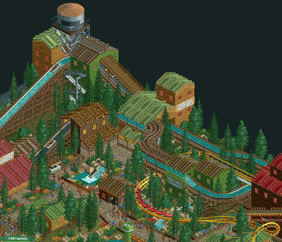
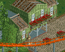
Whispering Pines is a small family park featuring rides for all ages. Shown here is the log flume, themed to an old saw mill and logging company.
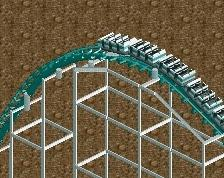
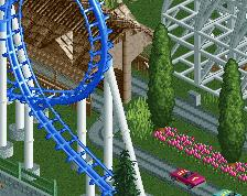
For the more daring, the park also features an arrow looping coaster and a state of the art wood coaster (not pictured). -
 Full-Size
-
2 fans
 Fans of this screenshot
-
 Tags
Tags

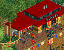
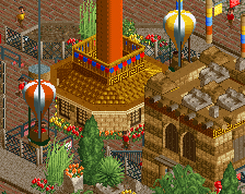
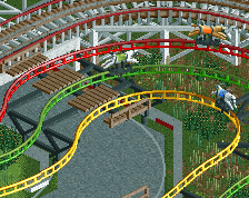
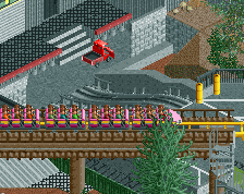
Can see some of the Shotguns inspiration here
Nonetheless, really impressive screen in my opinion; I especially like the wooden coaster + mine train cover over the log flume track. Wonderful interaction with the Arrow as well.
A little cramped for my tastes, but still does portray quite a lovely atmosphere.
Is that a frozen flume crashing into a fall as ride entrance scenery? brilliant. Love the atmosphere here
Perhaps a bit too much tracktitecture. Looks nice anyhow.
Wow that looks great. Loving the Arrow.
Like said above, a bit too much trackitecture (not a fan of track roofs for the most part), but otherwise it's really good. Loving the interaction between everything.
Bullshit. There's no way one can have too much trackitecture
You're falling into the same problem as with your CSO work. The roofs are all the same and the shapes and forms on the building are also the same. The only thing that differs those buildings from each other are the colours.
Try to vary with the roofs and walls you use. By the way, it's not forbidden in NCSO to use actual roofs as roofing a few times. In my opinion, trackitecture is there when the normal objects dont do the job well enough, but in this case you could have replaced A LOT of trackitecture with actual scenery objects.
I have to say I agree there's too much trackitecture here that would possibly look a lot better if it were regular roofing. I'm also not a fan of the colours in some areas...brown walls with green roofs and red windows?
The form of it and the little ideas in there are really nice, but there's just the colours and the trackitecture holding it back for me at the moment.
Dude you do NCSO! I didn't know that but I love it.
As other guys said, too much trackitecture. (Listen to Faas, he's totally right.) Use the standard roofs more often. But I love the rockwork, foliage, and interaction.
Thanks for the feedback everyone.
The thing with the roofs is that I don't really like the way the standard scenery roofs blend with trackitecture roofs so it looks weird to have them next to each other in a lot of cases. I tried to mix them in throughout the project and did in a few places which aren't shown but in most cases I just didn't feel like they looked right. I did try to vary the type of track I was using for the roofs though (wood coaster would always be the base because of the thickness but then you can mix things like mine train, car ride and virginia reel).
This is actually my first NCSO project and I have to say I have a whole new respect for it after building this park. It's incredibly difficult to do when you're so used to having such a large palate of objects.
By the way in regards to the walls and colors the theme of this park is a family / mountain type park (like Dollywood but on a MUCH, MUCH smaller scale). I was going for an Adirondack look so I had to be pretty locked in to wood, though in my next NCSO project I'll see what I can do to vary that up.
Thanks again the great feedback everyone, I really appreciate it... keep it coming as I'd love to use these tips to either spruce this up if time or allows or apply it to my next NCSO park.
I thinks its pretty awesome. I love the colors and the yellow coaster track. very nice, oldschool-ish feel to it.
You have some really good ideas. Agree about the overuse of trackitecture. You could use some paths as roofs as sometimes they work or your structures could have flat roofs. Other than that I think this is really great.
I also don't like the wooden track under the log flume.
No.
I like trackitecture, but this is just a sheer overuse.
You hate everything everyone does (you must have ranked this at like 10% given the vote jump lol).
I've yet to see any screenshot you've commented on that you haven't complained about. I love constructive criticism but when you hate everything it makes it hard to take you seriously.
Wait, you actually expect the great Wouter VL to not uselessly bitch at things while making nothing good of his own? I overestimated you, Bill.
It's not that the trackitecture is too much, it's how you're using it. You seem to be switching between the three roof styles indiscriminately which detracts from the work a little.
Tbh Wouter should just be perm banned
i agree with much of what has been said above (not with what wouter said haha). you definitely should use some more of the normal scenery and have a flatroof everyonce in a while, i love the flume though, it fits the area perfectly
The issue I have is that as soon as he showed up I got multiple votes that must have been around 10-20% just because of the jump. That seems like way too big of a coincidence. For a screenshot of course this really doesn't matter but in micro madness or if someone submits a park and needs a 55% from the community it could be a problem.
Maybe I'm wrong on this but I really don't think so. It's a huge coincidence.
Everyone else, thanks so much for the feedback (both positive and negative). I'll try to improve those things on my next NCSO park. This style is a lot more fun than I thought it would be so I'm looking forward to working with it some more.