Screenshot / urban park entrance. try #2
-
 22-June 14
-
 World of Exitement
-
 1 of 2
- Views 2,545
- Fans 1
- Comments 10
-
 Description
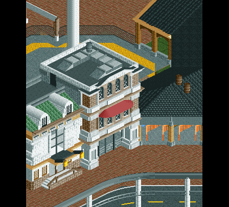
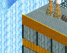
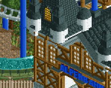
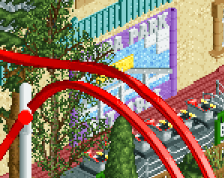
i'm completely redoing my urban park. this is about half of what i'm planning for the entrance. as you can see there will be shops and other buildings next to the entrance building, and upon entering the park you'll immediately see a huge frickin' windseeker.
sorry this is such a small screenshot -
 Full-Size
-
1 fan
 Fans of this screenshot
-
 Tags
Tags
Literally the best thing you've ever done.
Wow, Where did this come from?
Looks pretty good! The two white walls could use something. Another touch of colour or a window or something.
Wow, big step up.
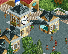
This is a term I haven't heard in a long while, but I think it certainly applies here: overdetailed. There are a lot of non-contributing colours, textures and shapes. As a result of this the whole screen is uncohesive and messy. Something else that bothers me is the centred window on the white building, and how it doesn't align with the dormers. The whole air conditioning system on the roof seems out of place too, and too large for such a small building, though I admit I'm not an expert on that subject. It just seems to make more sense to me if the building was air conditioned by a small unit on a wall. Instead you could have a proper roof. Lastly, why the barrels?
haha, looks like i pleasantly suprised quite a bit of people, 71% is the highest i've ever gotten on a screenshot i think
as for liam, i hope this fixes most of your complaints, i'm still keeping the windows though, see it as a recently renovated building
as you can still i also kept the airconditioning, but now it serves 2 buildings, also i made one of those things for electricity
The big white wall with the window is a little garish though. Air conditioning is a lot better on the second screen, but I still think that a duct would not go up the side of a building. In my opinion it would go on the inside, but that's just me.
RMM Offline
Absolutely beautiful. The entire compositions is perfect.
Where the fuck did this come from? What an incredible improvement! Great work.
I agree with Stoksy about the duct but that's really the only minor critique I have.