Screenshot / Hydra Rocket
-
 21-June 14
-
 Enchanted Garden: Adventure Studios
-
 1 of 6
- Views 2,450
- Fans 0
- Comments 11
-
 Description
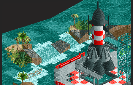
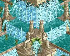
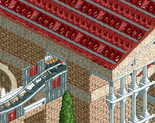
So I picked EGAS up again and have been making some progress. This is one of the corners that is formed by a dome like building housing a 3d cinema and a station for a darkride (I posted the interior shot of that once). This zone is dedicated to villians and the like pursuing riches or just plain old world domination. This screen shows a missile that works as water playground in front of some shops/refreshments (those are not done yet)
-
 Full-Size
-
 No fans of this screenshot
-
 Tags
Tags
the water edge has a kink am i drunk
meznator Offline
It looks Photoshopped.
The rocket could perhaps be a bit taller. And of course the vertical land face behind the waterfalls needs to be ice.
I completely agree with Ling. Make the waterfall ice, make the rocket a bit taller and you have a winner. Good to see you're making progress again. This park is now so old that even Adix might remember it?
Looks great as always
Glad to still see this going.
I think even some guys in the forums are younger than this park.
"MFG"
@5dave - If they are born after Juli 2003 they would be
@Ling/Liampie - Not to sure if the rocket needs to be bigger, but that has to do with the fact you can't see what is on the right side of the screen (lets just say I'm not making it myself easy). I'm more concerned about the coloring of the rocket.
I'm not gonna make any promises on when it is finished, but I've been able to tackle a few rough spots in the park lately. This screen is also the area that still needs most of the work. What remains is:
- Cartoon Carnival - about 70%ish. Need to theme the last part of the coaster and wrap up the guest areas.
- Desperado Gulch - front end is about 80%, the rides about 60%.
- Pandoras Grasp (not sure on the name yet) - The area of the screen. It's a bit split in two. The screens half is progressing very well and finishing up that part also means I can wrap up front end of the desperado area. The other half still needs major work, but for now I'm leaving that for when I'm done with the other areas.
- Aquaria Towers revision - As a major area in the park I realized it need some small updates and cleaning up. Can't promise that tadpole tavern stays X xD, but I'll will not mess with your awesome launch tunnel (still very grateful of that) .
- Overall revisions - Don't read too much into this as it is nowhere near as extensive as what's above, but I'm still adding/changing small stuff. It's not like I'm going to rebuild every ' dated' part (also part of the charm tbh), but just some polish here and there. Aquaria Towers just needs a bit more because its so central.
The coloring of the rocket is fine, the "shaft" is too short compared to the base. It makes it look fat.
Tried the rocket a bit larger, but the judgement on that is still out. I'll have to have the surrounding a step further than I have now to make that call though. Initially it would have been a bit larger, but with the objects I have I can't really make the small narrowing properly I wanted with a pod on top.
That said, I'm not going for a 100% realistic rocket here. The area is about evil geniuses and world domination, so the reason why it has 4 engines is just because I can have 4 engines on it
lovely atmosphere