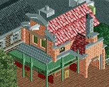
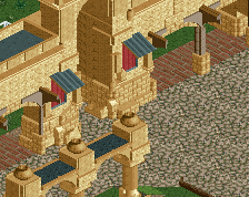
I know I've seen this before in a stream, but I find the purple/red combination here pretty ugly. There are a lot of circumstances where it looks pretty good but this is not one of them. I think even just a little less of the red would look a lot better.
Now the architecture itself is really nice. I agree with FK on the spires. I just think the purple and red sticks out a little too much, and not in a good way.
I'm torn between the knowledge that yes, the colors really are that vibrant in India, and the fact that it just doesn't look that great in-game. Structurally magnificent, but I wish the game palette had room for the kind of finesse you're working with.
I personally love the purple/red combo and don't see why others think it's 'ugly'. If it didn't have those strong contrasting colours, we wouldn't be able to see the details as clearly for a start, and I actually think that shade of purple goes well with the red anyway.
I've used those colors on the same building before, and I really like them together. I think they're distinct enough to make the building interesting and different, but muted enough that it still fits the area.
I've used those colors on the same building before, and I really like them together. I think they're distinct enough to make the building interesting and different, but muted enough that it still fits the area.
Well said!
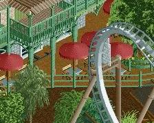
I'm just not sure about the white building. It seems a little bit out of scale to me?
But nevertheless, great screen Robbie, as always!
 31-May 14
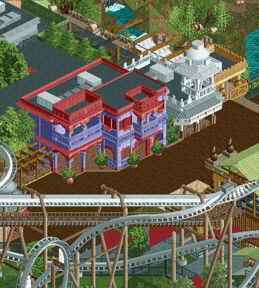
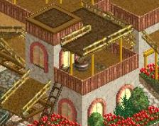
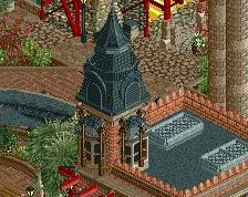
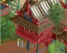
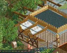
I love this, but i would say adding a few spires or ornamentation elements to the very top might help really sell this building a bit more.
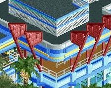
That archy is just insane!
90%
Now the architecture itself is really nice. I agree with FK on the spires. I just think the purple and red sticks out a little too much, and not in a good way.
I'm torn between the knowledge that yes, the colors really are that vibrant in India, and the fact that it just doesn't look that great in-game. Structurally magnificent, but I wish the game palette had room for the kind of finesse you're working with.
I personally love the purple/red combo and don't see why others think it's 'ugly'. If it didn't have those strong contrasting colours, we wouldn't be able to see the details as clearly for a start, and I actually think that shade of purple goes well with the red anyway.
I've used those colors on the same building before, and I really like them together. I think they're distinct enough to make the building interesting and different, but muted enough that it still fits the area.
Well said!
I'm just not sure about the white building. It seems a little bit out of scale to me?
But nevertheless, great screen Robbie, as always!
I think the colour combination works perfectly, and adds a nice bit of colour to what would otherwise be quite neutral.
Step 2: keep the Building
Step 3: Stop being so dam good at the game
I basically copied that exactly tbh, haha.
What he said...