Screenshot / Fisherman's Wharf
-
 30-May 14
-
 Stoksy's Magnificent 'Musements
-

 18 of 21
- Views 1,853
- Fans 0
- Comments 5
-
 Description
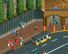
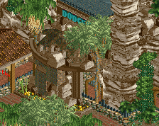
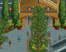
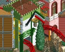
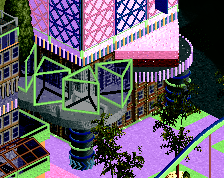
Based heavily on Fisherman's Wharf in Monterey, California.
Buildings have no shops/stalls in them as of yet but the pink building will house souvenirs and the dark orange building will be a restaurant. The initials C.H. stand for Cookie House [will be a kind of bakery]. -
 Full-Size
-
 No fans of this screenshot
-
 Tags
Tags
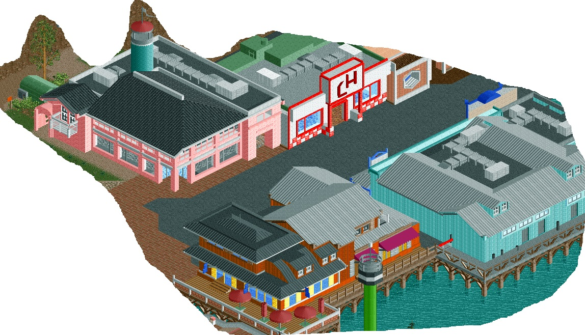


I really like this, especially the orange building. That deck is amazing (except for maybe the brick, I think the wood fence from the right side of the deck would be better if carried throughout).
I do think some trees and flowers might break up the path a little bit though. Personally I think that pink building is screaming for some flowers out front... it would add a lot of life into an already great screen. Peeps will help a lot too once you let them in.
Great work as always!
You've really got your own style, and your work is pretty identifiable.
I echo everything Bill said.
I hate that dark grey path; it makes everything so dull. I do like your adventurous colours and your big scale though.
^Any suggestions for alternative paths? I've currently changed it to a light grey which looks a bit nicer I think (and a little more realistic as well considering it would constantly be out in the sun so probably quite faded anyway).
The place I'm basing this on is literally a path with buildings on either side, but I have added foliage in front of the pink building (where the grass is) and I guess some plant pots could work here.
I'm relying on peeps for a lot of the 'life' in the park, so hopefully upon completion a lot of the areas that seem 'dull' won't end up being like that.
Anything lighter really. The darkness doesn't really match the bright colours of the buildings in my opinion.