Screenshot / Alternate Entrance
-
 25-May 14
-
 Pacific Point Boardwalk and Amusement Park
-

 5 of 10
- Views 2,896
- Fans 0
- Comments 8
-
 Description
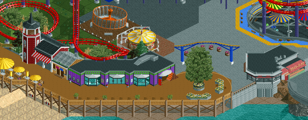
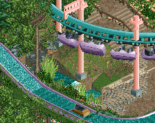
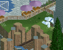
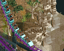
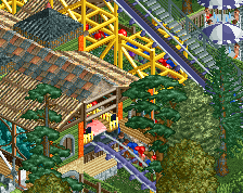
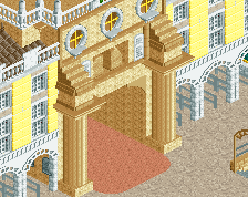
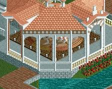
The "rear" entrance to the park, connecting the northern beach to the park, and housing a small selection of shops, rides, and restaurants.
A little unfinished around the edges, and yet another large swath of concrete to be filled in. Bits of inspiration for the structures from Tivoli Gardens and Thorpe Park. -
 Full-Size
-
 No fans of this screenshot
-
 Tags
Tags

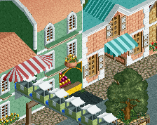
Must...have...diagonal...benches...[if only they were functional *sigh*]
Although I get the feeling that maybe they blend in a little too much with the boardwalk.
The buildings there are lovely, particularly that toilets. Glad that you managed to make the entrance 'work'.
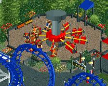
I personally think that the carousel and gravitron are a little too close together though; just having the carousel with foliage next to it would be suitable.
that's pretty great, honestly
Actually now that I'm looking here, a couple concerns
1- where are the roots from that tree going
2- how close the rotor is to the carousel
I wanted the rides pretty close to break up the path a bit more than I had been, and to give it the crowded feel that I want it to have. I can move it back, but the sprite clips with the coaster track if I just move it left one tile, so I'd have to move it diagonally, which would leave a strip of space between it and the coaster.
@stoksy: The bathroom is your favorite? Seriously?
@walto: I think there's still enough going on on the flat sides that it doesn't look any worse from other angles. I just wanted this one to show the full facade.
@][ : http://i.imgur.com/ghemW.jpg
I like it, the purple building looks cute. Only complaint: the massive amount of asphalt.
65%
^^Just because its made in such a way that so clearly indicates its purpose and is perfectly positioned between the two larger, more detailed buildings. I think that the purple building is better as a whole, but the toilets just stuck out so much I felt that I needed to comment.
Maybe it's just me, but I would prefer putting the carousel in the middle of that path and making it a grand, classic, building. Now its placement is just off to me.