Screenshot / Hyde Park Entrance
-
 15-May 14
- Views 2,798
- Fans 1
- Comments 6
-
 Description
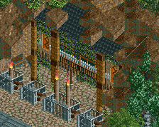
I normally wouldn't post unfinished screens like this, but just started working on the entrance of a new park I've wanted to build for a while.
Ideally, I want this park to be a duo/group park, simply because I already have a solo going on as well as a design, so PM me if you're interested and I'll send you the details.
But yeah, this is the entrance to Hyde Park, which is going to be what I would build/have built if I had been given Hyde Park and an unlimited budget. Again, normally wouldn't post unfinished but I just want to see if anyone is willing to join in on this as a duo/group park, otherwise it'll probably be put on the backburner for a while.
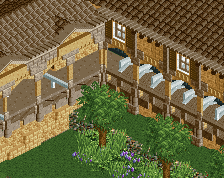
As for the screen, the ticket building on the side of the gate are definitely not final. The park would operate using a wristband system, which is why you don't see any turnstyles or the like at the gate. -
 Full-Size
-
1 fan
 Fans of this screenshot
-
 Tags
Tags
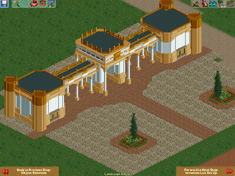
I would be willing to help on this, but I really only have time from July onwards. Looks really cool though, although the tiny trees look a bit like losers, I would definately bully them.
looks good! i do feel like it feels a bit asian though, but that might be me. i'd be willing to help you with this, but my main concern is that i wouldn't be good enough.
I feel like the middle should be higher. It's already higher than the other two 'columns' but it could stand to be a bit more so.
@Faas - Yeah the tree was the only 1/4 tile tree I could find in my files but I wanted a bigger one
@gdb - Not sure where the Asian comes from, but I guess I'll see if I can make it less so.
@csw - Well, this is the building that I'm basing this off, it's the entrance in this spot from the real Hyde Park in London:
Obviously I'm not trying to completely replicate it, as I've tried to spruce it up a bit to be a bit more lively and theme-parky, but I'd still like to keep the essence of it so I'd like to keep the towers roughly as they are.
Agree about the trees. The columns look really nice; if only they could be made slightly more curved but I don't know of any object(s) that would allow that.