Screenshot / Brown Park #2
-
 14-May 14
-
 Unnamed Park, but awesome. # CANCELED
-

 2 of 9
- Views 2,290
- Fans 1
- Comments 15
-
 Description
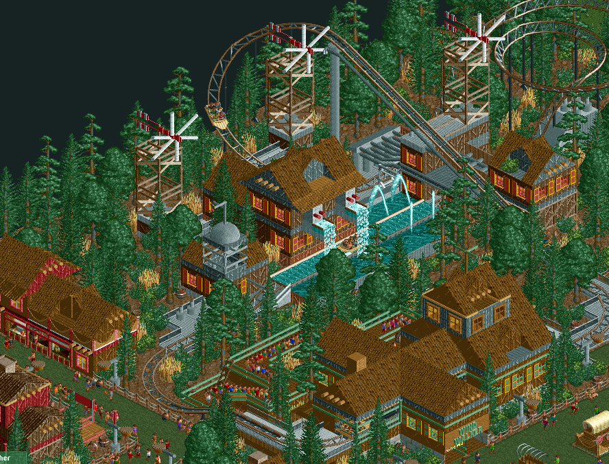
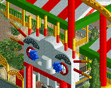
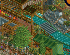
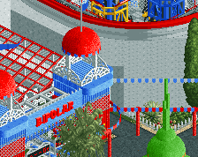
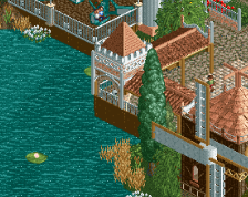
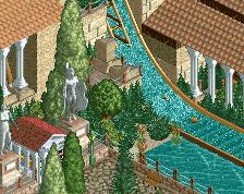
Alright, this is one awesome piece of art. Those 3 windmills are pretty much the best I ever built, same goes for the station building. I uploaded a different angle of the queue in the comments.
This park is so going to be a masterpiece... :D
Have fun commenting guys! -
 Full-Size
-
1 fan
 Fans of this screenshot
-
 Tags
Tags
pretty cool! i would say that you desperately need to use other colours than brown. also the windmills are nice, but i feel like having 3 of them is too many.
well it is called brown park so....
I love it. And I love that everything is brown.
Keep up the good work! It's great to see you back here!
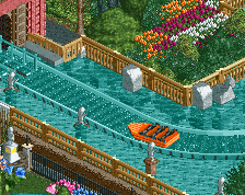
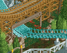
That water coaster is amazing! I love water coasters. It makes me happy to see those little boats with peeps in them go up and down and from left to right.
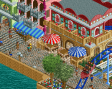
Even though it's all brown, this park is so much fun. I love the way you integrated the RCT food stalls into your architecture.
Thanks guys, for all your feedback. I just dont quite understand what you mean by saying its all brown? I mean sure, wood is the base material, which is basically brown. But i have a whole lot of grey in there, light red wood, green linings and fences on the station building, colored windows. what exactly is it, what youre asking for? yellow wooden roofs? bright blue tracks? But dont worry color freaks, there will be some more crazy color in this park, for sure.
I'm not entirely sure why you call it 'Brown Park' then seem to question why people are commenting about the brown...
Obviously the name is quite tongue in cheek, but still. I think the colours are fine personally for this theme, but I'd get bored of them across anymore than maybe a 40x40 area. My issue is more with the lack of detail - it looks good for a park from 5 or 6 years ago, but in this day it's definitely not top level stuff. I wouldn't say there's any way to improve it, but I wouldn't say it's any higher quality than high bronze/low silver.
Of course it all depends what you're building to achieve on whether that's relevant or not. If you're building to have fun and maybe grab a silver along the way, go at it please, I'd be happy to see it released, but if you're building with the expectation of pushing for spotlight quality then I think you need to update the bench and build with smaller objects. But again, if you're not aiming for that carry on as you are. For the style you're building in, there's not much really to be improved.
The reason i build and play this game is totally to have fun. I am married and have a very stressful job and when i find some spare time in the evening I love to dive into the game and create magical worlds and atmospheres with all these simple objects over and over again. I also love to create new buildings and structures for the first time. Even if they look kind of quirky and stupid. I mean, rollercoasters and giant cliffs, waterfalls, houses? Nobody can take that seriously.
On the other hand i deeply admire those top notch parks with buildings all made of countless tiles and details. I mean, corsair veredian!? The people who built it should freaking go to hollywood or something. i'd love to have the time, creativity and patience to build these things, but i dont think i can put so much effort in the game.
And of course, i love to share it with you and look at the worlds you guys create. Isnt it amazing, that there is always something new to build? New screenshots that make you gasp after all those years?
Finally someone else who recognises Corsair Veredian for the brilliance it is, easily the best park of that season for me.
But I'm glad that you realise that this isn't quite up there with the best of the best, and instead you're just building it for fun and, I'm assuming from the way you phrased your reply, to escape reality for a bit. Sadly, that escapism has disappeared in recent years with the focus shift onto realism, but nonetheless it's nice to see that there are some more old school players still around. It may not be the best (although certainly not bad), but as long as you have fun along the journey, who cares?
Loving those windmills! I would personally consider changing the green path to crazy paving as I just think it blends in too much with the surroundings.
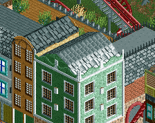
Whilst I can see what Trav is saying regarding detailing; not every park needs to conform to it, and it's refreshing to see a park like this with a wall and window that still looks good and gets people excited about seeing.
Maybe add some land height changes. A little terrain would be nice.
This looks fantastic. I think water coasters are a great ride for making mixed excitement/slow themed tracks, and it looks like you're doing a good job at filling both those criteria. I'm looking forward to more of this.