Screenshot / Brown Park #1
-
 13-May 14
-
 Unnamed Park, but awesome. # CANCELED
-
 1 of 9
- Views 2,156
- Fans 0
- Comments 7
-
 Description
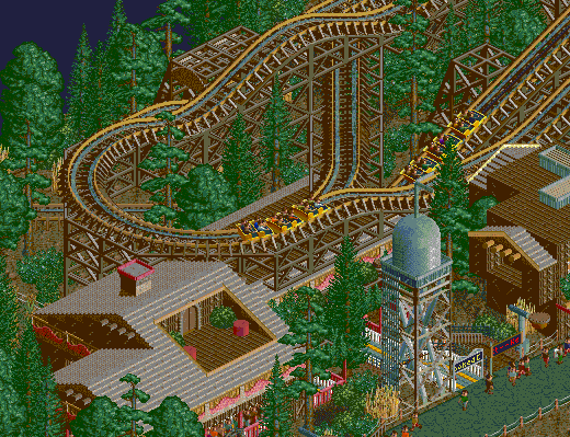
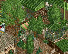
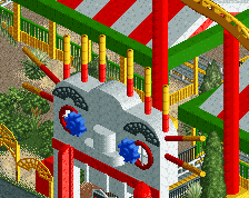
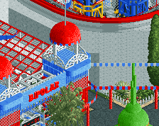
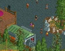
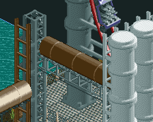
Alright guys, I'm having some time on my hands and got back in the game. This park is going to be mostly brown and mostly awesome. I'm always interested in your thoughts! This park now has a little watertower, a ridicolous barn and I'm planning some windmills. More is going to come soon.
-
 Full-Size
-
 No fans of this screenshot
-
 Tags
Tags
sorry, MS paint fucked up the colors a bit :/
save as a png instead, then it doesnt fuck the colours up
Too brown. jk
Water tower is pretty nice, and that custom lamp is actually very cool.
It's just nice to see a side friction. I really like the cut out balcony on the station, and the water tower's looking good too. If you fix the colours, could we see that version please?
I think that balcony in the roof is really nice
here in normal colors again:
thanks for your kind words. I really like custom build lamps and I'm glad you like them. I thought you would say they are too big or dont fit.
What additional colors would you suggest, if its too brown for you? I have hightlight colors going on there, but not too many on this screenhot.