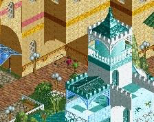
Huge fan of this. Fantastic planters, path layering in general is super cool. Great use of the brick path in key places. Just not sure about the crazy paving as a base, Id just slap some black or grey tarmac down but my preference tends to be on the boring side of these things
WOW. This is so clean and love the look. Question, how did you do the signage?
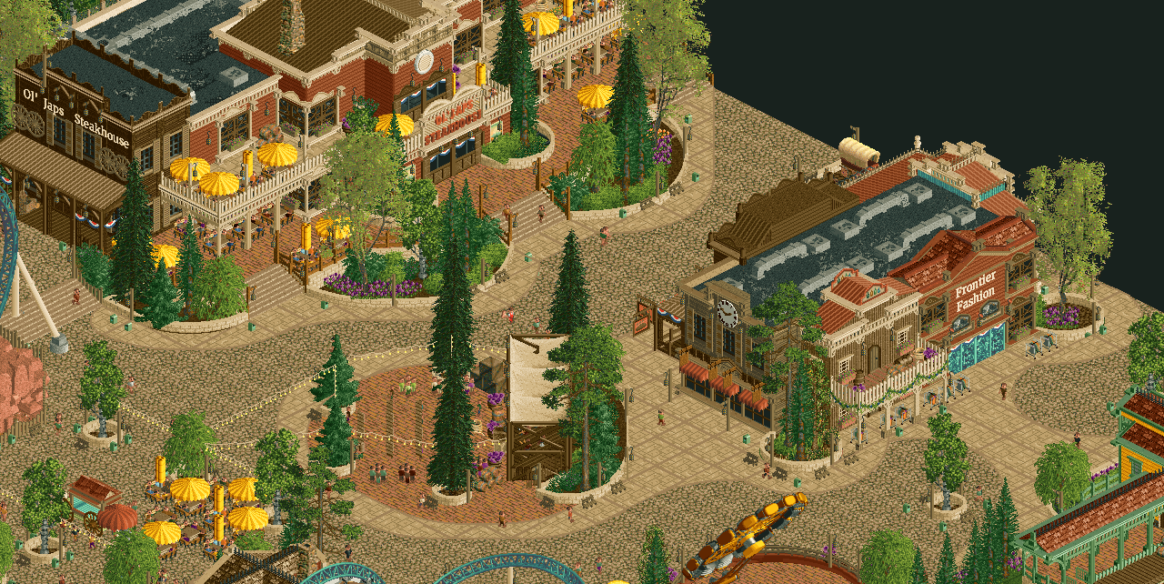
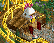
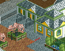
The Old Japs Steakhouse sign on the left and Frontier Fashion are the Merriweather 3D Sign objects. Just a sign object with another font, used invisible color for their background.
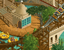
Agreed with everyone else so far. This is phenomenal! Easily your best work. You've implemented a level of macro that we haven't seen in previous releases. The terraced entrance to the restaraunt is the standout I think.
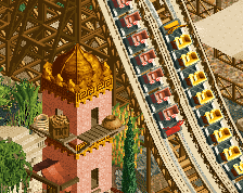
this is outstanding. as everyone is saying, a definite step up in terms of detail level and execution, you're nailing it. one thing that stood out from your last few parks is your excellent use of color and you're smashing it again here... the yellow, the purple, the classy base coloring, the mix of foliage colors... absolutely perfect.
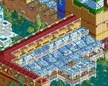
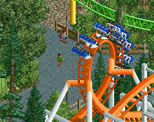
After a great ride on our rollercoaster, fill your tummies at Ol' Japs Steakhouse! Enjoy a delicious steak or the best ribs you can find in the wild west.
 30-March 25
this is the best thing you've ever made ol freddy
Easily your best work, this is stellar
You join the Soda Jerks for two rounds and become four times the player you once were. You're kind of a problem now Fred, I love it
Huge fan of this. Fantastic planters, path layering in general is super cool. Great use of the brick path in key places. Just not sure about the crazy paving as a base, Id just slap some black or grey tarmac down but my preference tends to be on the boring side of these things
Huge fan of this, not just a step up but two or three. Inspiring.
WOW. This is so clean and love the look. Question, how did you do the signage?
Wowowowow. I LOVE this! amazing work!
hmmmm simply wonderful excellent
Thanks for the kind words everyone.
The Old Japs Steakhouse sign on the left and Frontier Fashion are the Merriweather 3D Sign objects. Just a sign object with another font, used invisible color for their background.
Agreed with everyone else so far. This is phenomenal! Easily your best work. You've implemented a level of macro that we haven't seen in previous releases. The terraced entrance to the restaraunt is the standout I think.
Andrew, I don't think it's nice to want to burn this all down. It's really good work.
Also, I just noticed the trash cans... they are way too small, especially since you have gone for a slightly larger scale.
this is outstanding. as everyone is saying, a definite step up in terms of detail level and execution, you're nailing it. one thing that stood out from your last few parks is your excellent use of color and you're smashing it again here... the yellow, the purple, the classy base coloring, the mix of foliage colors... absolutely perfect.
Amazing
rad
Amazing work FredD! Very Disney-esque and obvious inspo from Belle Isle, but with enough of your own style in it. Can't wait to see more.