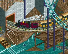
This was my favorite moment of the map. The deep red archi against the bright sands, the full-tile rockwork, and the foliage and waterfalls are so memorable. Love the way the mine train and water coaster interact too. Shades of Vere Aeternum as much as I hate to say that to two fellow Soda Jerks
I like it a lot! I wish the diagonal drops had some custom supporting because the wooden box supports look a bit messy, especially with how they sit in the water. But that's water under the bridge now.
agree with posix about the grid on the path, but it's a minor complaint. The colors here are perfect.
Always been a big fan of how waterfalls look with this palette. And leaving a large amount of sand in the background not only balances the composition in terms of color and form, but also allows for the prominent set pieces to really pop out. Great work guys
 16-March 25
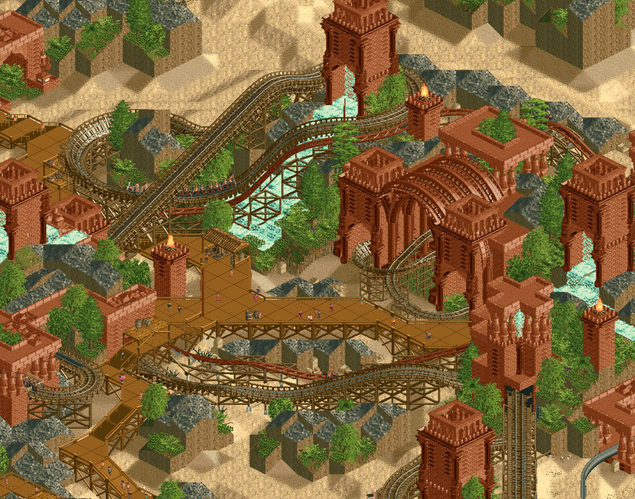
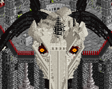
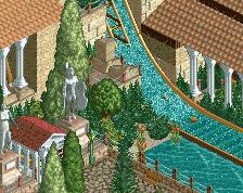
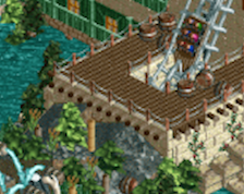
Excellent composition. Great use of hot moments and negative space. Architecture feels like a throwback, yet fresh and innovative. Consider me a fan
Lovely screen. I hope this finds its way into the NE database soon!
This was my favorite moment of the map. The deep red archi against the bright sands, the full-tile rockwork, and the foliage and waterfalls are so memorable. Love the way the mine train and water coaster interact too. Shades of Vere Aeternum as much as I hate to say that to two fellow Soda Jerks
I like it a lot! I wish the diagonal drops had some custom supporting because the wooden box supports look a bit messy, especially with how they sit in the water. But that's water under the bridge now.
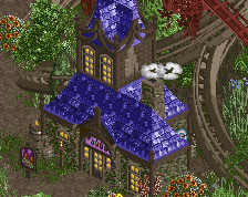
Very lovely Mulpje.
Just not sure about that strong grid on the path.
Easily one of the top 3 parks of this contest. So many lovely moments!
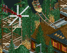
I love these wooden paths and the diagonal ones are really nice
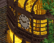
Very nice stuff. Muted palette and small color selection works well here.
Great scene from a great park. I will always be a fan of old school rct rockwork and the green foliage pops nicely with the muted red architecture
agree with posix about the grid on the path, but it's a minor complaint. The colors here are perfect.
Always been a big fan of how waterfalls look with this palette. And leaving a large amount of sand in the background not only balances the composition in terms of color and form, but also allows for the prominent set pieces to really pop out. Great work guys