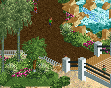
Adorable little scene! My big gripe is that gray stone texture though. It could afford to be a little less overbearing; right now it's taking my eye away from the rest of the screen. Rest of the screen is great though; almost feels Jaguar-like in its detailing in areas.
Agree with posix.. little bit too noisy for me. Drop your ISO settings and perhaps lower your f-stop. You'll get more smooth and crisp photos in no time.
I think if you were to strip that building of a bit of detail, maybe make it one or two tiles higher, it might be the move that the crunch needs to balance everything out. Otherwise you're rapidly improving with everything you do.
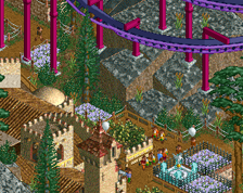
this is really good. there are a couple of things that i'd change as i agree with a couple of people that it's very busy.
- in general, smoothly transition colors where you can. i.e. dark rock to light sand, right now there's quite a harsh line between areas of color on the screen. if you can use interim colors to transition between dark and light colors it'll feel more natural.
- i've found fisch rocks to work best when the two colors are either the same or very similar - kinda the same as the above point, but keep the browns a similar color where you can and it'll feel smoother.
- the light wavy lines on the right are kinda eye-grabbing, they feel a little too uniform. if you can break up the continuous lines with some foliage, or rocks, or organic shapes, it'll feel more natural.
overall it's clear that the skill level is there and what you're building is really interesting, looking forward to seeing more!
 09-March 25
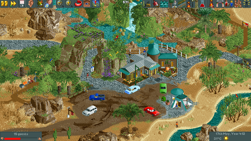
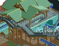
I like this a lot, but it feel like texture and crunch overload! I don't know where to look. I think dialing it back a little will help.
You are one of my favorite developing builders right now. Beautiful work! Very Babar-esque.
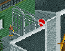
Is that the new Goldy after Alfred?
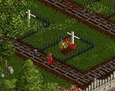
adorable
Adorable little scene! My big gripe is that gray stone texture though. It could afford to be a little less overbearing; right now it's taking my eye away from the rest of the screen. Rest of the screen is great though; almost feels Jaguar-like in its detailing in areas.
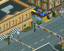
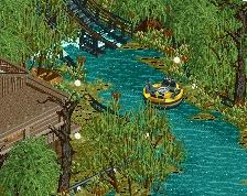
Love this, great atmosphere and landscaping! Could be that im tripping, but the cars seem a little big in proportion to the house maybe?
Very cool. Your talent is always a joy to see.
Would suggest to improve the crunch hygiene a little. Certain bits look somewhat noisy.
Agree with posix.. little bit too noisy for me. Drop your ISO settings and perhaps lower your f-stop. You'll get more smooth and crisp photos in no time.
Or don't use 2 colors on every fisch rock piece!
You throwing in some refreshing stuff at us.
I think if you were to strip that building of a bit of detail, maybe make it one or two tiles higher, it might be the move that the crunch needs to balance everything out. Otherwise you're rapidly improving with everything you do.
this is really good. there are a couple of things that i'd change as i agree with a couple of people that it's very busy.
- in general, smoothly transition colors where you can. i.e. dark rock to light sand, right now there's quite a harsh line between areas of color on the screen. if you can use interim colors to transition between dark and light colors it'll feel more natural.
- i've found fisch rocks to work best when the two colors are either the same or very similar - kinda the same as the above point, but keep the browns a similar color where you can and it'll feel smoother.
- the light wavy lines on the right are kinda eye-grabbing, they feel a little too uniform. if you can break up the continuous lines with some foliage, or rocks, or organic shapes, it'll feel more natural.
overall it's clear that the skill level is there and what you're building is really interesting, looking forward to seeing more!
The curves are amazing, but the difference in building texture and landscape is a bit jarring.
You're bringing something new to NE, love you're unique style