Screenshot / New Park (no name for it yet)
-
 03-May 14
- Views 1,332
- Fans 0
- Comments 8
-
 Description
This is my very first park build, so I did not use any custom scenery to stay away from extreme detailing (for now atleast)
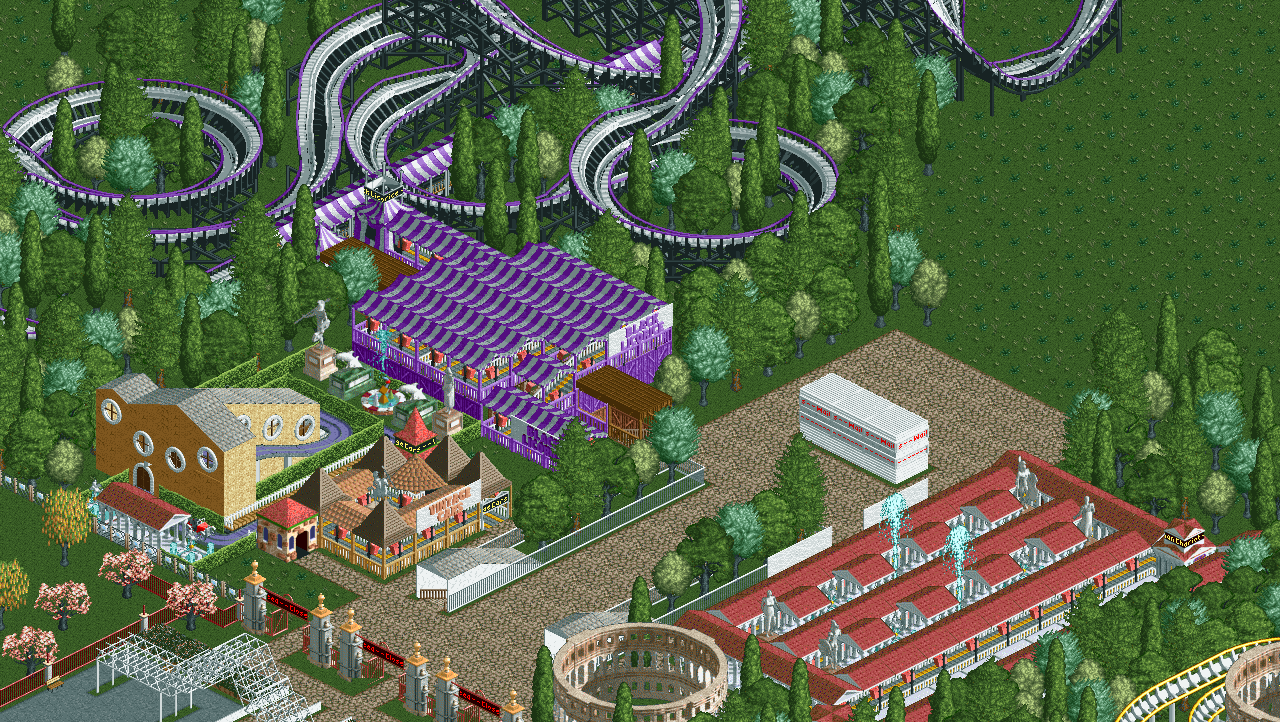
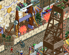
This is a rough draft of the entrance to the park. 2 coasters and a kids ride. The black and purple one is "Black Licorice", the gold and white one is "Roman Chariot" and the car ride is "Vintage Cars"
Hope you enjoy the screenshot! -
 Full-Size
-
 No fans of this screenshot
-
 Tags
Tags

first of all, welcome to the site.
but anyways i feel like there's way too much helixes on the woodie, and woodies usually don't have such bright colours such as purple on them. the queue roof also makes it a bit bland, try to not overuse them.
foliage could also use a bit of work. use 8cars (a program described in the tab that says 'game utilities', and use it to place some shrubs between the trees where you normally couldn't place them, so that you don't have to look at the grass between the trees. also i suggest you take out those smaller trees, they feel out of place, i'd use something like pines for colour variation
anyways, i think it's good that you actually posted a screenshot, a lot of people just make accounts but never really post.
This is going to sound stupid, but after taking a look around the screenshots again, I might just put this project on hold and revert my attention to a better looking one. I immediately noticed the bad quality in comparison when I uploaded it. Thanks for the post though!
i was gonna do a good long revie to help you imrpove ;(. feel free to ask me if you ever need any tips. though i might not be the most qualified person to give advice here, considering how good everybody else is
Oh please, go right ahead! I would REALLY appreciate some pointers.
well right now you have open stations. i suggest you always put a station building on it of some sorts. but it can also be open in certain occaisions (think the intamin accellerator(?) at thorpe park). try to go to a website called rcdb.com and you'll find plenty of station buildings. along with coasters which you can recreate in rct to improve your coaster building skills!
also, make sure your coasters always have brakes. you probably already know that though
Welcome to the site! It's great to see so many new people playing this game... for a game this old it's really amazing.
I think the black/white/purple combo on the coaster is brilliant.