Screenshot / Welcome to Tylstrup Sommerland!
-
 14-November 24
-
 Tylstrup Sommerland
-
 1 of 2
- Views 883
- Fans 1
- Comments 9
-
 Description
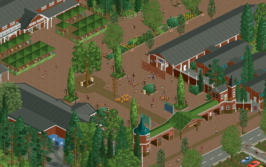
Obligatory V1 entrance screen to officially announce this project. I don't know yet how many screens I will post of this (possibly only one more after I submitted it).
I will probably add more details of it over time. Especially static peeps to fit the holes the peeps leave when walking around. -
 Full-Size
-
1 fan
 Fans of this screenshot
-
 Tags
Tags
I loved the atmosphere, it was very nice
Very good start! I love the green roof.
Good screen. Static peeps would definitely help to break up the paths a bit more. Maybe you could also put some stains here and there.
Really like this, very pleasant and I like the choice of a park in Denmark, not something I've seen much.
Yeeees, very cool! The grassy roof is great, and even though there's quite a lot of path, it works here.
My only gripe here are those square umbrellas. I'm not a fan of how packed together they are in the top left corner. Any chance to break them up more?
I also love the grassy roof entrance. Agreed w Jappy about those umbrellas - it's a bit unclear if you're going for a single large canopy structure or individual parasols, if it's the latter there ought to be some space between them and a bit less order or i think.
Cool project anyway, definitely getting the Scandinavian vibes.
Ha brings back great memories. Had one of the best spaghettis ever on that restaurant there. Looks all pretty clean and recognazible, good job. Also a fan of the grass roof. Good use of the static peeps objects also, little things like this add so much!
But also not a fan of the umbrellas. I suggest you delete some of these, leaving a few tables without umbrellas so it will feel less packed. I'm also not a fan of the color of them.
This is great, lots of nice little details and solid areas of park planning. Love the green roof.
Amazon Prime park lfg